
背景
Android花样loading进度条系列文章主要讲解如何自定义所需的进度条,包括水平、圆形、环形、圆弧形、不规则形状等。
本篇我们继续从圆环形进度条讲起,讲配文字的环形进度条,不仅有进度色彩,还有进度提示和文字说明,主要是使用Canvas绘制圆和圆弧、绘制文字。
效果
先上图看效果,这里有4个进度条,样式上有微妙区别,基本都属于一个类别的进度条了。 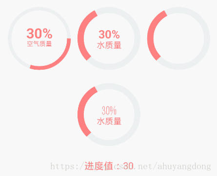
4个进度条基本上分为3类:
带文字的进度条;
不带文字的进度条;
带自定义字体的进度条
我们以第1种作为基本示例来讲解,需要准备的知识点有:
自定义控件的坐标轴;
Canvas圆环、圆弧绘制方法;
Canvas文字绘制方法
自定义属性;
Handler消息处理机制。
其中除了Canvas文字绘制方法没有说,其他都在上一篇 Android花样loading进度条(二)-简单环形进度条一文中有讲解过。
Canvas文字绘制
Canvas类提供了文字绘制方法:
android.graphics.Canvas#drawText(String text, float x, float y, Paint paint)
此方法还有几个重载的方法,我们这里就用到这个方法就可以了。参数说明:
text:要绘制的文字;
x:文字绘制起始的x坐标;
y:文字绘制baseline位置(具体可以查阅其他资料),在使用时调优即可;
paint:绘制时用到的画笔。
自定义属性
配文字的环形进度条控件一般定义的属性有:
圆环的颜色;
圆环的宽度;
圆环上的进度颜色;
圆环上的进度宽度;
文字大小;
文字颜色;
百分比大小等。
为此,我们定义attrs.xml配置文件的内容为:
<?xml version="1.0" encoding="UTF-8"?>
<resources>
    <!--配文字环形进度-->
    <declare-styleable name="TextRoundProgress">
        <!--圆环颜色-->
        <attr name="trp_roundColor" format="color" />
        <!--圆环的宽度-->
        <attr name="trp_roundWidth" format="dimension" />
        <!--圆环上的进度颜色-->
        <attr name="trp_progressColor" format="color" />
        <!--圆环上的进度宽度-->
        <attr name="trp_progressWidth" format="dimension" />
        <!--文字内容-->
        <attr name="trp_text" format="string" />
        <!--文字指示颜色-->
        <attr name="trp_textColor" format="color" />
        <!--文字指示字体大小-->
        <attr name="trp_textSize" format="dimension" />
        <!--数字指示字体大小-->
        <attr name="trp_numSize" format="dimension" />
        <!--进度值的最大值,一般为100-->
        <attr name="trp_max" format="integer" />
        <!--是否显示文字指示内容-->
        <attr name="trp_textShow" format="boolean" />
        <!--开始角度,指定进度初始点的绘制位置-->
        <attr name="trp_startAngle" format="integer" />
        <!--是否使用自定义字体-->
        <attr name="trp_userCustomFont" format="boolean" />
    </declare-styleable>
</resources>
有了属性定义后,我们在绘制的时候结合这些属性就可以按设置值绘制了。
进度条图形绘制
1、基础绘制
分两步走,第一步绘制背景环;第二步绘制前景进度环,这两步可以参考 Android花样loading进度条(二)-简单环形进度条。
2、绘制文字
由于本篇在上一篇简单环形进度上加了文字,有一些基础部分重合了,本篇主要讲差异化的部分,即绘制文字部分。
// step3 画文字指示
paint.setStrokeWidth(0);
paint.setColor(textColor);
paint.setTextSize(textSize);
// 计算百分比
int percent = (int) (((float) progress / (float) max) * 100);

if (textShow && text != null && text.length() > 0 && percent >= 0) {
    // 3.1 画文字
    paint.setTypeface(Typeface.DEFAULT); // 设置为默认字体
    float textWidth = paint.measureText(text); // 测量字体宽度
    canvas.drawText(text, centerX - textWidth / 2, centerX + textSize + 5, paint);
    // 3.2 画百分比
    paint.setTextSize(numSize);
    if (useCustomFont) {
        paint.setTypeface(AppResource.getTypeface(getContext())); // 设置字体
    } else {
        paint.setTypeface(Typeface.DEFAULT_BOLD); // 设置为加粗默认字体
    }
    float numWidth = paint.measureText(percent + "%"); // 测量字体宽度,我们需要根据字体的宽度设置在圆环中间
    canvas.drawText(percent + "%", centerX - numWidth / 2, centerX, paint); // 画出进度百分比
}
作解释如下:
percent:进度值对应的百分比,比较好理解;
textWidth:使用画笔测量出的文字宽度;
centerX 表示控件中心x坐标,centerX - textWidth / 2表示的点在中心向左偏移字体一半的长度;
drawText方法参数x=(centerX - textWidth / 2)表示文字要横向居中;
drawText方法参数y=(centerX + textSize + 5)表示文字竖向位置,由于这里不是垂直居中的,就是靠参数调出来的效果,不具有普及型;
paint.setTypeface:本方法可以设置画笔使用的文字字体。
至此,进度条绘制就完成了,整个TextRoundProgress的代码为:
package com.dommy.loading.widget;

import android.content.Context;
import android.content.res.TypedArray;
import android.graphics.Canvas;
import android.graphics.Color;
import android.graphics.Paint;
import android.graphics.RectF;
import android.graphics.Typeface;
import android.util.AttributeSet;
import android.view.View;

import com.dommy.loading.R;
import com.dommy.loading.util.AppResource;

/**
 * 配文字环形进度条
 */
public class TextRoundProgress extends View {
    private Paint paint; // 画笔对象的引用
    private int roundColor; // 圆环的颜色
    private float roundWidth; // 圆环的宽度
    private int progressColor; // 圆环进度的颜色
    private float progressWidth; // 圆环进度的宽度
    private String text; // 文字内容
    private int textColor; // 中间进度百分比的字符串的颜色
    private float textSize; // 中间进度百分比的字符串的字体大小
    private float numSize; // 中间进度文本大小
    private int max; // 最大进度
    private int startAngle; // 进度条起始角度
    private boolean textShow; // 是否显示中间的进度
    private boolean useCustomFont; // 是否使用自定义字体
    private int progress; // 当前进度

    public TextRoundProgress(Context context) {
        this(context, null);
    }

    public TextRoundProgress(Context context, AttributeSet attrs) {
        this(context, attrs, 0);
    }

    public TextRoundProgress(Context context, AttributeSet attrs, int defStyle) {
        super(context, attrs, defStyle);

        paint = new Paint();

        // 读取自定义属性的值
        TypedArray mTypedArray = context.obtainStyledAttributes(attrs, R.styleable.TextRoundProgress);

        // 获取自定义属性和默认值
        roundColor = mTypedArray.getColor(R.styleable.TextRoundProgress_trp_roundColor, Color.RED);
        roundWidth = mTypedArray.getDimension(R.styleable.TextRoundProgress_trp_roundWidth, 5);
        progressColor = mTypedArray.getColor(R.styleable.TextRoundProgress_trp_progressColor, Color.GREEN);
        progressWidth = mTypedArray.getDimension(R.styleable.TextRoundProgress_trp_progressWidth, roundWidth);
        text = mTypedArray.getString(R.styleable.TextRoundProgress_trp_text);
        textColor = mTypedArray.getColor(R.styleable.TextRoundProgress_trp_textColor, Color.GREEN);
        textSize = mTypedArray.getDimension(R.styleable.TextRoundProgress_trp_textSize, 11);
        numSize = mTypedArray.getDimension(R.styleable.TextRoundProgress_trp_numSize, 14);
        max = mTypedArray.getInteger(R.styleable.TextRoundProgress_trp_max, 100);
        startAngle = mTypedArray.getInt(R.styleable.TextRoundProgress_trp_startAngle, 90);
        textShow = mTypedArray.getBoolean(R.styleable.TextRoundProgress_trp_textShow, true);
        useCustomFont = mTypedArray.getBoolean(R.styleable.TextRoundProgress_trp_userCustomFont, false);
        mTypedArray.recycle();
    }

    @Override
    protected void onDraw(Canvas canvas) {
        super.onDraw(canvas);

        int centerX = getWidth() / 2; // 获取圆心的x坐标
        int radius = (int) (centerX - roundWidth / 2); // 圆环的半径

        // step1 画最外层的大圆环
        paint.setStrokeWidth(roundWidth); // 设置圆环的宽度
        paint.setColor(roundColor); // 设置圆环的颜色
        paint.setAntiAlias(true); // 消除锯齿
        // 设置画笔样式
        paint.setStyle(Paint.Style.STROKE);
        canvas.drawCircle(centerX, centerX, radius, paint); // 画出圆环

        // step2 画圆弧-画圆环的进度
        paint.setStrokeWidth(progressWidth); // 设置画笔的宽度使用进度条的宽度
        paint.setColor(progressColor); // 设置进度的颜色
        RectF oval = new RectF(centerX - radius, centerX - radius, centerX + radius, centerX + radius); // 用于定义的圆弧的形状和大小的界限

        int sweepAngle = 360 * progress / max; // 计算进度值在圆环所占的角度
        // 根据进度画圆弧
        canvas.drawArc(oval, startAngle, sweepAngle, false, paint);

        // step3 画文字指示
        paint.setStrokeWidth(0);
        paint.setColor(textColor);
        paint.setTextSize(textSize);
        // 计算百分比
        int percent = (int) (((float) progress / (float) max) * 100);

        if (textShow && text != null && text.length() > 0 && percent >= 0) {
            // 3.1 画文字
            paint.setTypeface(Typeface.DEFAULT); // 设置为默认字体
            float textWidth = paint.measureText(text); // 测量字体宽度
            canvas.drawText(text, centerX - textWidth / 2, centerX + textSize + 5, paint);
            // 3.2 画百分比
            paint.setTextSize(numSize);
            if (useCustomFont) {
                paint.setTypeface(AppResource.getTypeface(getContext())); // 设置字体
            } else {
                paint.setTypeface(Typeface.DEFAULT_BOLD); // 设置为加粗默认字体
            }
            float numWidth = paint.measureText(percent + "%"); // 测量字体宽度,我们需要根据字体的宽度设置在圆环中间
            canvas.drawText(percent + "%", centerX - numWidth / 2, centerX, paint); // 画出进度百分比
        }
    }

    /**
     * 设置进度的最大值
     * <p>根据需要,最大值一般设置为100,也可以设置为1000、10000等</p>
     *
     * @param max int最大值
     */
    public synchronized void setMax(int max) {
        if (max < 0) {
            throw new IllegalArgumentException("max not less than 0");
        }
        this.max = max;
    }

    /**
     * 获取进度
     *
     * @return int 当前进度值
     */
    public synchronized int getProgress() {
        return progress;
    }

    /**
     * 设置进度,此为线程安全控件
     *
     * @param progress 进度值
     */
    public synchronized void setProgress(int progress) {
        if (progress < 0) {
            throw new IllegalArgumentException("progress not less than 0");
        }
        if (progress > max) {
            progress = max;
        }
        this.progress = progress;
        // 刷新界面调用postInvalidate()能在非UI线程刷新
        postInvalidate();
    }
}
配文字环形进度条的使用
1、页面控件配置
自定义控件在页面中使用时,要使用类名来作为标签,自定义属性要通过命名空间引入,整体如:
<?xml version="1.0" encoding="utf-8"?>
<LinearLayout xmlns:android="http://schemas.android.com/apk/res/android"
    xmlns:app="http://schemas.android.com/apk/res-auto"
    xmlns:tools="http://schemas.android.com/tools"
    ...
    tools:context="com.dommy.loading.TextRoundActivity">

    ...

    <com.dommy.loading.widget.TextRoundProgress
        android:id="@+id/trp_0"
        android:layout_width="100dip"
        android:layout_height="100dip"
        android:layout_gravity="center"
        app:trp_max="100"
        app:trp_numSize="22sp"
        app:trp_progressColor="@color/red_web"
        app:trp_roundColor="@color/pro_bg"
        app:trp_roundWidth="6dip"
        app:trp_startAngle="0"
        app:trp_text="空气质量"
        app:trp_textColor="@color/red_web"
        app:trp_textSize="10sp" />

    ...
</LinearLayout>
界面编写时的preview效果: 
2、Activity代码控制
通过调用方法
com.dommy.loading.widget.TextRoundProgress#setProgress
就可以设置控件显示指定的进度,如:
trp0.setProgress(49);1
3、让进度动起来
通过Thread+Handler动态增加的方法,不断更新界面就可以达到动起来的效果: 
改变效果
1、更改外观
进度的宽度、颜色、字体大小等可以通过自定义属性直接修改。
2、更改字体
在上述代码中我们保留了使用自定义字体的属性,如果app:trp_userCustomFont属性设置为true,则使用我们自定义的字体。
自定义文字字体
1、新建asserts目录
在项目目录main上右键按图步骤新建出asserts目录。 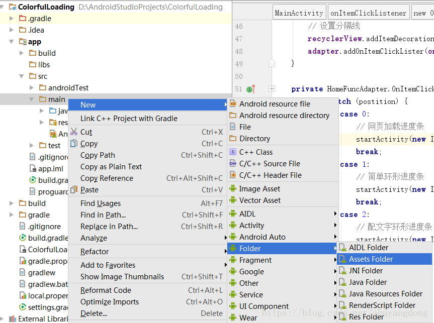
2、引入外部字体
在asserts目录下放置我们需要用的外部字体,我们这里放在fonts文件夹下,有一个数字字体,用在百分比上面的。 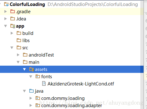
3、使用外部字体
在配文字环形进度条绘制过程中:
paint.setTypeface(AppResource.getTypeface(getContext())); // 设置字体
这行代码就实现了文字字体的更改,其中AppResource.getTypeface方法的源码为:
package com.dommy.loading.util;

import android.content.Context;
import android.graphics.Typeface;

/**
 * APP资源配置
 *
 * @author Dommy
 */
public class AppResource {
    private static Typeface typeface = null; // 公共字体

    /**
     * 获取自定义字体
     *
     * @param context
     * @return Typeface 字体
     */
    public static Typeface getTypeface(Context context) {
        if (typeface == null) {
            typeface = Typeface.createFromAsset(context.getAssets(), "fonts/AkzidenzGrotesk-LightCond.otf");
        }
        return typeface;
    }
}
此处使用数字字体AkzidenzGrotesk-LightCond,体现到进度条上的效果为: 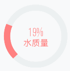
更换字体后的数字显得比较纤细,可以根据需要选择更多的字体和自定义扩展属性。
源码下载
待上传后补上。
共同学习,写下你的评论
评论加载中...
作者其他优质文章