
实际工作中我们经常会看到以下的布局方式:
<ul>
  <li  v-for="item in lists" class="item">
    <div class="icon">
      <img v-lazy="item.imgurl" width="60" height="60">
    </div>
    <div class="text">
      <p v-html="item.creator.name" class="name"></p>
      <p v-html="item.dissname" class="desc"></p>
    </div>
  </li>
</ul>
对应的css文件是:
.item {
  display: flex;
  align-items: center;
  box-sizing: border-box;
  padding: 0 20px 20px 20px;
  .icon {
    flex: 0 0 60px;
    width: 60px;
    padding-right: 20px;
  }
  .text {
    display: flex;
    flex-direction: column;
    justify-content: center;
    flex: 1;
    line-height: 20px;
    overflow: hidden;
    font-size: $font-size-medium;
    .name {
      margin-bottom: 10px;
      color: $color-text;
    }
    .desc {
      color: $color-text-d;
    }
  }
我们看到icon上写了
flex: 0 0 60px
这个是什么含义呢
flex是个shorhand property,默认是0 1 auto,分别对应flex-grow, flex-shrink, flex-basis这三个属性
flex-shrink
当flex-shirk的值不为0,且子盒子的flex-basis(或width)值之和 > 容器的padding的左边界到右边界的值。那么子盒子会根据申明的flex-shirk值去缩小当前子盒子的空间
<!DOCTYPE html>
<html lang="en">
<head>
    <meta charset="UTF-8">
    <title>Title</title>
    <style type="text/css">
        .flex-parent {
            width: 800px;
            display:flex;
            flex-direction: row;
        }
        div {
            height:200px;
        }


        .flex-son:nth-child(1){
            flex: 1 1 200px;
        }
        .flex-son:nth-child(2){
            flex: 1 1 300px;
        }
        .flex-son:nth-child(3){
            flex: 1 1 500px;
        }
    </style>
</head>
<body>

<div class="flex-parent">
    <div class="flex-son" style="background-color: red"></div>
    <div class="flex-son" style="background-color: yellow"></div>
    <div class="flex-son" style="background-color: aqua"></div>
</div>

</body>
</html>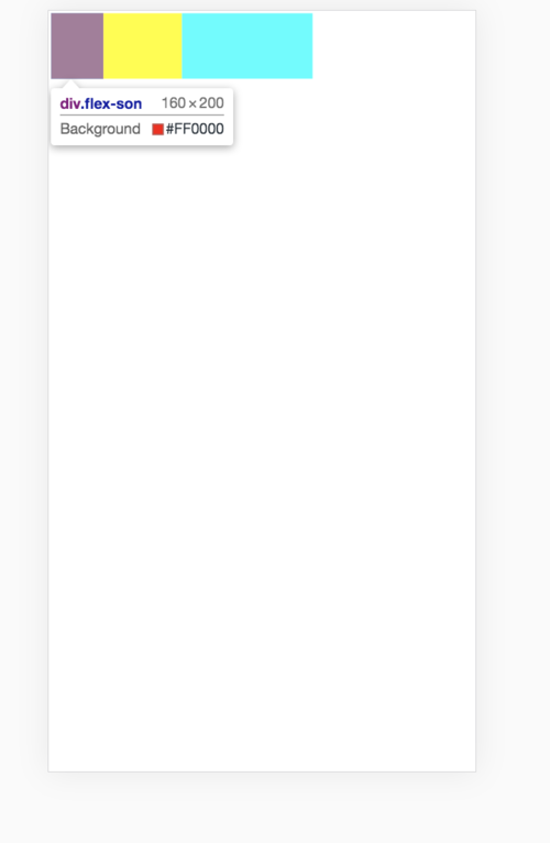
计算公式是
首先计算加上权重的值:1*200 + 1 * 300 + 1 * 500 = 1000 px
第一个item缩小的值为(200px*(1/权重的值))*(1000px-800px) = 40px,1是flow-shrink的值
实际上第一个item的宽度就是200px-40px = 160px
如果把第一个item的flow-shrink设为2,那么
首先计算加上权重的值:2*200 + 1 * 300 + 1 * 500 = 1200 px
那么第一个item 为 (200px*(2/1200px))*(1000px-800px) = 67px
第一个item的实际宽度就是133px
flex-grow
为同理
我们经常可以看到flex:1,相当于flex:1 1 0
flex-grow : 1; // 这意味着div将以与窗口大小相同的比例增长
flex-shrink : 1; // 这意味着div将以与窗口大小相同的比例缩小
flex-basis : 0; // 这意味着div没有这样的起始值,并且将根据可用的屏幕大小占用屏幕。例如: - 如果包装器中有3个div,则每个div将占用33%。
点击查看更多内容
为 TA 点赞
评论
共同学习,写下你的评论
评论加载中...
作者其他优质文章
正在加载中


感谢您的支持,我会继续努力的~
扫码打赏,你说多少就多少
赞赏金额会直接到老师账户
支付方式
打开微信扫一扫,即可进行扫码打赏哦