
抗浮动的专用属性 clear
clear 的定义
clear 属性的本质意义是让元素本身不能与前面的浮动元素相邻( 不在一行显示 )。
例子:
<style>
    ul {
        background-color: cornsilk;
        margin: 0;
        padding: 0;
    }

    li {
        background-color: brown;
        width: 40px;
        height: 40px;
        color: #fff;
        list-style: none;
        float: left;
    }

    li:first-child {
        background-color: cadetblue;
    }

    li:last-child {
        background-color: coral;
    }
</style>

<ul>
    <li>1</li>
    <li style="clear: both;">2</li>
    <li>3</li>
</ul>
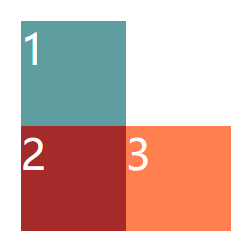
例子中,为第二个 li 元素设置了 clear 属性,这里需要注意,clear
属性元素只会抗拒自身与前面浮动元素相邻,对于后面的浮动元素,并没有效果。
实现原理
CSS2.1 之前,通过为抗浮动元素( 设置 clear 的元素 )增加上外边距( 即 margin-top ),来实现这种换行效果;CSS2.1 规范中,引入" 清除空间 "的概念,而上外边距不再改变。不管哪种方式,效果都是相同的。
例子:
<style>
    ul {
        background-color: cornsilk;
        margin: 0;
        padding: 0;
        overflow: hidden;
    }

    li {
        background-color: brown;
        width: 40px;
        height: 40px;
        color: #fff;
        list-style: none;
        float: left;
    }

    li:first-child {
        background-color: cadetblue;
    }

    li:last-child {
        background-color: coral;
    }
</style>

<ul>
    <li>1</li>
    <li style="clear: both;">2</li>
    <li>3</li>
</ul>

clear 的应用
1、推荐使用 clear:both
clear 属性值 left( 左侧抗浮动 )、right( 右侧抗浮动 ) 和 both( 两侧抗浮动 ),实际上,凡是 left 和 right 可以发挥作用的情况,直接使用 both 就可以。所以推荐直接使用 clear:both。
2、只有块级元素才有效
clear 属性只有块级元素才有效,因此可以直接使用块级元素,或者通过伪元素,设置为块级盒子,来消除浮动造成的高度塌陷。
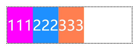
例子:
<style>
    nav {
        outline: dotted;
    }

    p {
        margin: 0;
        color: #fff;
        line-height: 40px;
        float: left;
    }

    p:nth-of-type(1) {
        background-color: fuchsia;
    }

    p:nth-of-type(2) {
        background-color: dodgerblue;
    }

    p:nth-of-type(3) {
        background-color: coral;
    }
    /* div {
    height: 2px;
    background: #FFEB3B;
    clear: both;
} */

    nav::after {
        content: "";
        /* 转换为块级元素  table 或 list-item 也可以 */
        display: block;
        clear: both;
        height: 0;
    }
</style>

<nav>
    <p>111</p>
    <p>222</p>
    <p>333</p>
    <!-- <div></div> -->
</nav>
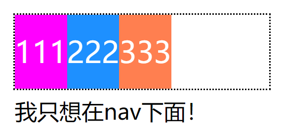
利用 BFC 避免高度塌陷
元素一旦具有 BFC ,那么无论其子元素如何折腾,都不会影响到外部元素。利用这一点,也可以避免 float 造成的高度塌陷。
触发 BFC 的方式有很多,但从效果上来看,float、display、position 等属性都会影响原来的布局,而 overflow 取值 hidden,既可以保持父元素块级盒子的流动性,又实现了区域的封闭性,实属最佳的选择。
例子:
<style>
    nav {
        outline: dotted;
        overflow: hidden;
        /* display: inline-block;
        position: absolute;
        float: left; */
    }

    p {
        margin: 0;
        color: #fff;
        line-height: 40px;
        float: left;
    }

    p:nth-of-type(1) {
        background-color: fuchsia;
    }

    p:nth-of-type(2) {
        background-color: dodgerblue;
    }

    p:nth-of-type(3) {
        background-color: coral;
    }
</style>

<nav>
    <p>111</p>
    <p>222</p>
    <p>333</p>
</nav>
<label>我只想在nav下面!</label>
如有错误,欢迎指正,本人不胜感激。
点击查看更多内容
3人点赞
评论
共同学习,写下你的评论
评论加载中...
作者其他优质文章
正在加载中


感谢您的支持,我会继续努力的~
扫码打赏,你说多少就多少
赞赏金额会直接到老师账户
支付方式
打开微信扫一扫,即可进行扫码打赏哦