
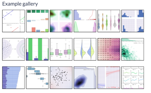
本篇内容主要涉及以下三个方面,阅读时间<=10分钟:
distplot 柱状图
kdeplot 核密度曲线
conditional plot 条件图
seaborn是matplotlib的高级版,对复杂图表的支持较好,可视化结果也非常吸引人。
所用数据为泰坦尼克事件数据,下载地址:https://www.kaggle.com/c/titanic/data
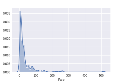
distplot
每次绘图plot时,seaborn会在已有的matplotlib figure上绘制,如没有则新建。
首先引入seaborn库,调用distplot函数对船票价格进行可视化:
#导入数据import pandas as pd
titanic=pd.read_csv('./data/train.csv')
print(titanic.shape)
print(titanic.head())
import seaborn as snsimport matplotlib.pyplot as plt sns.distplot(titanic['Fare']) plt.show()
结果如下,比matplotlib绘制的漂亮多了~
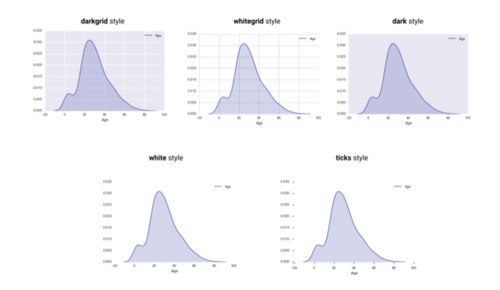
kdeplot
上一张图中,在柱状图的上方显示了一条平滑的曲线,我们将这条曲线称为Kernel Density Plot,是seaborn使用kernel density estimation 技术绘制得来的。
对‘Fare’属性绘制kdeplot:
sns.kdeplot(titanic['Fare'],shade=True)
sns.set_style('white')
plt.xlabel('Fare')
sns.despine(left=True,bottom=True)
plt.show()shade:显示曲线面积,方便观察
xlabel:在绘制kdeplot时,seaborn并不像distplot一样自动生成label,我们需要使用xlabel手动指定。
depine:隐藏四条边框,调用该方法时默认隐藏top and right spine,我们只需指定left and bottom即可。
set_style: seaborn中存在多种样式,我们可以使用该方法来改变默认样式:
darkgrid: Coordinate grid displayed, dark background color
whitegrid: Coordinate grid displayed, white background color
dark: Coordinate grid hidden, dark background color
white: Coordinate grid hidden, white background color
ticks: Coordinate grid hidden, white background color, ticks visible
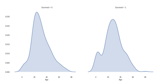
conditional plot
在seaborn中,可以通过指定条件来创建一组plot。
比如,通过conditional plot来对幸存者和非幸存者的年龄分布进行可视化。
g=sns.FacetGrid(titanic,col='Survived',size=6)
g.map(sns.kdeplot,'Age',shade=True)
sns.despine(left=True,bottom=True)
plt.show()
FacetGrid对象用于生成plot的网格布局;col用于指定使用哪个条件将数据分为多个子集;size用于指定每个plot的大小。
当网格创建完毕后,可以使用FacetGrid的map方法来指定plot类型和需要绘制的属性。
结果如下:
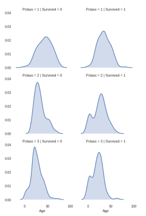
使用两个条件进行绘制:
g=sns.FacetGrid(titanic,col='Survived',row='Pclass',size=3)
g.map(sns.kdeplot,'Age',shade=True)
sns.despine(left=True,bottom=True)
plt.show()
col用于指定将同一行分为多个子集,row用于指定将同一列分为多个子集。
结果:
什么?你还嫌少?来人! 把老子的意大利......妞拿来给楼主玩玩
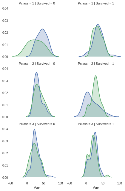
继续使用三个条件进行可视化:
使用两个条件就已经看的眼花缭乱了,三个条件不得乱成一窝老鼠吗?seaborn早想到了这点:采用在同一plot上使用不同颜色的方法进行可视化,指定hue参数:
g=sns.FacetGrid(titanic,col='Survived',row='Pclass',hue='Sex',size=3)
g.map(sns.kdeplot,'Age',shade=True)
sns.despine(left=True,bottom=True)
plt.show()
作者:asdfcxz
链接:https://www.jianshu.com/p/f56e85d44264
共同学习,写下你的评论
评论加载中...
作者其他优质文章