我正在制作px.choropleth()图表plotly.express。这是代码片段;import psycopg2import pandas as pdimport plotly.express as px''' PostgreSQL Variables '''# your postgres login variables''' PostgreSQL Connection '''# your postgres connection code''' SQL Query '''# your SQL Query ''' Load SQL Queries into Pandas DataFrame '''African = pd.DataFrame(SQL_Query_Code, columns=['list-of-all-columns'])''' Variable for Personal Colours '''# e.g. HTML/HEx code : '#4c5c73'# List all of the shades/tints codes; in this example I am using the tints codesmy_color_scale = [[0.0, '#4c5c73'], [0.1, '#5D6C81'], [0.2, '#6F7C8F'], [0.3, '#818C9D'], [0.4, '#939DAB'], [0.5, '#A5ADB9'], [0.6, '#B7BDC7'], [0.7, '#C9CED5'], [0.8, '#DBDEE3'], [0.9, '#EDEEF1'], [1.0, '#FFFFFF']]''' Plotly graph '''# Government Respond - School Closingafrican_figure1 = px.choropleth(African, locations='countrycode', color='c1_school_closing', color_continuous_scale=my_color_scale, range_color=[0, 3], hover_data={'c1_school_closing': False, 'countrycode': False, 'countryname': False}, hover_name='countryname', labels={'c1_school_closing': 'SCALE'})是否可以手动重命名由 ? 自动创建的图例px.choropleth?
1 回答
慕少森
TA贡献2019条经验 获得超9个赞
我举个例子。coloraxis_colorbar您可以在更新布局中使用字典。
这里,
tickvals- 颜色条中的枚举值
ticktext- 根据值显示的文本
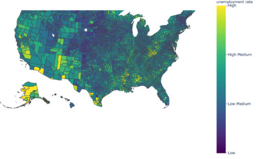
from urllib.request import urlopen
import json
with urlopen('https://raw.githubusercontent.com/plotly/datasets/master/geojson-counties-fips.json') as response:
counties = json.load(response)
import pandas as pd
df = pd.read_csv("https://raw.githubusercontent.com/plotly/datasets/master/fips-unemp-16.csv",
dtype={"fips": str})
import plotly.express as px
fig = px.choropleth(df, geojson=counties, locations='fips', color='unemp',
color_continuous_scale="Viridis",
range_color=(0, 12),
scope="usa"
)
fig.update_layout(margin={"r":0,"t":0,"l":0,"b":0},coloraxis_colorbar=dict(
title="unemployment rate",
thicknessmode="pixels",
lenmode="pixels",
yanchor="top",y=1,
ticks="outside",
tickvals=[0,4,8,12],
ticktext=["Low", "Low Medium", "High Medium", "High"],
dtick=4
))
fig.show()
现在来解决你的问题,
使用tickvals=[0,1,2,3]和
ticktext=['0 - no measures', '1 - recommend closing', '2 - require closing (only some levels)', '3 - require closing all levels']
添加回答
举报
0/150
提交
取消