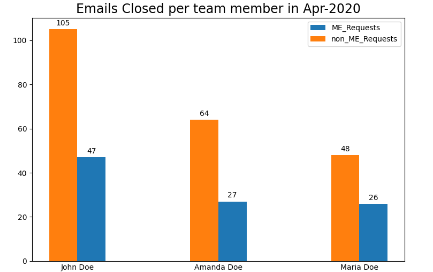
我的代码:import numpy as npimport matplotlib.pyplot as plt#sample dataME_Requests = {'John Doe': 47, 'Amanda Doe': 27, 'Maria Doe': 26}non_ME_Requests = {'John Doe': 105, 'Amanda Doe': 64, 'Maria Doe': 48}month="Apr-2020"X = np.arange(len(ME_Requests))ax = plt.subplot(111)ax.bar(X, ME_Requests.values(), width=0.2, align='center')ax.bar(X-0.2, non_ME_Requests.values(), width=0.2, align='center')ax.legend(('ME_Requests','non_ME_Requests'))plt.xticks(X, ME_Requests.keys())plt.title("Emails Closed per team member in {}".format(month) , fontsize=17)plt.savefig('img.png')plt.show()我目前的条形图:期望的输出:我正在尝试以下操作:#sample dataME_Requests = {'John Doe': 47, 'Amanda Doe': 27, 'Maria Doe': 26}non_ME_Requests = {'John Doe': 105, 'Amanda Doe': 64, 'Maria Doe': 48}month="Apr-2020"x = np.arange(len(month)) # the label locationswidth = 0.35 # the width of the barsfig, ax = plt.subplots()rects1 = ax.bar(X, ME_Requests.values(), width=0.2, align='center')rects2 = ax.bar(X-0.2, non_ME_Requests.values(), width=0.2, align='center')# Add some text for labels, title and custom x-axis tick labels, etc.ax.set_ylabel('# Requests')ax.set_title("Emails Closed per team member in {}".format(month) , fontsize=17)ax.set_xticks(X, ME_Requests.keys())ax.set_xticklabels(month)ax.legend(('ME_Requests','non_ME_Requests'))def autolabel(rects): """Attach a text label above each bar in *rects*, displaying its height.""" for rect in rects: height = rect.get_height() ax.annotate('{}'.format(height), xy=(rect.get_x() + rect.get_width() / 2, height), xytext=(0, 3), # 3 points vertical offset textcoords="offset points", ha='center', va='bottom')autolabel(rects1)autolabel(rects2)fig.tight_layout()plt.show()但是存在一个问题,因为它不会显示用户名(John Doe 等),而是显示“p”或“r”等。请参见下文:有人可以帮我解决这个问题吗?提前致谢!
1 回答
神不在的星期二
TA贡献1963条经验 获得超6个赞
ax.set_xticklabels(month)应替换为 ax.set_xticklabels(ME_Requests.keys()).
要将标签放在条形之间,您可以减去width/2左侧X条形的标签,并添加width/2右侧X条形的标签。ax.tick_params(axis='x', length=0)可以使用去除刻度线。
import numpy as np
import matplotlib.pyplot as plt
# sample data
ME_Requests = {'John Doe': 47, 'Amanda Doe': 27, 'Maria Doe': 26}
non_ME_Requests = {'John Doe': 105, 'Amanda Doe': 64, 'Maria Doe': 48}
month = "Apr-2020"
X = np.arange(len(ME_Requests))
fig, ax = plt.subplots()
rects1 = ax.bar(X + 0.1, ME_Requests.values(), width=0.2, align='center')
rects2 = ax.bar(X - 0.1, non_ME_Requests.values(), width=0.2, align='center')
ax.legend(('ME_Requests', 'non_ME_Requests'))
ax.set_xticks(X)
ax.set_xticklabels(ME_Requests.keys())
ax.set_title(f"Emails Closed per team member in {month}", fontsize=17)
ax.tick_params(axis='x', length=0)
def autolabel(rects):
"""Attach a text label above each bar in *rects*, displaying its height."""
for rect in rects:
height = rect.get_height()
ax.annotate(f'{height:.0f}',
xy=(rect.get_x() + rect.get_width() / 2, height),
xytext=(0, 3), # 3 points vertical offset
textcoords="offset points",
ha='center', va='bottom')
autolabel(rects1)
autolabel(rects2)
fig.tight_layout()
plt.show()
添加回答
举报
0/150
提交
取消