我需要在绘图中创建“相对”和“分组”图表的组合。我弄清楚了如何使用以下代码创建堆叠和分组:from plotly import graph_objects as goimport plotlypyplt = plotly.offline.plotdata = { "Sports_19": [15, 23, 32, 10, 23, 22, 32, 24], "Casual_19": [4, 12, 11, 14, 15, 12, 22, 14], "Yoga_19": [4, 8, 18, 6, 12, 11, 10, 4], "Sports_20": [11, 18, 18, 0, 20, 12, 12, 11], "Casual_20": [20, 10, 9, 6, 10, 11, 17, 22], "Yoga_20": [11, 18, 18, 0, 20, 12, 12, 11], "labels": ["January", "February", "March", "April", "May", 'June', 'July', "August"] }fig = go.Figure()fig.add_trace(go.Bar(name="Sports",x=data["labels"],y=data["Sports_19"],offsetgroup=19,marker_color='lightsalmon',text=data["Sports_19"],textposition='auto'))fig.add_trace(go.Bar(name="Casual",x=data['labels'],y=data['Casual_19'],offsetgroup=19,base=data['Sports_19'],marker_color='crimson',text=data["Casual_19"],textposition='auto'))fig.add_trace(go.Bar(name="Yoga",x=data['labels'],y=data['Yoga_19'],marker_color='indianred',text=data["Yoga_19"],textposition='auto',offsetgroup=19,base=[val1 + val2 for val1, val2 in zip(data["Sports_19"], data["Casual_19"])]))fig.add_trace(go.Bar(name="Sports_20",x=data["labels"],y=data["Sports_20"],offsetgroup=20,marker_color='lightsalmon',showlegend=False,text=data["Sports_20"],textposition='auto'))fig.add_trace(go.Bar(name="Casual_20",x=data['labels'],y=data['Casual_20'],offsetgroup=20,base=data['Sports_20'],marker_color='crimson',showlegend=False,text=data["Casual_20"],textposition='auto'))fig.add_trace(go.Bar(name="Yoga_20", x=data['labels'], y=data['Yoga_20'], marker_color='indianred', text=data["Yoga_20"], showlegend=False, textposition='auto', offsetgroup=20, base=[val1 + val2 for val1, val2 in zip(data["Sports_20"], data["Casual_20"])]))fig.update_layout(title="2019 vs 2020 Sales by Category",yaxis_title="Sales amount in US$")fig.show()pyplt(fig, auto_open=True)输出是这样的:有什么方法可以将此图转换为“相对”和“分组”的组合吗?可能不是用plotly,而是用matplotlib或其他工具?ps 这是“相对图”的示例(但未分组):
1 回答
慕田峪9158850
TA贡献1794条经验 获得超8个赞
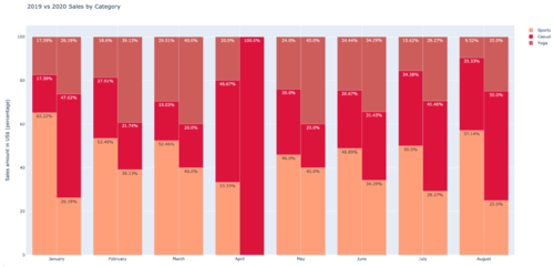
也许最直接的方法是创建两个新的数据框df_perc_19并df_perc_20存储数据,将其标准化为每年每个月的相对百分比,四舍五入到两位数,因为.round(2)长小数会导致文本的默认方向发生变化 - 感觉您可以随意调整。
text然后访问这些新数据帧中的值以进行跟踪,尽管它很难看,但您可以使用以下方法获取要显示的参数的百分比:text=[str(x)+"%" for x in df_perc_19["Casual_19"]]
import pandas as pd
import plotly
from plotly import graph_objects as go
# pyplt = plotly.offline.plot
data = {
"Sports_19": [15, 23, 32, 10, 23, 22, 32, 24],
"Casual_19": [4, 12, 11, 14, 15, 12, 22, 14],
"Yoga_19": [4, 8, 18, 6, 12, 11, 10, 4],
"Sports_20": [11, 18, 18, 0, 20, 12, 12, 11],
"Casual_20": [20, 10, 9, 6, 10, 11, 17, 22],
"Yoga_20": [11, 18, 18, 0, 20, 12, 12, 11],
# "labels": ["January", "February", "March", "April", "May", 'June', 'July', "August"]
}
labels = ["January", "February", "March", "April", "May", 'June', 'July', "August"]
df = pd.DataFrame(data=data,index=labels)
## normalize data for the months of 2019, and the months of 2020
df_perc_19 = df.apply(lambda x: 100*x[["Sports_19","Casual_19","Yoga_19"]] / x[["Sports_19","Casual_19","Yoga_19"]].sum(),axis=1).round(2)
df_perc_20 = df.apply(lambda x: 100*x[["Sports_20","Casual_20","Yoga_20"]] / x[["Sports_20","Casual_20","Yoga_20"]].sum(),axis=1).round(2)
fig = go.Figure()
## traces for 2019
fig.add_trace(go.Bar(name="Sports",x=labels,y=df_perc_19["Sports_19"],offsetgroup=19,marker_color='lightsalmon',text=[str(x)+"%" for x in df_perc_19["Sports_19"]],textposition='auto'))
fig.add_trace(go.Bar(name="Casual",x=labels,y=df_perc_19['Casual_19'],offsetgroup=19,base=df_perc_19['Sports_19'],marker_color='crimson',text=[str(x)+"%" for x in df_perc_19["Casual_19"]],textposition='auto'))
fig.add_trace(go.Bar(name="Yoga",x=labels,y=df_perc_19['Yoga_19'],marker_color='indianred',text=[str(x)+"%" for x in df_perc_19["Yoga_19"]],textposition='auto',offsetgroup=19,base=[val1 + val2 for val1, val2 in zip(df_perc_19["Sports_19"], df_perc_19["Casual_19"])]))
## traces for 2020
fig.add_trace(go.Bar(name="Sports_20",x=labels,y=df_perc_20["Sports_20"],offsetgroup=20,marker_color='lightsalmon',showlegend=False,text=[str(x)+"%" for x in df_perc_20["Sports_20"]] ,textposition='auto'))
fig.add_trace(go.Bar(name="Casual_20",x=labels,y=df_perc_20['Casual_20'],offsetgroup=20,base=df_perc_20['Sports_20'],marker_color='crimson',showlegend=False,text=[str(x)+"%" for x in df_perc_20["Casual_20"]],textposition='auto'))
fig.add_trace(go.Bar(name="Yoga_20", x=labels, y=df_perc_20['Yoga_20'], marker_color='indianred', text=[str(x)+"%" for x in df_perc_20["Yoga_20"]], showlegend=False, textposition='auto', offsetgroup=20, base=[val1 + val2 for val1, val2 in zip(df_perc_20["Sports_20"], df_perc_20["Casual_20"])]))
fig.update_layout(title="2019 vs 2020 Sales by Category",yaxis_title="Sales amount in US$ (percentage)")
fig.show()
# pyplt(fig, auto_open=True)
添加回答
举报
0/150
提交
取消