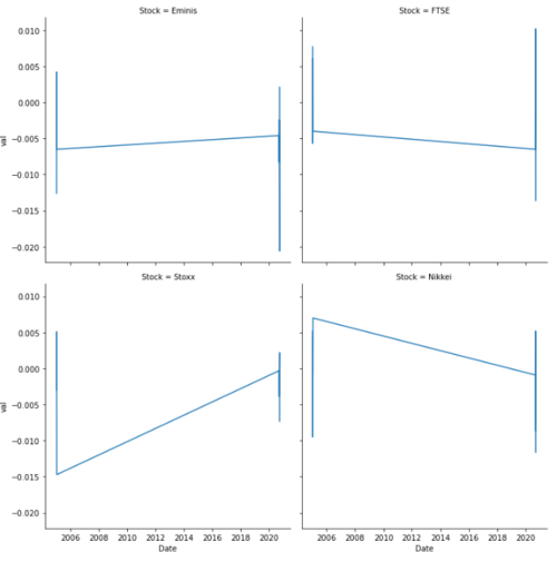
我在这里做错了什么?我想创建新的数据框,df并使用日期作为每个新创建的数据框(Emins、FTSE、Stoxx 和 Nikkei)折线图中的 x 轴。我有一个df从 data.xlsx 创建的名为数据框,它看起来像这样: Dates ES1 Z 1 VG1 NK10 2005-01-04 -0.0126 0.0077 -0.0030 0.00521 2005-01-05 -0.0065 -0.0057 0.0007 -0.00952 2005-01-06 0.0042 0.0017 0.0051 0.00443 2005-01-07 -0.0017 0.0061 0.0010 -0.00094 2005-01-11 -0.0065 -0.0040 -0.0147 0.00703670 2020-09-16 -0.0046 -0.0065 -0.0003 -0.00093671 2020-09-17 -0.0083 -0.0034 -0.0039 -0.00863672 2020-09-18 -0.0024 -0.0009 -0.0009 0.00523673 2020-09-23 -0.0206 0.0102 0.0022 -0.00133674 2020-09-24 0.0021 -0.0136 -0.0073 -0.0116我df创建了 4 个新数据框,分别称为 Eminis、FTSE、Stoxx 和 Nikkei。感谢您的帮助!!!! import numpy as np import matplotlib.pyplot as plt plt.style.use('classic') df = pd.read_excel('data.xlsx') df = df.rename(columns={'Dates':'Date','ES1': 'Eminis', 'Z 1': 'FTSE','VG1': 'Stoxx','NK1': 'Nikkei','TY1': 'Notes','G 1': 'Gilts', 'RX1': 'Bunds','JB1': 'JGBS','CL1': 'Oil','HG1': 'Copper','S 1': 'Soybeans','GC1': 'Gold','WILLTIPS': 'TIPS'}) headers = df.columns Eminis = df[['Date','Eminis']] FTSE = df[['Date','FTSE']] Stoxx = df[['Date','Stoxx']] Nikkei = df[['Date','Nikkei']] # create multiple plots via plt.subplots(rows,columns) fig, axes = plt.subplots(2,2, figsize=(20,15)) x = Date y1 = Eminis y2 = Notes y3 = Stoxx y4 = Nikkei # one plot on each subplot axes[0][0].line(x,y1) axes[0][1].line(x,y2) axes[1][0].line(x,y3) axes[1][1].line(x,y4) plt.legends() plt.show()
2 回答
拉丁的传说
TA贡献1789条经验 获得超8个赞
优雅的解决方案是:
将DataFrame 中的Dates列设置为索引。
创建一个具有所需数量的子图(在您的情况下为 4)的图形,调用plt.subplots。
从 DataFrame 中绘制一个图,传递:
ax -子图的ax结果(这里是Axes对象的数组 ,而不是单个Axes),
subplots=True - 在单独的子图中绘制每一列。
执行此操作的代码是:
fig, a = plt.subplots(2, 2, figsize=(12, 6), tight_layout=True)
df.plot(ax=a, subplots=True, rot=60);
为了测试上面的代码,我创建了以下 DataFrame:
np.random.seed(1)
ind = pd.date_range('2005-01-01', '2006-12-31', freq='7D')
df = pd.DataFrame(np.random.rand(ind.size, 4),
index=ind, columns=['ES1', 'Z 1', 'VG1', 'NK1'])
并得到以下图片:
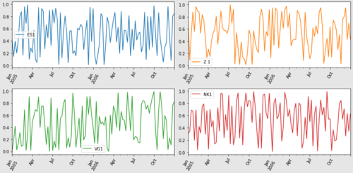
由于我的测试数据是随机的,我假设“7天”频率,以使图片不会太“混乱”。对于真实数据,请考虑使用“7D”频率和mean()聚合函数进行重采样。
RISEBY
TA贡献1856条经验 获得超5个赞
我认为更简洁的选择是不要制作许多数据帧,这会造成不必要的工作和复杂性。
绘制数据就是为绘图 API 塑造数据框
在这种情况下,更好的选择是使用 .dataframe 将宽格式转换为长(整齐)格式
.melt。这会将所有标签放在一列中,并将值放在另一列中
使用,它可以从长格式的数据帧
seaborn.relplot创建。FacetGridseaborn是 的高级 APImatplotlib,使绘图变得更加容易。
如果数据框包含许多股票,但只绘制少数股票,则可以使用布尔索引来选择它们
fig, a = plt.subplots(2, 2, figsize=(12, 6), tight_layout=True)
df.plot(ax=a, subplots=True, rot=60);
为了测试上面的代码,我创建了以下 DataFrame:
np.random.seed(1)
ind = pd.date_range('2005-01-01', '2006-12-31', freq='7D')
df = pd.DataFrame(np.random.rand(ind.size, 4),
index=ind, columns=['ES1', 'Z 1', 'VG1', 'NK1'])
并得到以下图片:
我在这里做错了什么?
当前的实现效率低下,有许多不正确的方法调用和未定义的变量。
如果需要,必须为每个子图显示图例。
Date没有定义为x = Datey2 = Notes:Notes未定义.line不是plt方法并导致AttributeError; 它应该是plt.ploty1 - y4是 DataFrame,但传递给 y 轴的绘图方法,这会导致TypeError: unhashable type: 'numpy.ndarray'; 一列应作为 传递y。.legends不是一种方法;它是.legend
fig, a = plt.subplots(2, 2, figsize=(12, 6), tight_layout=True)
df.plot(ax=a, subplots=True, rot=60);
为了测试上面的代码,我创建了以下 DataFrame:
np.random.seed(1)
ind = pd.date_range('2005-01-01', '2006-12-31', freq='7D')
df = pd.DataFrame(np.random.rand(ind.size, 4),
index=ind, columns=['ES1', 'Z 1', 'VG1', 'NK1'])
并得到以下图片:
添加回答
举报
0/150
提交
取消