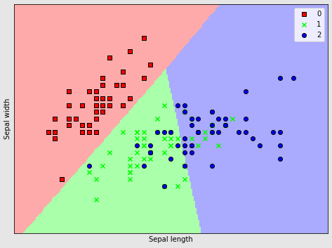
我想训练逻辑回归模型,然后创建一个以特定方式显示边界线的图。到目前为止我的工作import numpy as npimport matplotlib.pyplot as pltfrom sklearn.linear_model import LogisticRegressionfrom sklearn import datasetsfrom matplotlib.colors import ListedColormapcmap_light = ListedColormap(['#FFAAAA', '#AAFFAA', '#AAAAFF'])cmap_bold = ListedColormap(['#FF0000', '#00FF00', '#0000FF'])# import some data to play withiris = datasets.load_iris()X = iris.data[:, :2] # we only take the first two features.Y = iris.targetlogreg = LogisticRegression(C=1e5)# Create an instance of Logistic Regression Classifier and fit the data.logreg.fit(X, Y)# Plot the decision boundary. For that, we will assign a color to each# point in the mesh [x_min, x_max]x[y_min, y_max].x_min, x_max = X[:, 0].min() - .5, X[:, 0].max() + .5y_min, y_max = X[:, 1].min() - .5, X[:, 1].max() + .5h = .02 # step size in the meshxx, yy = np.meshgrid(np.arange(x_min, x_max, h), np.arange(y_min, y_max, h))Z = logreg.predict(np.c_[xx.ravel(), yy.ravel()])# Put the result into a color plotZ = Z.reshape(xx.shape)plt.figure(1, figsize=(4, 3))plt.pcolormesh(xx, yy, Z, cmap=cmap_light)# Plot also the training pointsplt.scatter(X[:, 0], X[:,1], c=Y, marker='x',edgecolors='k', cmap=cmap_bold)plt.xlabel('Sepal length'),plt.ylabel('Sepal width')plt.xlim(xx.min(), xx.max())plt.ylim(yy.min(), yy.max())plt.xticks(())plt.yticks(())plt.show()但是我发现它非常难以阅读。我想在左上角为每个分类和图例添加其他标记。就像下图所示:你知道我该如何改变吗?我玩过marker ='s', marker='x',但这些改变了散点图上的所有点,而不是一个特定的分类。
3 回答
烙印99
TA贡献1829条经验 获得超13个赞
由于您正在使用分类值进行绘图,因此您可以单独绘制每个类:
# Replace this
# plt.scatter(X[:, 0], X[:,1], c=Y, marker='x',edgecolors='k', cmap=cmap_bold)
# with this
markers = 'sxo'
for m,i in zip(markers,np.unique(Y)):
mask = Y==i
plt.scatter(X[mask, 0], X[mask,1], c=cmap_bold.colors[i],
marker=m,edgecolors='k', label=i)
plt.legend()
输出:
杨魅力
TA贡献1811条经验 获得超6个赞
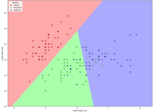
X我发现从&创建数据框Y,然后用 绘制数据点更容易seaborn.scatterplot。seaborn是 matplotlib 的高级 api如如何从 k-近邻预测中提取边界值中所示,数据框列可用于指定要拟合的所有数据以及 x 和 y 的最小值和最大值。
加载并设置数据
import numpy as np
import matplotlib.pyplot as plt # version 3.3.1
from sklearn.linear_model import LogisticRegression
from sklearn import datasets
from matplotlib.colors import ListedColormap
import seaborn # versuin 0.11.0
import pandas # version 1.1.3
cmap_light = ListedColormap(['#FFAAAA', '#AAFFAA', '#AAAAFF'])
cmap_bold = ListedColormap(['#FF0000', '#00FF00', '#0000FF'])
# seaborn.scatterplot palette parameter takes a list
palette = ['#FF0000', '#00FF00', '#0000FF']
# import some data to play with
iris = datasets.load_iris()
X = iris.data[:, :2] # we only take the first two features.
Y = iris.target
# add X & Y to dataframe
df = pd.DataFrame(X, columns=iris.feature_names[:2])
df['label'] = Y
# map the number values to the species name and add it to the dataframe
species_map = dict(zip(range(3), iris.target_names))
df['species'] = df.label.map(species_map)
logreg = LogisticRegression(C=1e5)
# Create an instance of Logistic Regression Classifier and fit the data.
logreg.fit(X, Y)
# Plot the decision boundary. For that, we will assign a color to each
# point in the mesh [x_min, x_max]x[y_min, y_max].
x_min, x_max = X[:, 0].min() - .5, X[:, 0].max() + .5
y_min, y_max = X[:, 1].min() - .5, X[:, 1].max() + .5
h = .02 # step size in the mesh
xx, yy = np.meshgrid(np.arange(x_min, x_max, h), np.arange(y_min, y_max, h))
Z = logreg.predict(np.c_[xx.ravel(), yy.ravel()])
# Put the result into a color plot
Z = Z.reshape(xx.shape)
绘制数据图
plt.figure(1, figsize=(8, 6))
plt.pcolormesh(xx, yy, Z, cmap=cmap_light, shading='auto')
# Plot also the training points
# add data points using seaborn
sns.scatterplot(data=df, x='sepal length (cm)', y='sepal width (cm)', hue='species',
style='species', edgecolor='k', alpha=0.5, palette=palette, s=70)
# change legend location
plt.legend(title='Species', loc=2)
plt.xlim(xx.min(), xx.max())
plt.ylim(yy.min(), yy.max())
# plt.xticks(())
# plt.yticks(())
plt.show()
alpha=0.5与 , 一起使用sns.scatterplot,以显示 和 的某些值'versicolor'重叠'virginica'。
如果species图例需要标签而不是名称,请更改hue='species'为hue='label'。
慕妹3242003
TA贡献1824条经验 获得超6个赞
您需要将单个调用更改plt.scatter为每个标记类型的一个调用,因为 matplotlib 不允许像颜色那样传递多个标记类型。
情节代码变成了类似的东西
# Put the result into a color plot
Z = Z.reshape(xx.shape)
plt.figure(1, figsize=(4, 3))
plt.pcolormesh(xx, yy, Z, cmap=cmap_light)
# Plot also the training points
X0 = X[Y==0]
X1 = X[Y==1]
X2 = X[Y==2]
Y0 = Y[Y==0]
Y1 = Y[Y==1]
Y2 = Y[Y==2]
plt.scatter(X0[:, 0], X0[:,1], marker='s',color="red")
plt.scatter(X1[:, 0], X1[:,1], marker='x',color="blue")
plt.scatter(X2[:, 0], X2[:,1], marker='o',color="green")
plt.xlabel('Sepal length'),
plt.ylabel('Sepal width')
plt.xlim(xx.min(), xx.max())
plt.ylim(yy.min(), yy.max())
plt.xticks(())
plt.yticks(())
plt.show()
您可以在其中单独设置每个类别的标记类型和颜色。您还可以为标记类型创建一个列表,为颜色创建另一个列表,并使用循环。
添加回答
举报
0/150
提交
取消