
1、图片圆角显示
例如(非常简单):
HTML:
<img class="lazyload" src="data:image/png;base64,iVBORw0KGgoAAAANSUhEUgAAAAEAAAABCAYAAAAfFcSJAAAAAXNSR0IArs4c6QAAAARnQU1BAACxjwv8YQUAAAAJcEhZcwAADsQAAA7EAZUrDhsAAAANSURBVBhXYzh8+PB/AAffA0nNPuCLAAAAAElFTkSuQmCC" data-original="mao.png" />
CSS:
img{
    border-radius: 10px;
}
如果图片只为圆角,这种方式确实没问题,但如果还要加上居中的效果,这种方式就有问题,下面会说明。
2、图片居中显示(铺满父容器且不变形)
效果图如下:
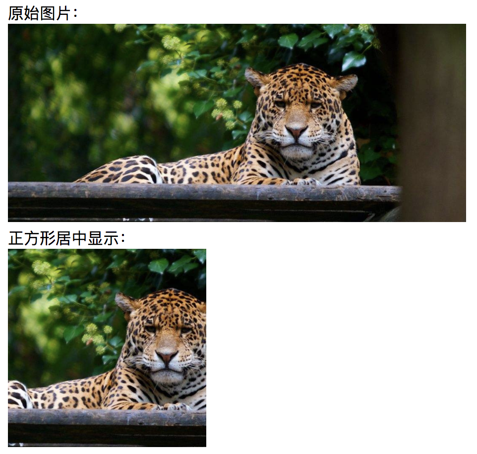
PS:为了实现上图居中的效果,单靠CSS是不行的,还需要JS处理。
例如:
HTML:
<div class="rd-box" style="width:200px;height:200px;overflow:hidden;"> <img class="lazyload" src="data:image/png;base64,iVBORw0KGgoAAAANSUhEUgAAAAEAAAABCAYAAAAfFcSJAAAAAXNSR0IArs4c6QAAAARnQU1BAACxjwv8YQUAAAAJcEhZcwAADsQAAA7EAZUrDhsAAAANSURBVBhXYzh8+PB/AAffA0nNPuCLAAAAAElFTkSuQmCC" data-original="mao.png" ="centerThisImg(this, 200, 200)"/></div>
CSS:

.rd-box{
    position: relative;
    display: inline-block;
    border-radius: 10px;
}.rd-box img{
    display: block;
    border-radius: 10px;
}
JS:
//图片自适应填充,并居中显示。function centerThisImg(el, maxWidth, maxHeight){    var $img = $(el),
        img = $img[0];    var imgHeight = img.naturalHeight,
        imgWidth = img.naturalWidth,
        finalWidth,
        finalHeight,
        tsffix = '';    var rm = maxWidth / maxHeight,
        r = imgWidth / imgHeight;    if(r < rm){
        finalWidth = maxWidth;
        finalHeight = maxWidth / r;
        tsffix = 'translateY(-' + (finalHeight - maxHeight) / 2 + 'px)';
    } else {
        finalHeight = maxHeight;
        finalWidth = maxHeight * r;
        tsffix = 'translateX(-' + (finalWidth - maxWidth) / 2 + 'px)';
    }
    $img.css({width: finalWidth, height: finalHeight, transform: tsffix});
}
PS:图片的长宽是不定的,为了让图片不变形的铺满父容器,需要重新计算图片长宽,并计算居中需要位移的距离。
从这一点就可以看到我说的问题,在CSS中我是加上圆角的样式,但实际上却没有圆角效果。
这是因为当我们把图片居中(不变形)时,我们看到的现在居中的四角,其实是图片中间部位,真正图片的四角早在不可见的地方。
所以,想让居中的图片再有圆角效果,得另外想办法。
3、遮挡法模拟出圆角
我们可以用四个内凹三角形,遮挡在图片四角上(居中后的),让人误以为是图片圆角了。
例如(结合居中的完整代码):


<!DOCTYPE html><html><head lang="en">
    <meta charset="UTF-8">
    <title>正方形居中显示并且圆角</title>
    <style>
        img{
            height: 200px;
        }
        label{
            display: block;
        }
        .rd-box2{
            position: relative;
            display: inline-block;
        }
        .rd-box2 img{
            display: block;
        }
        .rd-box2 .left-top,
        .rd-box2 .right-top,
        .rd-box2 .left-bottom,
        .rd-box2 .right-bottom{
            position: absolute;
            width: 10px;
            height: 10px;
            z-index: 1;
        }
        .rd-box2 .left-top{
            top: 0;
            left: 0;
            background: radial-gradient(20px at right bottom,transparent 50%,#F4F4F4 50%);
        }
        .rd-box2 .right-top{
            top: 0;
            right: 0;
            background: radial-gradient(20px at left bottom,transparent 50%,#F4F4F4 50%);
        }
        .rd-box2 .left-bottom{
            bottom: 0;
            left: 0;
            background: radial-gradient(20px at right top,transparent 50%,#F4F4F4 50%);
        }
        .rd-box2 .right-bottom{
            bottom: 0;
            right: 0;
            background: radial-gradient(20px at left top,transparent 50%,#F4F4F4 50%);
        }
    </style>
    <script class="lazyload" src="data:image/png;base64,iVBORw0KGgoAAAANSUhEUgAAAAEAAAABCAYAAAAfFcSJAAAAAXNSR0IArs4c6QAAAARnQU1BAACxjwv8YQUAAAAJcEhZcwAADsQAAA7EAZUrDhsAAAANSURBVBhXYzh8+PB/AAffA0nNPuCLAAAAAElFTkSuQmCC" data-original="https://cdn.bootcss.com/jquery/3.3.1/jquery.js"></script>
    <script>
        //图片自适应填充,并居中显示。
        function centerThisImg(el, maxWidth, maxHeight){            var $img = $(el),
                img = $img[0];            var imgHeight = img.naturalHeight,
                imgWidth = img.naturalWidth,
                finalWidth,
                finalHeight,
                tsffix = '';            var rm = maxWidth / maxHeight,
                r = imgWidth / imgHeight;            if(r < rm){
                finalWidth = maxWidth;
                finalHeight = maxWidth / r;
                tsffix = 'translateY(-' + (finalHeight - maxHeight) / 2 + 'px)';
            } else {
                finalHeight = maxHeight;
                finalWidth = maxHeight * r;
                tsffix = 'translateX(-' + (finalWidth - maxWidth) / 2 + 'px)';
            }
            $img.css({width: finalWidth, height: finalHeight, transform: tsffix});
        }    </script></head><body>
    <label>正方形居中显示并且圆角:</label>
    <div class="rd-box2" style="width:200px;height:200px;overflow:hidden;">
        <i class="left-top"></i>
        <i class="right-top"></i>
        <i class="left-bottom"></i>
        <i class="right-bottom"></i>
        <img class="lazyload" src="data:image/png;base64,iVBORw0KGgoAAAANSUhEUgAAAAEAAAABCAYAAAAfFcSJAAAAAXNSR0IArs4c6QAAAARnQU1BAACxjwv8YQUAAAAJcEhZcwAADsQAAA7EAZUrDhsAAAANSURBVBhXYzh8+PB/AAffA0nNPuCLAAAAAElFTkSuQmCC" data-original="mao.png" ="centerThisImg(this, 200, 200)"/>
    </div></body></html>
View Code
效果图如下:
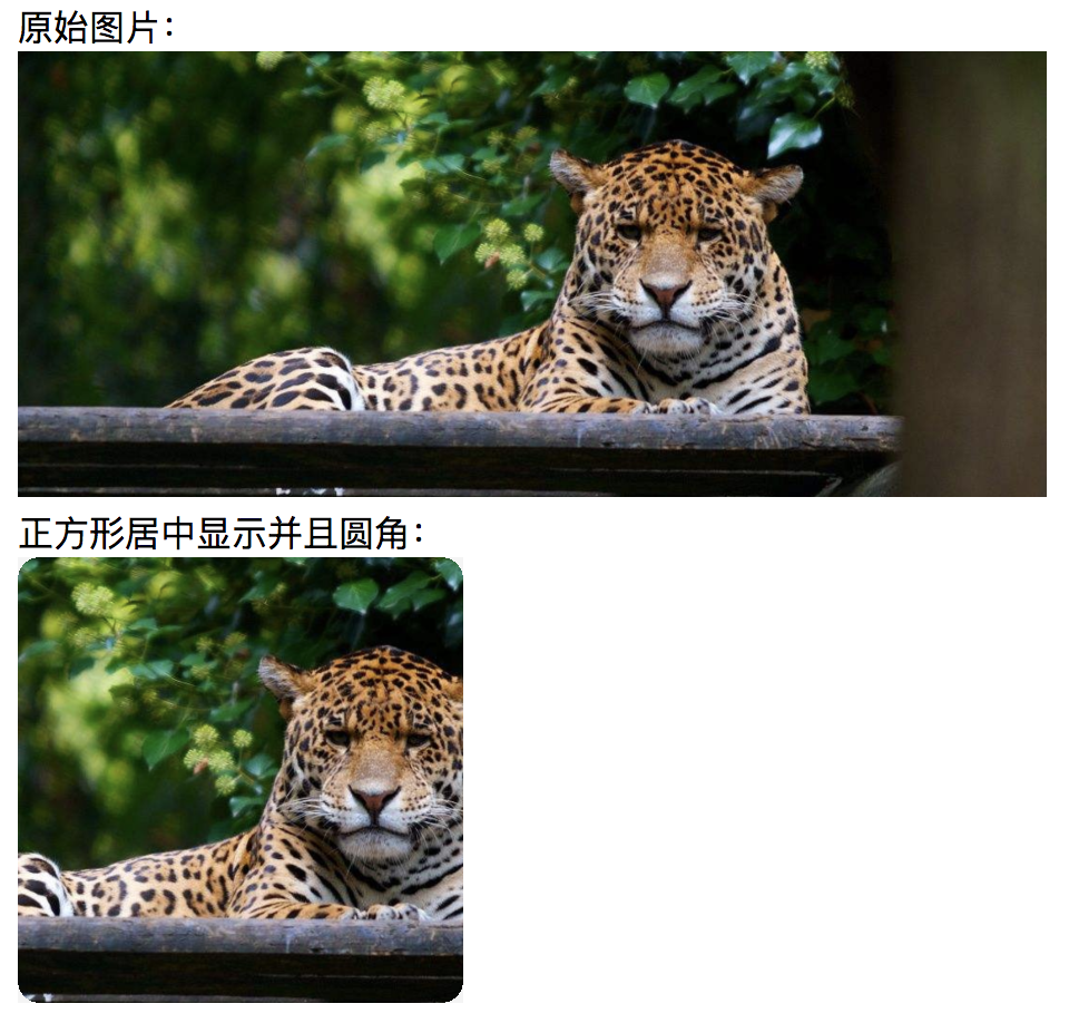
总结:
其实,如果图片能够继承父元素的圆角效果,那么就不需要这么麻烦,但是现实是图片元素四个角会超出父元素(设了圆角)。
我查阅了资料,有人说这种行为是浏览器默认特性,就是这样效果(https://stackoverflow.com/questions/8582176/should-border-radius-clip-the-content)。
我实际的测试也是这样,不过,就不深究了。
本文为原创文章,转载请保留原出处,方便溯源,如有错误地方,谢谢指正。
本文地址 :http://www.cnblogs.com/lovesong/p/10015829.html
点击查看更多内容
为 TA 点赞
评论
共同学习,写下你的评论
评论加载中...
作者其他优质文章
正在加载中


感谢您的支持,我会继续努力的~
扫码打赏,你说多少就多少
赞赏金额会直接到老师账户
支付方式
打开微信扫一扫,即可进行扫码打赏哦