
---恢复内容开始---
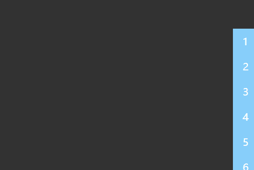
一、效果
二、知识点
1、line-height:1;/*清除默认高度*/
2、font-weight: bold;/*字体加粗*/
3、transition-delay: 0.1s;延迟动画过渡
4、:nth-child(1)按下标选取集合元素的子元素
5、<span>一般用于没有实际意义的文本,修饰文本,比如标号
6、var oLi1=document.querySelectorAll(".wrap li");/*元素获取*/
var oLi=document.getElementsByTagName("li");/*标签获取*/
7、forEach()对数组每个元素都执行一次提供的函数
三、源码
<!doctype html><html>
 <head>
    <meta charset="UTF-8">
    <meta name="Keywords" content="关键词">
    <meta name="Description"  content="描述">
    <title>波浪导航条</title>
    <style>
        body{
            margin: 0;
            padding: 0;
            height: 2000px;
            line-height:1;/*清除默认高度*/
        }
        .wrap{
            position: fixed;
            top: 50px;
            right: 0;
            width: 100px;
            height: 400px;

        }
        .wrap ol{
            list-style: none;
            margin: 0;
            padding: 0;

            color: #fff;
        }
        .wrap:hover li{
            left: 0;
        }
        .wrap li{
            position: relative;
            left:70px;
            width: 100%;
            height: 30px;
            border-bottom: 1px solid #fff;
            line-height: 30px;
            color: black;
            transition: 1s;
        }
        /*注释原因用js来写特效,简单有维护性*/
        /* .wrap li:nth-child(1){:nth-child(1)按下标选取集合元素的子元素
            transition-delay: 0;延迟动画过渡
        }
               .wrap li:nth-child(2){:nth-child(1)按下标选取集合元素的子元素
            transition-delay: 0.2s;延迟动画过渡
        }
        .wrap li:nth-child(3){
            transition-delay: 0.3s;
        }
        .wrap li:nth-child(4){
            transition-delay: 0.4s;
        }
        .wrap li:nth-child(5){
            transition-delay: 0.5s;
        }
        .wrap li:nth-child(6){
            transition-delay: 0.6s;
        }
        .wrap li:nth-child(7){
            transition-delay: 0.7s;
        }
        .wrap li:nth-child(8){
            transition-delay: 0.8s;
        }
        .wrap li:nth-child(9){
            transition-delay: 0.9s;
        }
        .wrap li:nth-child(10){
            transition-delay: 1s;
        } */
        span{
            display: inline-block;
            width: 30px;
            height: 30px;
            background-color: #0099ff;
            text-align: center;
            font-weight: bold;/*字体加粗*/
            color: #fff;
        }

    </style>
 </head>
 <body>
    <div class="wrap">
        <ol><!-- 有序列表 -->
            <li><span>1</span>html</li><!-- <span>一般用于没有实际意义的文本,修饰文本,比如标号 -->
            <li><span>2</span>html</li>
            <li><span>3</span>html</li>
            <li><span>4</span>html</li>
            <li><span>5</span>html</li>
            <li><span>6</span>html</li>
            <li><span>7</span>html</li>
            <li><span>8</span>html</li>
            <li><span>9</span>html</li>
            <li><span>10</span>html</li>
        </ol>
    </div>
    <script>

        var oLi1=document.querySelectorAll(".wrap li");/*元素获取*/

        var oLi=document.getElementsByTagName("li");/*标签获取*/

        /*forEach()对数组每个元素都执行一次提供的函数*/
        [].forEach.call(oLi,function(e1,index){
            e1.style.transitionDelay=index*0.08+"s"})    </script>
 </body></html>
---恢复内容结束---
作者:king-blue
原文链接:https://www.cnblogs.com/Liuxingtao/p/10319415.html
点击查看更多内容
为 TA 点赞
评论
共同学习,写下你的评论
评论加载中...
作者其他优质文章
正在加载中


感谢您的支持,我会继续努力的~
扫码打赏,你说多少就多少
赞赏金额会直接到老师账户
支付方式
打开微信扫一扫,即可进行扫码打赏哦