为了账号安全,请及时绑定邮箱和手机立即绑定

使用JS+Three.js+Echart开发商场室内地图客流信息统计功能(上)

标签:
JavaScript

 现在的商场管理者在管理商场的同时面临着一些无法避免的问题比如:人员监管不到位、效率低下、商场同质化严重,人流量少等。发现了这些问题作为开发人员的我们怎能视而不见,我们的责任就是发现问题解决问题,提供更好更智能的服务。因此就此问题我们想出了相应的解决办法,使用JS+Three.js+Echart开发了一个功能界面,为商场管理者提供更加高效的管理方法。

  通过商场管理系统的相应界面,商场管理者可实时获取商场的人流数据、人流密度的热力分布、可实时查看商场各处的视频监控信息、安保人员的实时位置信息及运动轨迹。针对突发状况可以即时调度、快速处理。还可以依据大数据分析周边业态情况,为制定运营策略提供数据支持等。

  就以上的市场实际情况需求,开始了我的功能开发之旅。

  我使用ESMap的地图编辑器编辑好商场地图后,开始布局规划解决问题

开发流程如下:

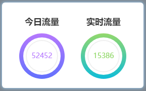
  首先,实现一个商场客流量信息的饼状统计表,还有各个时间点的流量趋势和人群密度的线性图表。再实现一个控制面板,可以通过控制面板根据地图的热力图查看商场各个位置客流量以及各个位置的实时视频等,情况一目了然;最后做一个可以搜索店铺客流量及营业额情况的搜索框。

1.方便开发,先使用模拟数据创建图表,投入使用后自行接入后台数据即可。

(1)使用Echart创建统计客流量的饼状图:

复制代码

function circleSet() {
        myChart1 = echarts.init(document.getElementById('ec1'));
        myChart2 = echarts.init(document.getElementById('ec2'));    
        var color= ['#b679fe', '#6271fd','#94d96c', '#0fbdd9','#f0f0f0'];        var dataStyle = {
            normal: {
                label: {
                    show: false
                },
                labelLine: {
                    show: false
                },
                shadowBlur: 40,
                borderWidth: 10,
                shadowColor: 'rgba(0, 0, 0, 0)' //边框阴影
            }
        };        //第一个饼状图
        var optionCircleA = {
            backgroundColor: '#fff',
            title: {
                text: '52452',
                x: 'center',
                y: 'center',
                textStyle: {
                    fontWeight: 'normal',
                    fontSize: 14,
                    color: "#b679fe",
                }
            },
            series: [{
                    name: 'Line 1',
                    type: 'pie',
                    clockWise: false,
                    radius: [37, 45],
                    center:['50%','50%'],
                    itemStyle: dataStyle,
                    hoverAnimation: false,
                    startAngle: 90,
                    label:{
                        borderRadius:'10',
                    },
                    data: [{
                            value: 54.6,
                            name: '外',
                            itemStyle: {
                                normal: {
                                    color: new echarts.graphic.LinearGradient(0, 0, 0, 1, [{
                                        offset: 0,
                                        color:color[0]
                                    }, {
                                        offset: 1,
                                        color: color[1]
                                    }])
                                }
                            }
                        },
                        {
                            value: 0,
                            name: '',
                            tooltip: {
                                show: false
                            },
                        },
                    ]
                },
                {
                    name: 'Line 2',
                    type: 'pie',
                    clockWise: false,
                    radius: [30, 32],
                    center:['50%','50%'],
                    itemStyle: dataStyle,
                    hoverAnimation: false,
                    startAngle: 90,
                    data: [{
                            value: 56.7,
                            name: '内',
                            itemStyle: {
                                normal: {
                                    color: new echarts.graphic.LinearGradient(0, 0, 0, 1, [{
                                        offset: 0,
                                        color: color[4]
                                    }, {
                                        offset: 1,
                                        color: color[4]
                                    }])
                                }
                            }
                        },
                        {
                            value: 0,
                            name: '',
                            tooltip: {
                                show: false
                            },
                        },
                    ]
                },    
            ]
        };    //第二个饼状图
        var optionCircleB = {
            backgroundColor: '#fff',
            title: {
                text: '15386',
                x: 'center',
                y: 'center',
                textStyle: {
                    fontWeight: 'normal',
                    fontSize: 14,
                    color: "#94d96c",
                }
            },       
            series: [{
                    name: 'Line 1',
                    type: 'pie',
                    clockWise: false,
                    radius: [37, 45],
                    center:['50%','50%'],
                    itemStyle: dataStyle,
                    hoverAnimation: false,
                    startAngle: 90,
                    label:{
                        borderRadius:'10',
                    },
                    data: [{
                            value: 54.6,
                            name: '外',
                            itemStyle: {
                                normal: {
                                    color: new echarts.graphic.LinearGradient(0, 0, 0, 1, [{
                                        offset: 0,
                                        color:color[2]
                                    }, {
                                        offset: 1,
                                        color: color[3]
                                    }])
                                }
                            }
                        },
                        {
                            value: 0,
                            name: '',
                            tooltip: {
                                show: false
                            },
                        },
                    ]
                },
                {
                    name: 'Line 2',
                    type: 'pie',
                    clockWise: false,
                    radius: [30, 32],
                    center:['50%','50%'],
                    itemStyle: dataStyle,
                    hoverAnimation: false,
                    startAngle: 90,
                    data: [{
                            value: 56.7,
                            name: '内',
                            itemStyle: {
                                normal: {
                                    color: new echarts.graphic.LinearGradient(0, 0, 0, 1, [{
                                        offset: 0,
                                        color: color[4]
                                    }, {
                                        offset: 1,
                                        color: color[4]
                                    }])
                                }
                            }
                        },
                        {
                            value: 0,
                            name: '',
                            tooltip: {
                                show: false
                            },
                        },
                    ]
                },
            ]
        };
        myChart1.setOption(optionCircleA);
        myChart2.setOption(optionCircleB);
    }

复制代码

效果如下图:


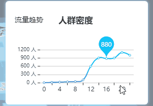
(2)使用echart创建人群密度线性图表,封装在函数lineSetA()内:

复制代码

    //人群密度线性图表
    function lineSetA() {
        myChart3 = echarts.init(document.getElementById('ec3'));        var colors = ['#12c3f8', '#4384d7'];
        optionLineA = {
            color: colors,
            visualMap: [{
                show: false,
                type: 'continuous',
                seriesIndex: 0,            
                min: 0,
                max: 600,
                borderWidth: 3,
                color: colors,
            }],
            xAxis: {
                type: 'category',
                data: ['0', '2', '4', '6', '8', '10', '12', '14', '16', '18', '20', '22'],
                show: true,
                position: {
                  bottom: 10, 
                  show: false,
                },
                onZero: false,
                axisLine: {
                    lineStyle: {
                        width: 0,                    
                    }
                }
            },
            yAxis: {
                type: 'value',
                axisLabel: {
                    formatter: '{value} 人',
                    fontSize: 10,
                },
                axisLine: {
                    lineStyle: {
                        width: 0,
                    }
                },
                minInterval: 300,
            },
            grid: [{
                top: '40',
                bottom: '25',
                left: '50',
                right: '10'
            }],
            series: [{
                data: [ 0, 10, 20, 30, 40, 100, 600, 900, 880, 900, 1100, 1000],
                type: 'line',
                smooth: true,
                markPoint: {
                    data: [
                        {
                            name: '880',
                            coord: ['16','880'],
                            value: '880',
                    ],
                    label: {
                        show: true,                       
                    },
                }
            }]
        };
        myChart3.setOption(optionLineA);
    }

复制代码

创建流量趋势线性图表,封装在函数lineSetB()内:

复制代码

//流量趋势线性图表
    function lineSetB() {
        myChart4 = echarts.init(document.getElementById('ec3'));        var colors = ['#12c3f8', '#4384d7'];        var optionLineB = {
            color: colors,
            visualMap: [{
                show: false,
                type: 'continuous',
                seriesIndex: 0,              
                min: 0,
                max: 600,
                borderWidth: 3,
                color: colors, 
            }],
            xAxis: {
                type: 'category',
                data: ['0', '2', '4', '6', '8', '10', '12', '14', '16', '18', '20', '22'],
                show: true,
                position: {
                  bottom: 10, 
                  show: false,
                },
                onZero: false,
                axisLine: {
                    lineStyle: {
                        width: 0,                      
                    }
                }
            },
            yAxis: {
                type: 'value',
                axisLabel: {
                    formatter: '{value} 人/平方米',
                    fontSize: 10,
                },
                axisLine: {
                    lineStyle: {
                        width: 0,
                    }
                },
                minInterval: 0.5,
            },
            grid: [{
                top: '40',
                bottom: '25',
                left: '70',
                right: '10'
            }],
            series: [{
                data: [ 0, 1, 2, 3, 4, 3, 2, 3, 3.5, 2, 1, 3],
                type: 'line',
                smooth: true,
                markPoint: {
                    data: [
                        {
                            name: '4',
                            coord: ['14','3'],
                            value: '4',
                        }
                    ],
                    label: {
                        show: true,
                    },
                }
            }]
        };
        myChart4.setOption(optionLineB);
    }

复制代码

切换线性图表数据显示实现:

复制代码

    //切换线性图表数据显示
    $(".list-b .title-box .t-a").click(function() {//点击流量趋势
        $(".list-b .title-box .t-b").removeClass('active');//移除当前样式
        $(this).addClass('active');//给点击添加新样式        resizeLineA();
    })
    $(".list-b .title-box .t-b").click(function() {//点击人群密度
        $(".list-b .title-box .t-a").removeClass('active');
        $(this).addClass('active');
        resizeLineA(1);
    })

复制代码

更换装图表的盒子(div)和线性图表信息:

复制代码

    function resizeLineA(n) {
        $(".line-cen").remove();//先移除原有的盒子
        var aa = document.createElement('div');//在创建一个新盒子装图表
        aa.id = 'ec3'
        aa.className = 'line-cen'
        $(".line-box").append(aa)        if (n == 1) {
            lineSetA();//显示人群密度图表
        } else {
            lineSetB();//显示流量趋势图表        }
    }

复制代码

效果如下图:


除此之外,还可以根据实际情况再添加相应的图表。
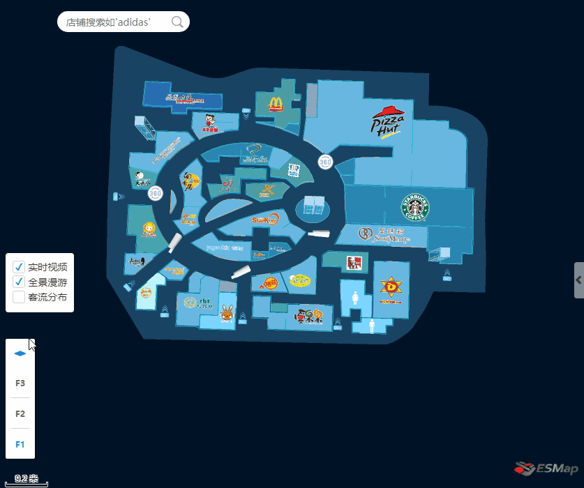
2.check控制面板

  开发一个控制面板,对管理者来说可以更好的全局掌握控制商场情况我在控制面板上加了实时视频,全景漫游和客流分布,下面就这三个功能的实现过程做下介绍。

(1)客流分布热力图功能,以下载入的是模拟数据,投入使用后可直接载入实际数据,根据数据体现热力图的情况。

复制代码

//添加热力图,根据json文件function addHeatMap() {    // 创建热力图对象
    if (!heatmapInstance)
        heatmapInstance = esmap.ESHeatMap.create(map, {
            radius: 24, //热点半径
            opacity: .5, //热力图透明度
            max: 35, //热力点value的最大值
            maxSize: 2048,
            gradient: {//渐变色值,可配
                0.35: "green",                0.5: "yellow",                0.7: "orange",                0.85: "red"
            }
    $.getJSON("data/003.json", function(data) { //数据载入
        var datas = data.datas;        var len = datas.length;
        exec(datas[0]["data"][0]["fnum"], datas[0]["data"][0]["points"]);//绘制热力图
        var index = 1;
        timer1 = setInterval(function () {            if (index > 1) index = 0;            for (var el of datas[0]["data"][0]["points"]) {                switch (index) {                    case 0: el.value = el.value - 1;                    break;                    case 1: el.value = el.value + 1;                    break;
                }
            }
            exec(datas[0]["data"][0]["fnum"], datas[0]["data"][0]["points"]);
            index++;
        }, 2000)        return;
    });    function exec(fnum, points) {//绘制热力图函数
        var floorLayer = map.getFloor(fnum);//获取应用楼层
        heatmapInstance.clearPoints();//清除热力点
        heatmapInstance.addPoints(points);//热力点添加到热力图
        //热力图应用到哪一楼层        floorLayer.applyHeatMap(heatmapInstance);
    }
}

复制代码

热力图如下:

使用JS+Three.js+Echart开发商场室内地图客流信息统计功能(下):https://www.imooc.com/article/282068  

作者:         室内三维地图

原文出处:https://www.cnblogs.com/esmap/p/10457072.html  

点击查看更多内容
TA 点赞

若觉得本文不错,就分享一下吧!

评论

作者其他优质文章

正在加载中
  • 推荐
  • 评论
  • 收藏
  • 共同学习,写下你的评论
感谢您的支持,我会继续努力的~
扫码打赏,你说多少就多少
赞赏金额会直接到老师账户
支付方式
打开微信扫一扫,即可进行扫码打赏哦
今天注册有机会得

100积分直接送

付费专栏免费学

大额优惠券免费领

立即参与 放弃机会
意见反馈 帮助中心 APP下载
官方微信

举报

0/150
提交
取消