
模板方法模式
模板方法模式
将不变的部分封装在父类中,而可变的部分则通过子类继承并进行扩展,就叫做模板方法模式。
使用场景
我们在使用UI框架的时候,可能会注意到:框架中的很多组件,比如按钮、提示框等,样式比较统一:
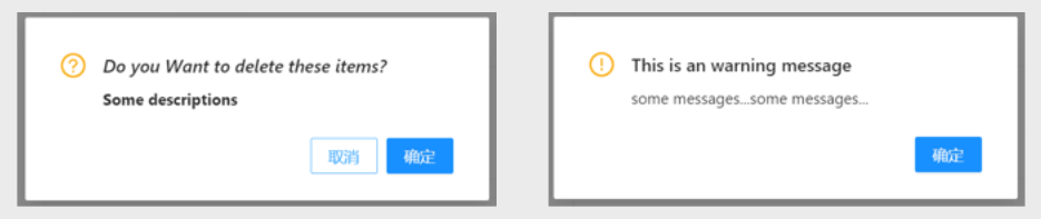
如果现在让我们去制作截图中的两种提示框,或者更多类似的提示框,我们完全可以抽象出一个最基础、最简单的一个提示框, 而其他的只要在此基础上增加一些功能即可。
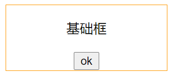
首先,我们写一个最基础的提示框,它应该包括提示内容和一个确认按钮:
例子:
<style>
  .alert_style {
    width: 33%;
    border: 1px solid rgb(255, 152, 0);
    text-align: center;
    margin: 0 auto;
  }
</style>

// 创建基本提示框
let Alert = function (data) {
  // 创建提示框的容器
  this.containerNode = document.createElement('div');
  this.containerNode.className = 'alert_style';

  // 创建提示内容的节点与文本
  this.contentNode = document.createElement('p');
  this.contentNode.innerHTML = data.content || '';

  // 创建确认按钮的节点、文本与回调
  this.confireBtnNode = document.createElement('button');
  this.confireBtnNode.innerHTML = data.confireBtnTxt || '确认';
  this.confireCallBack = data.confireCallBack || function () {};
};

// 创建基本方法
Alert.prototype = {
  // 初始化提示框
  init() {
    this.containerNode.appendChild(this.contentNode);
    this.containerNode.appendChild(this.confireBtnNode);
    this.confireBtnNode.onclick = () => {
      this.confireCallBack();
      this.hide();
    };
    document.body.appendChild(this.containerNode);
    this.hide();
  },

  // 隐藏提示框
  hide() {
    this.containerNode.style.display = 'none';
  },

  // 显示提示框
  show() {
    this.containerNode.style.display = 'block';
  },
};

// 测试基础提示框
let panel = new Alert({
  content: '基础框',
  confireBtnTxt: 'ok',
  confireCallBack() {
    alert('true');
  },
});
panel.init();
panel.show();
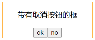
接下来,如果我们想创建一个带有取消按钮的提示框,那么在此基础上,只需要进行拓展即可。
例子:
let CancelAlert = function (data) {
  // 继承基本提示框
  Alert.call(this, data);

  // 创建取消按钮的节点、文本与回调
  this.cancelBtnNode = document.createElement('button');
  this.cancelBtnNode.innerHTML = data.cancelBtnTxt || '取消';
  this.cancelCallBack = data.cancelCallBack || function () {};
};

// 继承基本提示框的方法
CancelAlert.prototype = Object.create(Alert.prototype);

// 重写基本提示框的init方法
CancelAlert.prototype.init = function () {
  Alert.prototype.init.call(this);
  this.containerNode.appendChild(this.cancelBtnNode);
  this.cancelBtnNode.onclick = () => {
    this.cancelCallBack();
    this.hide();
  };
};

// 测试带有取消按钮的提示框
let panel = new CancelAlert({
  content: '带有取消按钮的框',
  confireBtnTxt: 'ok',
  cancelBtnTxt: 'no',
  confireCallBack() {
    alert('true');
  },
  cancelCallBack() {
    alert('false');
  },
});
panel.init();
panel.show();
如有错误,欢迎指正,本人不胜感激。
点击查看更多内容
2人点赞
评论
共同学习,写下你的评论
评论加载中...
作者其他优质文章
正在加载中


感谢您的支持,我会继续努力的~
扫码打赏,你说多少就多少
赞赏金额会直接到老师账户
支付方式
打开微信扫一扫,即可进行扫码打赏哦