
小菜之前尝试过 **Flutter** 自带的 [**DropdownButton**]下拉框,简单方便;但仅单纯的原生效果不足以满足各类个性化设计;于是小菜以 **DropdownButton** 为基础,调整部分源码,扩展为 **ACEDropdownButton** 自定义下拉框组件;
-
添加 backgroundColor 设置下拉框背景色;
-
添加 menuRadius 设置下拉框边框效果;
-
添加 isChecked 设置下拉框中默认选中状态及 iconChecked 选中图标;
-
下拉框在展示时不会遮挡 DropdownButton 按钮,默认在按钮顶部或底部展示;
-
下拉框展示效果调整为默认由上而下;
对于 DropdownButton 整体的功能是非常完整的,包括路由管理,已经动画效果等;小菜仅站在巨人的肩膀上进行一点小扩展,学习源码真的对我们自己的编码很有帮助;

DropdownButton 源码
  **DropdownButton** 源码整合在一个文件中,文件中有很多私有类,不会影响其它组件;

  以小菜的理解,整个下拉框包括三个核心组件,分别是 **DropdownButton**、**_DropdownMenu** 和 **_DropdownRoute**;
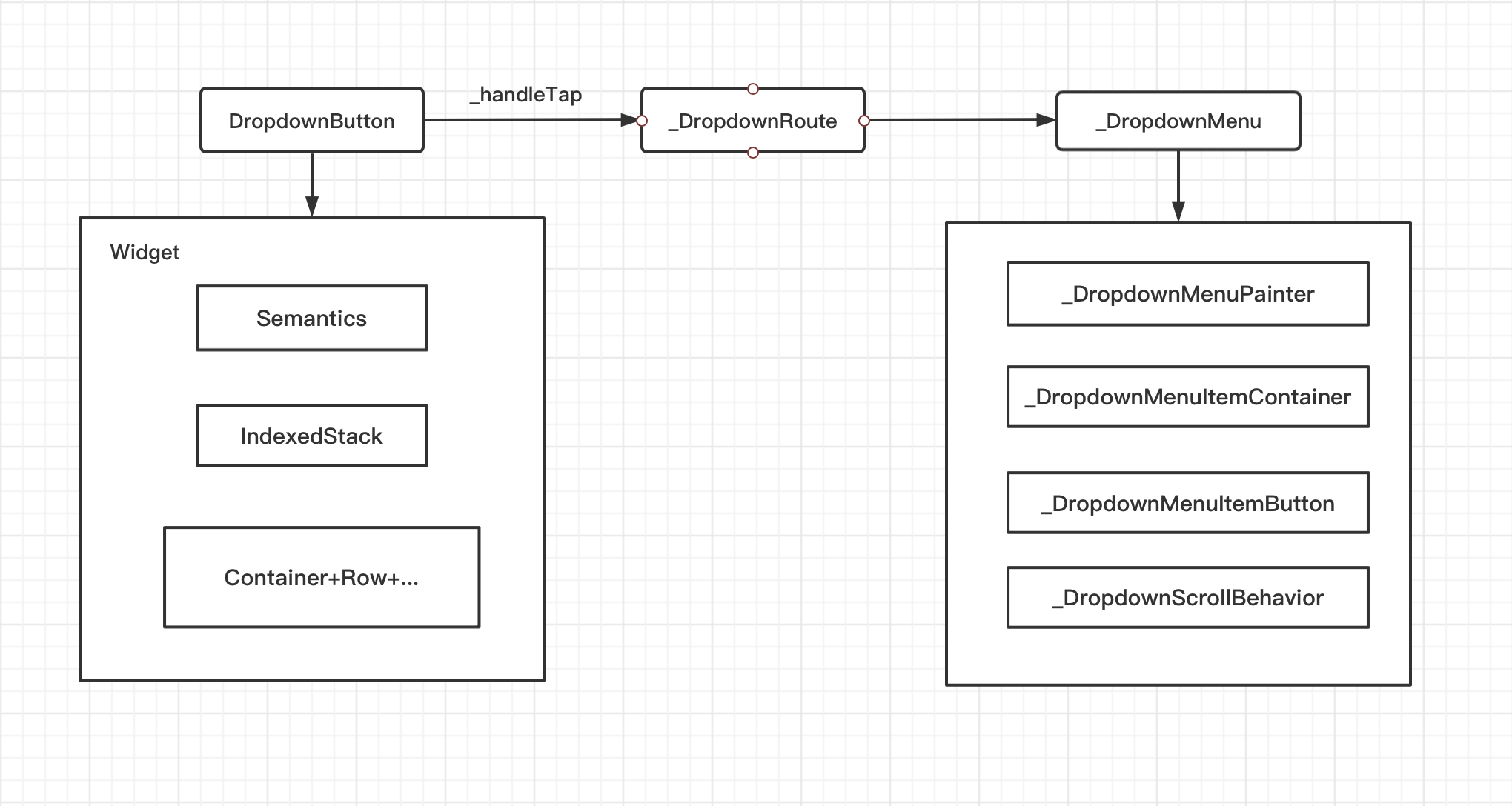
DropdownButton 是开发人员最直接面对的 StatefulWidget 有状态的组件,包含众多属性,基本框架是一个方便于视力障碍人员的 Semantics 组件,而其核心组件是一个层级遮罩 IndexedStack;其中在进行背景图标等各种样式绘制;
Widget innerItemsWidget;
if (items.isEmpty) {
  innerItemsWidget = Container();
} else {
  innerItemsWidget = IndexedStack(
      index: index, alignment: AlignmentDirectional.centerStart,
      children: widget.isDense ? items : items.map((Widget item) {
              return widget.itemHeight != null ? SizedBox(height: widget.itemHeight, child: item) : Column(mainAxisSize: MainAxisSize.min, children: [item]);
            }).toList());
}
  在 **DropdownButton** 点击 **_handleTap()** 操作中,主要通过 **_DropdownRoute** 来完成的,**_DropdownRoute** 是一个 **PopupRoute** 路由;小菜认为最核心的是 **getMenuLimits** 对于下拉框的尺寸位置,各子 **item** 位置等一系列位置计算;在这里可以确定下拉框展示的起始位置以及与屏幕两端距离判断,指定具体的约束条件;**DropdownButton** 同时还起到了衔接 **_DropdownMenu** 展示作用;

  在 **_DropdownMenuRouteLayout** 中还有一点需要注意,通过计算 **Menu** 最大高度与屏幕差距,设置 **Menu** 最大高度比屏幕高度最少差一个 **item** 容器空间,用来用户点击时关闭下拉框;
_MenuLimits getMenuLimits(Rect buttonRect, double availableHeight, int index) {
  final double maxMenuHeight = availableHeight - 2.0 * _kMenuItemHeight;
  final double buttonTop = buttonRect.top;
  final double buttonBottom = math.min(buttonRect.bottom, availableHeight);
  final double selectedItemOffset = getItemOffset(index);
  final double topLimit = math.min(_kMenuItemHeight, buttonTop);
  final double bottomLimit = math.max(availableHeight - _kMenuItemHeight, buttonBottom);
  double menuTop = (buttonTop - selectedItemOffset) - (itemHeights[selectedIndex] - buttonRect.height) / 2.0;
  double preferredMenuHeight = kMaterialListPadding.vertical;
  if (items.isNotEmpty)  preferredMenuHeight += itemHeights.reduce((double total, double height) => total + height);
  final double menuHeight = math.min(maxMenuHeight, preferredMenuHeight);
  double menuBottom = menuTop + menuHeight;
  if (menuTop < topLimit) menuTop = math.min(buttonTop, topLimit);

  if (menuBottom > bottomLimit) {
    menuBottom = math.max(buttonBottom, bottomLimit);
    menuTop = menuBottom - menuHeight;
  }

  final double scrollOffset = preferredMenuHeight <= maxMenuHeight ? 0 : math.max(0.0, selectedItemOffset - (buttonTop - menuTop));
  return _MenuLimits(menuTop, menuBottom, menuHeight, scrollOffset);
}
  **_DropdownMenu** 也是一个 **StatefulWidget** 有状态组件,在下拉框展示的同时设置了一系列的动画,展示动画分为三个阶段,**[0-0.25s]** 先淡入选中 **item** 所在的矩形容器,**[0.25-0.5s]** 以选中 **item** 为中心向两端扩容直到容纳所有的 **item**,**[0.5-1.0s]** 由上而下淡入展示 **item** 内容;

  **_DropdownMenu** 通过 **_DropdownMenuPainter** 和 **_DropdownMenuItemContainer** 分别对下拉框以及子 **item** 的绘制,小菜主要是在此进行下拉框样式的扩展;
CustomPaint(
  painter: _DropdownMenuPainter(
      color: route.backgroundColor ?? Theme.of(context).canvasColor,
      menuRadius: route.menuRadius,
      elevation: route.elevation,
      selectedIndex: route.selectedIndex,
      resize: _resize,
      getSelectedItemOffset: () => route.getItemOffset(route.selectedIndex))
源码有太多需要学习的地方,小菜强烈建议多阅读源码;
ACEDropdownButton 扩展
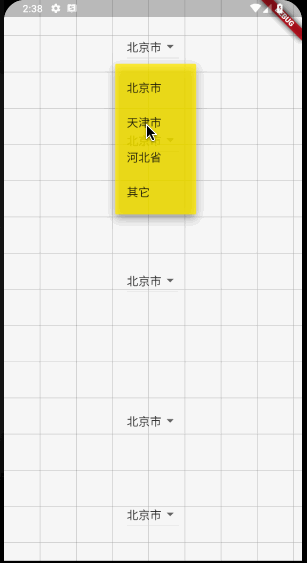
1. backgroundColor 下拉框背景色
  根据 **DropdownButton** 源码可得,下拉框的背景色可以通过 **_DropdownMenu** 中绘制 **_DropdownMenuPainter** 时处理,默认的背景色为 **Theme.of(context).canvasColor**;当然我们也可以手动设置主题中的 **canvasColor** 来更新下拉框背景色;

  小菜添加 **backgroundColor** 属性,并通过 **ACEDropdownButton -> _DropdownRoute -> _DropdownMenu** 中转设置下拉框背景色;
class _DropdownMenuState extends State<_DropdownMenu> {
    ...
    @override
    Widget build(BuildContext context) {
    return FadeTransition(
        opacity: _fadeOpacity,
        child: CustomPaint(
            painter: _DropdownMenuPainter(
                color: route.backgroundColor ?? Theme.of(context).canvasColor,
                elevation: route.elevation,
                selectedIndex: route.selectedIndex,
                resize: _resize,
                getSelectedItemOffset: () => route.getItemOffset(route.selectedIndex)),
        ...
    }
    ...
}

return ACEDropdownButton(
    value: dropdownValue,
    backgroundColor: Colors.green.withOpacity(0.8),
    onChanged: (String newValue) => setState(() => dropdownValue = newValue),
    items: ['北京市', '天津市', '河北省', '其它'].map>((String value) {
      return ACEDropdownMenuItem(value: value, child: Text(value));
    }).toList());
2. menuRadius 下拉框边框效果
下拉框的边框需要在 **_DropdownMenuPainter** 中绘制,跟 **backgroundColor** 相同,设置 **menuRadius** 下拉框属性,并通过 **_DropdownRoute** 中转一下,其中需要在 **_DropdownMenuPainter** 中添加 **menuRadius**;
class _DropdownMenuPainter extends CustomPainter {
  _DropdownMenuPainter(
      {this.color, this.elevation,
      this.selectedIndex, this.resize,
      this.getSelectedItemOffset,
      this.menuRadius})
      : _painter = BoxDecoration(
          color: color,
          borderRadius: menuRadius ?? BorderRadius.circular(2.0),
          boxShadow: kElevationToShadow[elevation],
        ).createBoxPainter(),
        super(repaint: resize);
}

return ACEDropdownButton(
    value: dropdownValue,
    backgroundColor: Colors.green.withOpacity(0.8),
    menuRadius: const BorderRadius.all(Radius.circular(15.0)),
    onChanged: (String newValue) => setState(() => dropdownValue = newValue),
    items: ['北京市', '天津市', '河北省', '其它'].map>((String value) {
      return ACEDropdownMenuItem(value: value, child: Text(value));
    }).toList());
3. isChecked & iconChecked 下拉框选中状态及图标
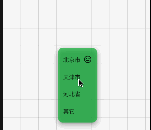
  小菜想实现在下拉框展示时,突显出选中状态 **item**,于是在对应 **item** 位置添加一个 **iconChecked** 图标,其中 **isChecked** 为 **true** 时,会展示选中图标,否则正常不展示;

  **item** 的绘制是在 **_DropdownMenuItemButton** 中加载的,可以通过 **_DropdownMenuItemButton** 添加属性设置,小菜为了统一管理,依旧通过 **_DropdownRoute** 进行中转;
class _DropdownMenuItemButtonState extends State<_DropdownMenuItemButton> {
    @override
    Widget build(BuildContext context) {
        ...
        Widget child = FadeTransition(
        opacity: opacity,
        child: InkWell(
            autofocus: widget.itemIndex == widget.route.selectedIndex,
            child: Container(
                padding: widget.padding,
                child: Row(children: [
                  Expanded(child: widget.route.items[widget.itemIndex]),
                  widget.route.isChecked == true && widget.itemIndex == widget.route.selectedIndex
                      ? (widget.route.iconChecked ?? Icon(Icons.check, size: _kIconCheckedSize))
                      : Container()
                ])),
        ...
    }
}

return ACEDropdownButton(
    value: dropdownValue,
    backgroundColor: Colors.green.withOpacity(0.8),
    menuRadius: const BorderRadius.all(Radius.circular(15.0)),
    isChecked: true,
    iconChecked: Icon(Icons.tag_faces),
    onChanged: (String newValue) => setState(() => dropdownValue = newValue),
    items: ['北京市', '天津市', '河北省', '其它'].map>((String value) {
      return ACEDropdownMenuItem(value: value, child: Text(value));
    }).toList());
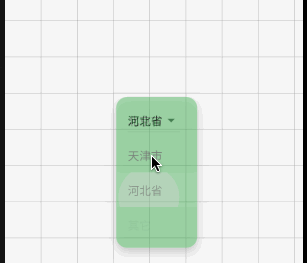
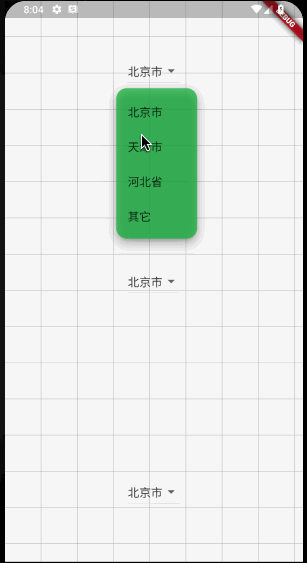
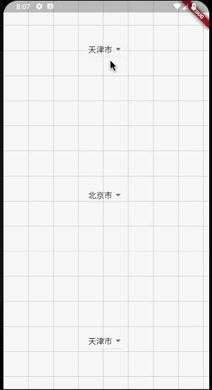
4. 避免遮挡
小菜选择自定义 **ACEDropdownButton** 下拉框最重要的原因是,**Flutter** 自带的 **DropdownButton** 在下拉框展示时会默认遮挡按钮,小菜预期的效果是:
-
若按钮下部分屏幕空间足够展示所有下拉 items,则在按钮下部分展示,且不遮挡按钮;
-
若按钮下部分高度不足以展示下拉 items,查看按钮上半部分屏幕空间是否足以展示所有下拉 items,若足够则展示,且不遮挡按钮;
-
若按钮上半部分和下半部分屏幕空间均不足以展示所有下拉 items 时,此时以屏幕顶部或底部为边界,展示可滑动 items 下拉框;
分析源码,下拉框展示位置是通过 _MenuLimits getMenuLimits 计算的,默认的 menuTop 是通过按钮顶部与选中 item 所在位置以及下拉框整体高度等综合计算获得的,因此展示的位置优先以选中 item 覆盖按钮位置,再向上向下延展;小菜简化计算方式,仅判断屏幕剩余空间与按钮高度差是否能容纳下拉框高度;从而确定 menuTop 起始位置,在按钮上半部分或按钮下半部分展示;
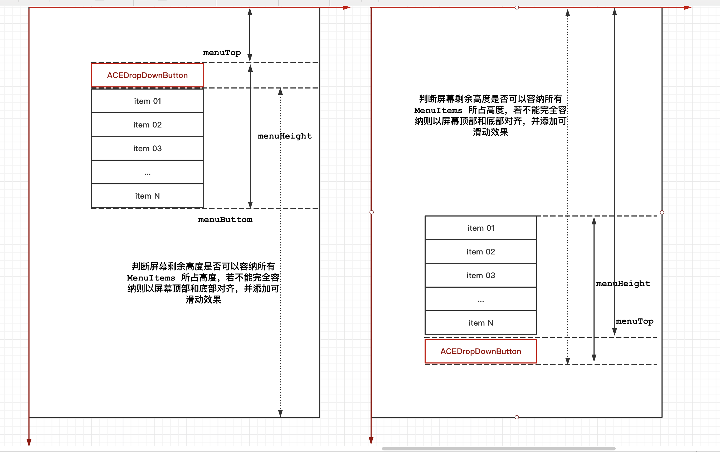
final double menuHeight = math.min(maxMenuHeight, preferredMenuHeight);
if (bottomLimit - buttonRect.bottom < menuHeight) {
    menuTop = buttonRect.top - menuHeight;
} else {
    menuTop = buttonRect.bottom;
}
double menuBottom = menuTop + menuHeight;
5. Animate 下拉框展示动画
  **DropdownButton** 下拉框展示动画默认是以选中 **item** 为起点,分别向上下两端延展;

  小菜修改了下拉框展示位置,因为动画会显得很突兀,于是小菜调整动画起始位置,在 **getSelectedItemOffset** 设为 **route.getItemOffset(0)** 第一个 **item** 位即可;小菜同时也测试过若在按钮上半部分展示下拉框时,由末尾 **item** 向首位 **item** 动画,修改了很多方法,结果的效果却很奇怪,不符合日常动画展示效果,因此无论从何处展示下拉框,均是从第一个 **item** 位置开始展示动画;
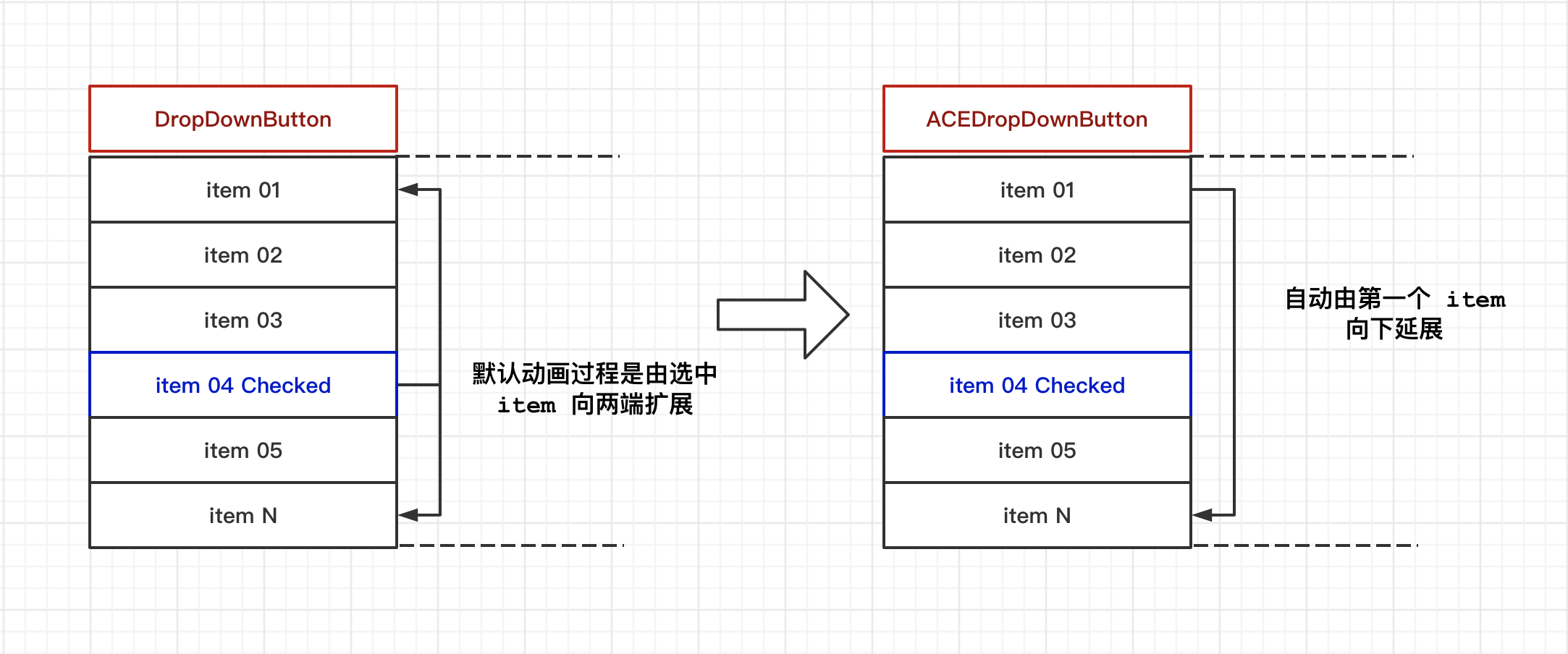
getSelectedItemOffset: () => route.getItemOffset(0)),
[**ACEDropdownButton 案例源码**](https://github.com/ACE-YANGCE/FlutterApp/blob/master/lib/page/ace_dropdown_page.dart)
小菜对于源码的理解还不够深入,仅对需要的效果修改了部分源码,对于所有测试场景可能不够全面;如有错误,请多多指导!
> 来源: 阿策小和尚
共同学习,写下你的评论
评论加载中...
作者其他优质文章