
小菜在尝试做主题颜色切换时,希望背景色有一个自然的过渡过程,于是了解到 ColorTween 颜色补间差值器,配合 AnimationController 实现两种颜色间的自然过渡;小菜简单尝试一下;
ColorTween
源码分析
ColorTween 的源码很简单,继承自 Tween 补间动画,与 Tween 相同,只是 begin 和 end 用 Color 替代;其中若需要透明状态,可以将 begin / end 设置为 null;Colors.transparent 再此代表黑色透明,会淡入淡出黑色;
class ColorTween extends Tween<Color?> {
  ColorTween({ Color? begin, Color? end }) : super(begin: begin, end: end);

  @override
  Color? lerp(double t) => Color.lerp(begin, end, t);
}
案例源码
小菜预先设置好需要主题颜色切换的 UI Widget,之后通过混入 TickerProviderStateMixin,在 initState() 初始化时设置好 AnimationController,将颜色传递给背景色;
AnimationController _controller;
Animation<Color> _colors;
Color _currentColor = Colors.black;

@override
void initState() {
  super.initState();
  _controller = AnimationController(duration: Duration(seconds: 3), vsync: this);
  _colors = ColorTween(begin: _currentColor, end: Colors.amber).animate(_controller);
}

_bodyWid() => Material(
    child: AnimatedBuilder(
        animation: _colors,
        builder: (BuildContext _, Widget childWidget) {
          return Scaffold(backgroundColor: _colors.value, body: _itemListWid());
        }));
通过 AnimationController 控制淡入淡出时机;reset() 重置控制器,forward() 为 begin 到 end 颜色切换;reward() 为 end 到 begin 颜色切换;repeat() 重复循环切换;
_changeColorWid() => Container(
color: Colors.white,
child: Column(children: [
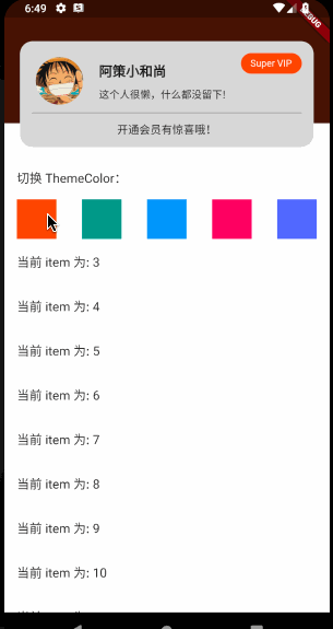
ListTile(title: Text('切换 ThemeColor:')),
Row(mainAxisAlignment: MainAxisAlignment.spaceAround, children: [
_itemColorWid(Colors.deepOrange), _itemColorWid(Colors.teal),
_itemColorWid(Colors.blue), _itemColorWid(Colors.pink),
_itemColorWid(Colors.indigoAccent)
])
]));
_itemColorWid(color) => GestureDetector(
child: Container(width: 50.0, height: 50.0, color: color),
onTap: () {
_colors = ColorTween(begin: _currentColor, end: color).animate(_controller);
setState(() {
_controller.reset();
_controller.forward();
});
_currentColor = color;
});
ButtonBar
小菜在很多场景中设置水平均分或右对齐,为此小菜了解到一个新的容器方式,ButtonBar 默认水平方式放置子 Widget 当水平宽度无法完全放置所有子 Widget 时会竖直方向放置,小菜简单学习一下;
源码分析
const ButtonBar({
    Key key,
    this.alignment,         // 对齐方式
    this.mainAxisSize,      // 主轴上占据空间范围
    this.buttonTextTheme,   // 按钮文本主题
    this.buttonMinWidth,    // 子按钮最小宽度
    this.buttonHeight,      // 子按钮最高度
    this.buttonPadding,     // 子按钮内边距
    this.buttonAlignedDropdown, // 下拉菜单是否与子按钮对齐
    this.layoutBehavior,
    this.overflowDirection, // 子按钮排列顺序
    this.overflowButtonSpacing, // 子按钮之间间距
    this.children = const <Widget>[],
})
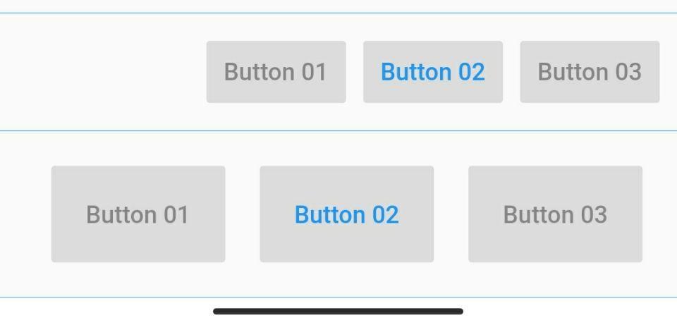
简单分析源码,ButtonBar 作为一个无状态的 StatelessWidget 与 Row 类似,作为一个存放子 Widget 的容器,其中包括了类似于对齐方式等属性方便应用;小菜简单理解为变形的 Row,实际是继承自 Flex 的 _ButtonBarRow;
案例尝试
构造方法
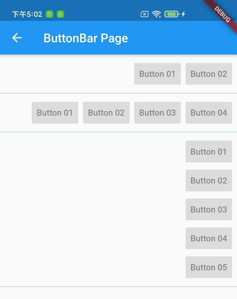
ButtonBar 作为一个 Widget 容器,用于水平存放各 Widget,若子 Widget 占据空间范围大于分配空间时,则竖直方向展示;
_buttonBarWid01() => ButtonBar(children: <Widget>[
      RaisedButton(child: Text('Button 01'), onPressed: null),
      RaisedButton(child: Text('Button 02'), onPressed: null) ]);

_buttonBarWid02() => ButtonBar(children: <Widget>[
      RaisedButton(child: Text('Button 01'), onPressed: null),
      RaisedButton(child: Text('Button 02'), onPressed: null),
      RaisedButton(child: Text('Button 03'), onPressed: null),
      RaisedButton(child: Text('Button 04'), onPressed: null) ]);

_buttonBarWid03() => ButtonBar(children: <Widget>[
      RaisedButton(child: Text('Button 01'), onPressed: null),
      RaisedButton(child: Text('Button 02'), onPressed: null),
      RaisedButton(child: Text('Button 03'), onPressed: null),
      RaisedButton(child: Text('Button 04'), onPressed: null),
      RaisedButton(child: Text('Button 05'), onPressed: null) ]);
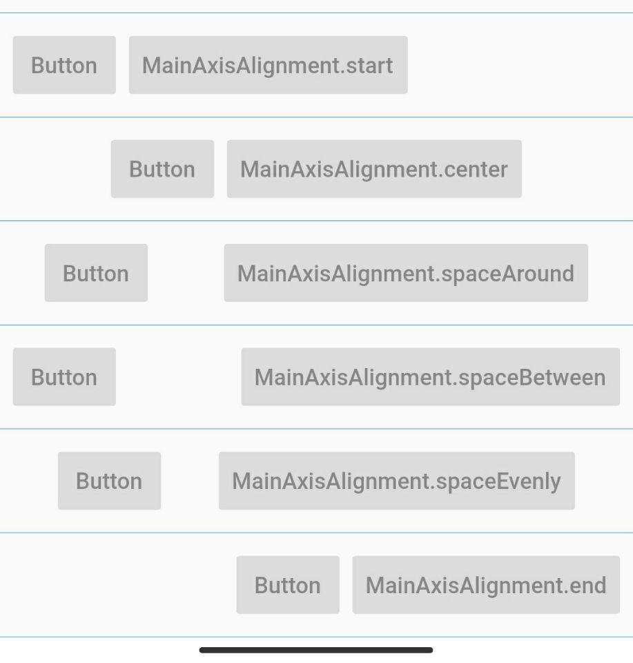
1. alignment
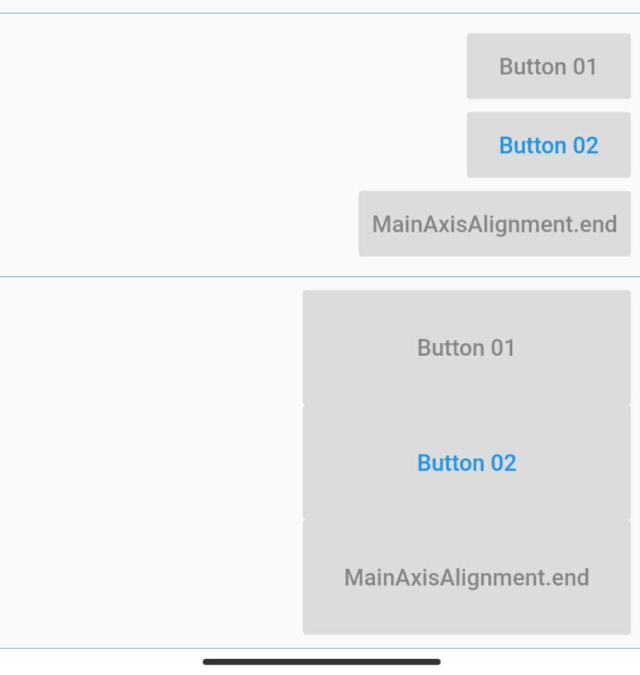
alignment 为容器内子 Widget 的对齐方式,不设置或为 null 时默认为 end 方式对齐,此时与 ltr / rtl 相关;
_buttonBarWid01(index) {
  MainAxisAlignment alignment;
  if (index == 0) {
    alignment = MainAxisAlignment.start;
  } else if (index == 1) {
    alignment = MainAxisAlignment.center;
  } else if (index == 2) {
    alignment = MainAxisAlignment.spaceAround;
  } else if (index == 3) {
    alignment = MainAxisAlignment.spaceBetween;
  } else if (index == 4) {
    alignment = MainAxisAlignment.spaceEvenly;
  } else {
    alignment = MainAxisAlignment.end;
  }
  return ButtonBar(alignment: alignment, children: <Widget>[
    RaisedButton(child: Text('Button'), onPressed: null),
    RaisedButton(child: Text('${alignment.toString()}'), onPressed: null) ]);
}
2. mainAxisSize
mainAxisSize 为主轴上占据空间范围,与 Row / Column 一致,分为 min / max 最小范围和最大填充范围两种;
_buttonBarWid05(mainAxisSize) => Container(
    color: Colors.blue.withOpacity(0.3),
    child: ButtonBar(mainAxisSize: mainAxisSize, children: <Widget>[
      RaisedButton(child: Text('Button 01'), onPressed: null),
      RaisedButton(child: Text('Button 02'), onPressed: null),
      RaisedButton(child: Text('Button 03'), onPressed: null)
    ]));

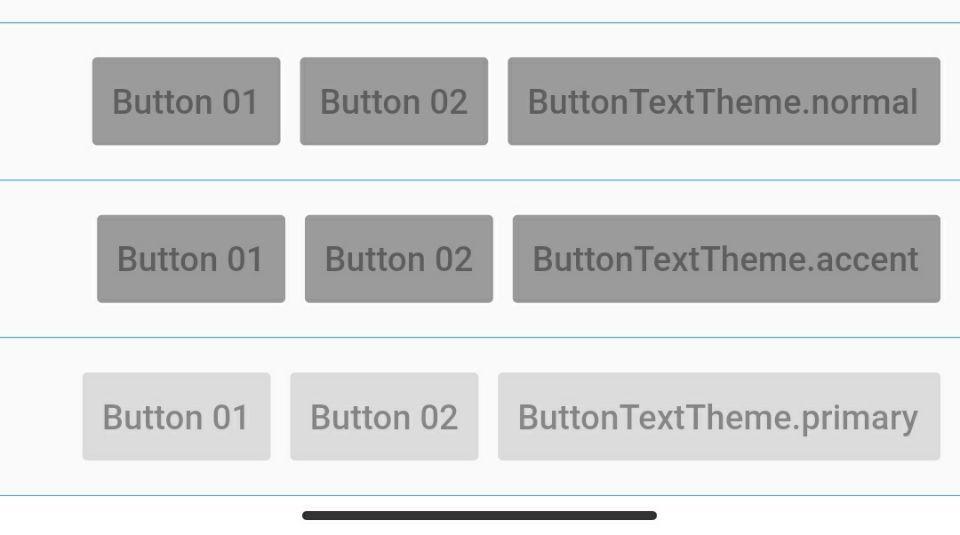
3. buttonTextTheme
buttonTextTheme 为子 Widget 按钮主题,主要包括 normal / accent / primary 三种主题样式,分别对应 ThemeData.brightness / accentColor / primaryColor;
_buttonBarWid04(theme) =>
    ButtonBar(buttonTextTheme: theme, children: <Widget>[
      RaisedButton(child: Text('Button 01'), onPressed: null),
      RaisedButton(child: Text('Button 02', style: TextStyle(color: Colors.blue)), onPressed: null),
      RaisedButton(child: Text('${theme.toString()}'), onPressed: null),
    ]);
4. buttonMinWidth & buttonHeight
buttonMinWidth & buttonHeight 分别对应子 Widget 默认的最小按钮宽度和按钮高度;
_buttonBarWid06(width, height, alignment) =>
    ButtonBar(buttonMinWidth: width, buttonHeight: height, children: <Widget>[
      RaisedButton(child: Text('Button 01'), onPressed: null),
      RaisedButton(child: Text('Button 02', style: TextStyle(color: Colors.blue)), onPressed: null),
      RaisedButton(child: Text('${alignment.toString()}'), onPressed: null),
    ]);
5. overflowButtonSpacing & buttonPadding
overflowButtonSpacing 对应子按钮外间距,类似于 GridView 元素间间距;buttonPadding 对应子按钮内边距;
_buttonBarWid07(padding, spacing) => ButtonBar(
      overflowButtonSpacing: spacing,
      buttonPadding: EdgeInsets.all(padding),
      children: <Widget>[
        RaisedButton(child: Text('Button 01'), onPressed: null),
        RaisedButton(child: Text('Button 02', style: TextStyle(color: Colors.blue)), onPressed: null),
        RaisedButton(child: Text('Button 03'), onPressed: null)
      ]);
6. overflowDirection
overflowDirection 为若容器内子 Widget 所占范围超过最大限制范围时,垂直排列顺序,小菜理解为顺序和倒序两种;
_buttonBarWid08(direction) =>
    ButtonBar(overflowDirection: direction, children: <Widget>[
      RaisedButton(child: Text('Button 01'), onPressed: null),
      RaisedButton(child: Text('Button 02', style: TextStyle(color: Colors.blue)), onPressed: null),
      RaisedButton(child: Text('Button 03'), onPressed: null),
      RaisedButton(child: Text('${direction.toString()}'), onPressed: null),
    ]);

ColorTween 和 ButtonBar 的应用非常简单,这次小菜在实际场景中进行尝试学习,如有错误,请多多指导!
来源: 阿策小和尚
共同学习,写下你的评论
评论加载中...
作者其他优质文章