
小菜在之前尝试过 ToggleButtons 按钮切换容器组,小菜了解到类似的 iOS 风格的 CupertinoSegmentedControl 分段控制器;在日常应用中使用频率较高,今天小菜简单学习一下;
CupertinoSegmentedControl
源码分析
CupertinoSegmentedControl({
    Key key,
    @required this.children,
    @required this.onValueChanged,  // 状态变更回调
    this.groupValue,            // 当前状态
    this.unselectedColor,       // 未选中区域颜色
    this.selectedColor,         // 选中区域颜色
    this.borderColor,           // 边框颜色
    this.pressedColor,          // 点击时颜色
    this.padding,               // 内边距
})
简单分析源码可得,整个 CupertinoSegmentedControl 控制器属性很清晰,使用起来也非常简单;
const EdgeInsetsGeometry _kHorizontalItemPadding = EdgeInsets.symmetric(horizontal: 16.0);

const double _kMinSegmentedControlHeight = 28.0;

const Duration _kFadeDuration = Duration(milliseconds: 165);
通过常量可以了解到控制器设置的默认边距值,最小高度以及点击时颜色切换时长;其中通过 ColorTween 动画方式进行背景色切换;
class _SegmentedControlContainerBoxParentData extends ContainerBoxParentData<RenderBox> {
  RRect surroundingRect;
}

RRect rChildRect;
if (child == leftChild) {
    rChildRect = RRect.fromRectAndCorners(childRect, topLeft: const Radius.circular(3.0), bottomLeft: const Radius.circular(3.0));
} else if (child == rightChild) {
    rChildRect = RRect.fromRectAndCorners(childRect, topRight: const Radius.circular(3.0), bottomRight: const Radius.circular(3.0));
} else {
    rChildRect = RRect.fromRectAndCorners(childRect);
}
边框的绘制继承了 ContainerBoxParentData,需要设置 Widget 的最大最小宽高;通过 RRect 双层圆角矩形绘制边框,小菜还学习了之前未尝试过的 fromRectAndCorners 绘制部分圆角方式;
其中多个 Widget 之间的点击切换 GestureDetector 使用也非常值得学习;
案例尝试
小菜先实现一个基本的分段控制器,然后逐步加入各个属性进行了解;
1. children & onValueChanged
children 和 onValueChanged 是两个必备属性,分别对应子 Widget 数组和状态变更回调的监听;onValueChanged 不可为空;
其中 children 为 LinkedHashMap 类型,每个 key-value 均不可为空;且如果 key 相同,后面的 key-value 对会覆盖之前重复 key 的 key-value 对;key 为 T 范型类型,并未限制具体的类型;children 长度需 >=2;
var mixMap = {
  '飞机': Padding(padding: EdgeInsets.symmetric(vertical: 10.0), child: Icon(Icons.airplanemode_active)),
  '公交': Padding(padding: EdgeInsets.symmetric(vertical: 10.0), child: Icon(Icons.directions_bus)),
  '骑行': Padding(padding: EdgeInsets.symmetric(vertical: 10.0), child: Icon(Icons.directions_bike))
};
var _currentIndexStr = '飞机';

_segmentedWid01() => Container(
    child: CupertinoSegmentedControl(
        children: mixMap,
        onValueChanged: (index) {
          print('index -> $index');
          setState(() => _currentIndexStr = index);
        }));
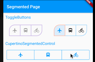
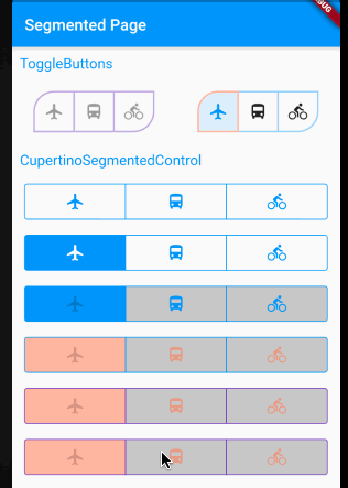
2. groupValue
groupValue 对应当前选中的状态,若不设置该属性,在控制器切换过程中只可以监听到回调方法,而不会实际进行变更;
_segmentedWid02() => Container(
    child: CupertinoSegmentedControl(
        children: mixMap,
        onValueChanged: (index) {
          print('index -> $index');
          setState(() => _currentIndexStr = index);
        },
        groupValue: _currentIndexStr));
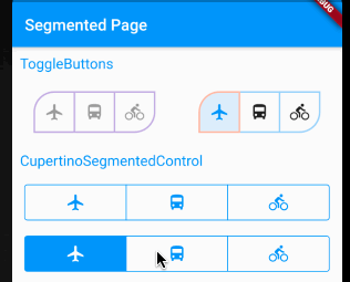
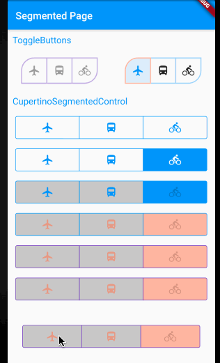
3. unselectedColor
unselectedColor 对应未选中切换区域背景色,默认是 CupertinoTheme.primaryContrastingColor;
_segmentedWid03() => Container(
    child: CupertinoSegmentedControl(
        children: mixMap,
        onValueChanged: (index) {
          print('index -> $index');
          setState(() => _currentIndexStr = index);
        },
        groupValue: _currentIndexStr,
        unselectedColor: Colors.black.withOpacity(0.2)));
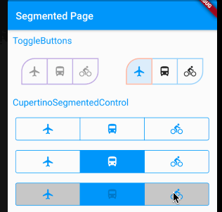
4. selectedColor
selectedColor 对应选中切换区域背景色,默认是 CupertinoTheme.primaryColor;
_segmentedWid04() => Container(
    child: CupertinoSegmentedControl(
        children: mixMap,
        onValueChanged: (index) {
          print('index -> $index');
          setState(() => _currentIndexStr = index);
        },
        groupValue: _currentIndexStr,
        unselectedColor: Colors.black.withOpacity(0.2),
        selectedColor: Colors.deepOrange.withOpacity(0.4)));
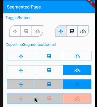
5. borderColor
borderColor 对应边框色,默认是 CupertinoTheme.primaryColor;
_segmentedWid05() => Container(
    child: CupertinoSegmentedControl(
        children: mixMap,
        onValueChanged: (index) {
          print('index -> $index');
          setState(() => _currentIndexStr = index);
        },
        groupValue: _currentIndexStr,
        unselectedColor: Colors.black.withOpacity(0.2),
        selectedColor: Colors.deepOrange.withOpacity(0.4),
        borderColor: Colors.deepPurple));
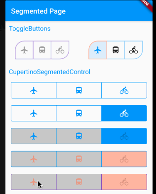
6. pressedColor
pressedColor 对点击选中时背景色,默认是 selectedColor 颜色加 20% 透明度;
_segmentedWid06() => Container(
    child: CupertinoSegmentedControl(
        children: mixMap,
        onValueChanged: (index) {
          print('index -> $index');
          setState(() => _currentIndexStr = index);
        },
        groupValue: _currentIndexStr,
        unselectedColor: Colors.black.withOpacity(0.2),
        selectedColor: Colors.deepOrange.withOpacity(0.4),
        borderColor: Colors.deepPurple,
        pressedColor: Colors.green.withOpacity(0.4)));
7. padding
padding 对应 CupertinoSegmentedControl 内边距,注意该 padding 是整个控制器的内边距,而非子 Widget 的内边距,默认是居于水平方向,左右 16 距离;
_segmentedWid07() => Container(
    child: CupertinoSegmentedControl(
        children: mixMap,
        onValueChanged: (index) {
          print('index -> $index');
          setState(() => _currentIndexStr = index);
        },
        groupValue: _currentIndexStr,
        unselectedColor: Colors.black.withOpacity(0.2),
        selectedColor: Colors.deepOrange.withOpacity(0.4),
        borderColor: Colors.deepPurple,
        pressedColor: Colors.green.withOpacity(0.4),
        padding: EdgeInsets.all(30.0)));
CupertinoSegmentedControl 在 iOS 设备上支持点击和滑动切换,但小菜尝试在 Android 端主要是点击切换;小菜对于源码的阅读还很浅薄,如有错误,请多多指导!
来源: 阿策小和尚
共同学习,写下你的评论
评论加载中...
作者其他优质文章