
课程信息
课程名称:前端工程师
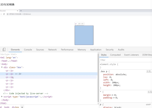
课程章节:第三周 2D与3D转换
课程讲师:
课程内容:
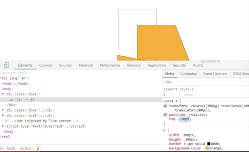
空间移动
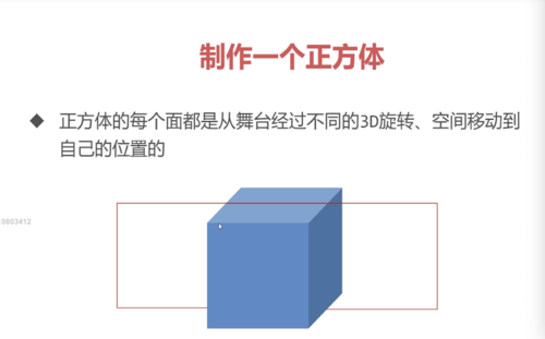
当元素进行3D旋转后,即可继续添加translateX()、translateY()、translateZ()、属性让元素在空间继续移动

空间移动要添加在3D旋转之后
以当前的旋转面形成一个坐标轴,沿着x、y、z轴移动
transform:rotateX(30deg) translateX(30deg) translateZ(100deg);
制作一个正方形
<!DOCTYPE html>
<html lang="en">
<head>
<meta charset="UTF-8">
<meta http-equiv="X-UA-Compatible" content="IE=edge">
<meta name="viewport" content="width=device-width, initial-scale=1.0">
<title>实现一个正方体</title>
<style>
*{
margin: 0;
padding: 0;
}
.box{
width: 200px;
height: 200px;
border: 1px solid #000;
margin: 100px auto;
perspective: 300px;
position: relative;
}
.box p{
/* 使用绝对定位使每个p标签都在舞台的基准位置 */
/* 从同一个位置出发形成正方体 */
position: absolute;
left: 0;
top: 0;
height: 200px;
width: 200px;
}
.box p:nth-child(1){
background-color: rgba(219,56,211,0.486);
/* 前面 */
transform: translateZ(100px);
}
.box p:nth-child(2){
background-color: rgba(16, 238, 27, 0.486);
/* 顶面 */
/* 随着它的后仰,它的正方向已经变成了向上(面朝的方向变为了向上),所以用translateZ而不是translateY */
transform: rotateX(90deg) translateZ(100px);
}
.box p:nth-child(3){
background-color: rgba(13, 74, 207, 0.486);
/* 背面 */
transform: rotateX(180deg) translateZ(100px);
}
.box p:nth-child(4){
background-color: rgba(93, 6, 6, 0.486);
/* 底面 */
transform:rotateX(-90deg) translateZ(100px);
}
.box p:nth-child(5){
background-color: rgba(245, 237, 4, 0.486);
/* 右侧面 */
transform: rotateY(90deg) translateZ(100px);
}
.box p:nth-child(6){
background-color: rgba(219, 132, 56, 0.486);
/* 左侧面 */
transform: rotateY(-90deg) translateZ(100px);
}
</style>
</head>
<body>
<div class="box">
<p></p>
<p></p>
<p></p>
<p></p>
<p></p>
<p></p>
</div>
</body>
</html>

学习收获与心得:
成功没有捷径,只有靠自己的努力和付出才能取得胜利
学习完毕截图:
共同学习,写下你的评论
评论加载中...
作者其他优质文章