
CSS3背景 醒目而惊艳的滚动效果
<!DOCTYPE html>
<html lang="en">
<head>
<meta charset="UTF-8">
<title>Title</title>
<style>
* {
padding: 0;
margin: 0;
}
body {
height: 2000px;
}
#wrap {
width: 800px;
height: 400px;
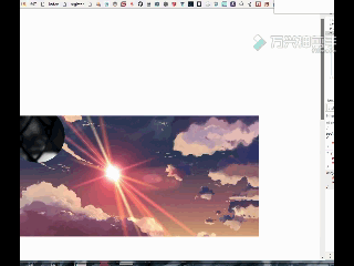
background: url("bg.jpg") no-repeat center ;
background-size: cover;
}
.sircle {
position: absolute;
top: 20%;
left: 20%;
width: 0px;
height: 0px;
border-radius:50%;
background: url('circle.jpg') no-repeat fixed;
background-size: 800px 400px;
background-position-x: 0;
background-position-y: 400px;
border:1px solid #2b2b2b;
}
.box {
overflow: hidden;
float: left;
position: absolute;
top: 400px;
}
</style>
</head>
<body>
<div class="box">
<div id="wrap">
<div class="sircle"></div>
</div>
</div>
<script class="lazyload" src="data:image/png;base64,iVBORw0KGgoAAAANSUhEUgAAAAEAAAABCAYAAAAfFcSJAAAAAXNSR0IArs4c6QAAAARnQU1BAACxjwv8YQUAAAAJcEhZcwAADsQAAA7EAZUrDhsAAAANSURBVBhXYzh8+PB/AAffA0nNPuCLAAAAAElFTkSuQmCC" data-original="https://cdn.bootcss.com/jquery/3.3.1/jquery.min.js"></script>
<script>
$(() => {
/**背景滚动自身高度时, */
var body = $('body')[0],
sircle = document.querySelector('.sircle');
// body.onscroll = function () ;
body.onscroll=function () {
console.log(this.scrollY);
sircle.style.width = this.scrollY * 4 + 'px';
sircle.style.height = this.scrollY * 4 + 'px';
sircle.style.left = 20 - this.scrollY + 'px';
sircle.style.top = 20 - this.scrollY + 'px';
sircle.style.backgroundPositionY =-this.scrollY+400 + 'px';
}
})
</script>
</body>
</html>/点击查看更多内容
为 TA 点赞
评论
共同学习,写下你的评论
评论加载中...
作者其他优质文章
正在加载中


感谢您的支持,我会继续努力的~
扫码打赏,你说多少就多少
赞赏金额会直接到老师账户
支付方式
打开微信扫一扫,即可进行扫码打赏哦