
button样式篇一(ant Design React)
这篇来介绍button中elementUi、iview、ant中样式结构
ant Design react
ant-react中button分两个文件less:
mixins.less:根据button功能样式不同封装成函数。
index.less:调用mixins.less中的函数来声明button的相关class
我们先来看mixins.less的结构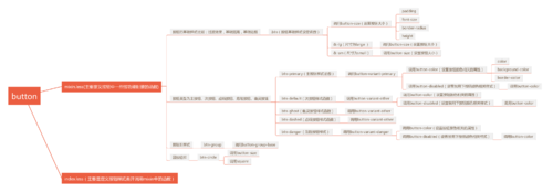
btn(基础样式,主要用设置按钮通用样式):
.btn() {  display: inline-block;//行内块元素  font-weight: @btn-font-weight;//字体粗细  text-align: center;//字体居中  touch-action: manipulation;//浏览器只允许进行滚动和持续缩放操作  cursor: pointer;//鼠标移上去形状  background-image: none;//背景图片为空  border: @border-width-base @border-style-base transparent;//边框透明  white-space: nowrap;//不换行
  .button-size(@btn-height-base; @btn-padding-base; @font-size-base; @btn-border-radius-base);//padding height font-size  border-radius设置  user-select: none;//文本不能被选择  transition: all .3s @ease-in-out;//过渡  position: relative;//相对定位

  > .@{iconfont-css-prefix} {    line-height: 1;//行高不带单位是相对字体的比例
  }

  &,
  &:active,
  &:focus {    outline: 0;//是绘制于元素周围的一条线,位于边框边缘的外围,可起到突出元素的作用
  }

  &:not([disabled]):hover {    text-decoration: none;//定义标准的文本
  }

  &:not([disabled]):active {    outline: 0;    transition: none;
  }

  &.disabled,
  &[disabled] {    cursor: not-allowed;
    > * {      pointer-events: none;//元素永远不会成为鼠标事件的target
    }
  }

  &-lg {
    .button-size(@btn-height-lg; @btn-padding-lg; @btn-font-size-lg; @btn-border-radius-base);
  }

  &-sm {
    .button-size(@btn-height-sm; @btn-padding-sm; @btn-font-size-sm; @btn-border-radius-sm);
  }
}
其中的具体属性不多说了,不知道的可以百度属性就知道了,大概就是设置字体粗细、字体居中、不换行、过渡、定位、边框、激活、焦点、hover、disabled等样式,其中btn中调用了button-size函数。&-lg、&-sm设置大按钮和小按钮,调用了button-size函数
button-size(设置按钮大小):
.button-size(@height; @padding; @font-size; @border-radius) {  padding: @padding;  font-size: @font-size;  border-radius: @border-radius;  height: @height;
}以height、padding、font-size、border-radius为输入参数来设置按钮大小,宽度通过padding和font-size就能设置宽度。
下一个部分是设置按钮类型为主按钮、次按钮、虚线按钮、危险按钮、幽灵按键样式函数:
.button-variant-primary(@color; @background) {  .button-color(@color; @background; @background);
  &:hover,
  &:focus {
    .button-color(@color; ~`colorPalette("@{background}", 5)`; ~`colorPalette("@{background}", 5)`);
  }

  &:active,
  &.active {
    .button-color(@color; ~`colorPalette("@{background}", 7)`; ~`colorPalette("@{background}", 7)`);
  }  .button-disabled();
}.button-variant-other(@color; @background; @border) {  .button-color(@color; @background; @border);

  &:hover,
  &:focus {
    .button-color(@primary-5; @background; @primary-5);
  }

  &:active,
  &.active {
    .button-color(@primary-7; @background; @primary-7);
  }  .button-disabled();
}.button-variant-danger(@color; @background; @border) {  .button-color(@color; @background; @border);

  &:hover {
    .button-color(@btn-primary-color; ~`colorPalette("@{color}", 5)`; ~`colorPalette("@{color}", 5)`);
  }

  &:focus {
    .button-color(~`colorPalette("@{color}", 5)`; #fff; ~`colorPalette("@{color}", 5)`);
  }

  &:active,
  &.active {
    .button-color(@btn-primary-color; ~`colorPalette("@{color}", 7)`; ~`colorPalette("@{color}", 7)`);
  }  .button-disabled();
}.button-variant-ghost(@color) {  .button-color(@color; transparent; @color);

  &:hover,
  &:focus {
    .button-color(~`colorPalette("@{color}", 5)`; transparent; ~`colorPalette("@{color}", 5)`);
  }

  &:active,
  &.active {
    .button-color(~`colorPalette("@{color}", 7)`; transparent; ~`colorPalette("@{color}", 7)`);
  }  .button-disabled();
}
代码中我们可以看到这些函数都是调用button-color来设置按钮的边框,背景,文字颜色,和调用button-disabled来设置禁用样式。主要还是基础颜色样式不同,而且hover,active颜色样式不一样。而且在后面函数中btn-primary、btn-default、btn-ghost、btn-dashed、btn-danger调用上面的对应函数。代码如下:
// primary button style.btn-primary() {
  .button-variant-primary(@btn-primary-color; @btn-primary-bg);
}

// default button style.btn-default() {
  .button-variant-other(@btn-default-color; @btn-default-bg; @btn-default-border);
  &:hover,
  &:focus,
  &:active,
  &.active {    background: @btn-default-bg;    text-decoration: none;
  }
}

// ghost button style.btn-ghost() {
  .button-variant-other(@btn-ghost-color, @btn-ghost-bg, @btn-ghost-border);
}

// dashed button style.btn-dashed() {
  .button-variant-other(@btn-default-color, @btn-default-bg, @btn-default-border);  border-style: dashed;
}

// danger button style.btn-danger() {
  .button-variant-danger(@btn-danger-color, @btn-danger-bg, @btn-danger-border);
}
剩下就是按钮组的样式和圆按钮的样式
.button-group-base(@btnClassName) {//按钮组的基础样式
  position: relative;  display: inline-block;
  > .@{btnClassName},
  > span > .@{btnClassName} {    position: relative;    line-height: @btn-height-base - 2px;    &:hover,    &:focus,    &:active,    &.active {      z-index: 2;
    }    &:disabled {      z-index: 0;
    }
  }  // size
  &-lg > .@{btnClassName},  &-lg > span > .@{btnClassName} {    .button-size(@btn-height-lg; @btn-padding-lg; @btn-font-size-lg; 0);    line-height: @btn-height-lg - 2px;
  }  &-sm > .@{btnClassName},  &-sm > span > .@{btnClassName} {    .button-size(@btn-height-sm; @btn-padding-sm; @font-size-base; 0);    line-height: @btn-height-sm - 2px;
    > .@{iconfont-css-prefix} {      font-size: @font-size-base;
    }
  }
}.btn-group(@btnClassName: btn) {//按钮组主要是设置里面一排按钮的边框和圆角
  .button-group-base(@btnClassName);  .@{btnClassName} + .@{btnClassName},  .@{btnClassName} + &,  span + .@{btnClassName},  .@{btnClassName} + span,
  > span + span,  & + .@{btnClassName},  & + & {    margin-left: -1px;
  }  .@{btnClassName}-primary + .@{btnClassName}:not(.@{btnClassName}-primary):not([disabled]) {    border-left-color: transparent;
  }  .@{btnClassName} {    border-radius: 0;
  }

  > .@{btnClassName}:first-child,
  > span:first-child > .@{btnClassName} {    margin-left: 0;
  }
  > .@{btnClassName}:only-child {    border-radius: @btn-border-radius-base;
  }
  > span:only-child > .@{btnClassName} {    border-radius: @btn-border-radius-base;
  }

  > .@{btnClassName}:first-child:not(:last-child),
  > span:first-child:not(:last-child) > .@{btnClassName} {    border-bottom-left-radius: @btn-border-radius-base;    border-top-left-radius: @btn-border-radius-base;
  }

  > .@{btnClassName}:last-child:not(:first-child),
  > span:last-child:not(:first-child) > .@{btnClassName} {    border-bottom-right-radius: @btn-border-radius-base;    border-top-right-radius: @btn-border-radius-base;
  }  &-sm {
    > .@{btnClassName}:only-child {      border-radius: @btn-border-radius-sm;
    }
    > span:only-child > .@{btnClassName} {      border-radius: @btn-border-radius-sm;
    }
    > .@{btnClassName}:first-child:not(:last-child),
    > span:first-child:not(:last-child) > .@{btnClassName} {      border-bottom-left-radius: @btn-border-radius-sm;      border-top-left-radius: @btn-border-radius-sm;
    }
    > .@{btnClassName}:last-child:not(:first-child),
    > span:last-child:not(:first-child) > .@{btnClassName} {      border-bottom-right-radius: @btn-border-radius-sm;      border-top-right-radius: @btn-border-radius-sm;
    }
  }  & > & {    float: left;
  }  & > &:not(:first-child):not(:last-child) > .@{btnClassName} {    border-radius: 0;
  }  & > &:first-child:not(:last-child) {
    > .@{btnClassName}:last-child {      border-bottom-right-radius: 0;      border-top-right-radius: 0;      padding-right: 8px;
    }
  }  & > &:last-child:not(:first-child) > .@{btnClassName}:first-child {    border-bottom-left-radius: 0;    border-top-left-radius: 0;    padding-left: 8px;
  }
}
原文出处:https://www.cnblogs.com/hetaojs/p/9582864.html
共同学习,写下你的评论
评论加载中...
作者其他优质文章