
-
<!DOCTYPE html PUBLIC "-//W3C//DTD XHTML 1.0 Transitional//EN" "http://www.w3.org/TR/xhtml1/DTD/xhtml1-transitional.dtd">
<html xmlns="http://www.w3.org/1999/xhtml">
<head>
<meta http-equiv="Content-Type" content="text/html; charset=utf-8" />
<title>混合布局编程挑战</title>
<style type="text/css">
body{ margin:0; padding:0; font-size:30px; color:#fff}
.top{height:100px;margin:0 auto;background:black;}
.main{height:600px;background:pink;}
.right{height:600px;background:green;position:absolute;left:210px;width:100%;}
.left{ height:600px;width:200px;background:blue;float:left;}
.foot{width:600px; height: 400px;margin:0 auto; background:#FFAA33; clear:both;}
</style>
</head>
<body>
<div class="top">top</div>
<div class="main">
<div class="right">right</div>
<div class="left">left</div>
</div>
<div class="foot">foot</div>
</body>
</html>
查看全部 -
<!doctype html>
<html xmlns="http;//www.w3.org/1999/xhtml">
<head>
<meta http-equiv="Content=Type"conent="text/html;charset=utf-8">
<title>布局</title>
<style type="text/css">
body{margin:0;padding:0}
.top{height:100px;background:blue}
.head{height:100px;height:600px;background:#f60;margin:0 auto}
.main{width:200px;height:600px;background:#ccc;margin:0 auto}
.left{width:200px;height:600px;background:yellow;float:left}
.right{width:600px;height:600px;background:green;float:left}
.sub_1{width:400px;height:600px;background:#09F;float:right}
.sub_2{width:800px;height:100px;background:#900;margin:0 auto}
</style>
</head>
<body>
<div class="top">
<div class="head">
</div>
</div>
<div class="main">
<div class="left">
</div>
</div>
<div class="right">
<div class="sub_1">
</div>
<div class="sub_2">
</div>
</div>
</body>
</html>
查看全部 -
<!doctype html>
<html xmlns="http;//www.w3.org/1999/xhtml">
<head>
<meta http-equiv="Content=Type"conent="text/html;charset=utf-8">
<title>布局</title>
<style type="text/css">
body{margin:0;padding:0 auto}
.left{width:33.33%;height:500px;float:left;background:#ccc}
.middle{width;33.33%;height:500px;float:left;background:#999}
.right{width:33.33%;height:500px;float:right;background:#ddd}
</style>
</head>
<body>
<div class="left"></div>
<div class="middle"></div>
<div class="right"></div>
</body>
</html>
<!doctype html>
<html xmlns="http;//www.w3.org/1999/xhtml">
<head>
<meta http-equiv="Content=Type"conent="text/html;charset=utf-8">
<title>布局</title>
<style type="text/css">
body{margin:0;padding:0}
.left{width:200px;height:500px;background:#ccc;position:absoulate;left:0;tpo:0}
.middle{height:500px;float:left;background:#999;margin:0 300px 0 200px}
.right{width:33.33%;height:500px;background:#ddd;position:absoulate;left:0;tpo:0}
</style>
</head>
<body>
<div class="left">200px</div>
<div class="middle">设计首页的第一步就是设计版面布局,就像传统的报刊杂志编辑一样,我们将网页看做一张报纸,进行排版布局。虽然动态网页技术的发展使得我们开始趋向于学习场景编剧,但是固定的网页版面试及基础依然是必须的,他们的基本原理是共通的,你可以领会要点,举一反三</div>
<div class="right">300px</div>
</body>
</html>
查看全部 -
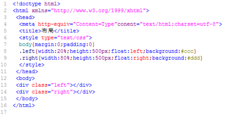
<!doctype html>
<html xmlns="http;//www.w3.org/1999/xhtml">
<head>
<meta http-equiv="Content=Type"conent="text/html;charset=utf-8">
<title>布局</title>
<style type="text/css">
body{margin:0;padding:0}
.left{width:20%;height:500px;float:left;background:#ccc}
.right{width:80%;height:500px;float:right;background:#ddd}
</style>
</head>
<body>
<div class="left"></div>
<div class="right"></div>
</body>
</html>
 查看全部
查看全部 -
<!doctype html>
<html>
<head>
<meta http-equiv="Content=Type"conent="text/html;charset=utf-8">
<title>布局</title>
<style type="text/css">
body{margin:0;padding:0}
.main{width:800px;height:300px;background:#cc;margin:0 auto}
</style>
</head>
<body>
<div class="main"></div>
</body>
</html>
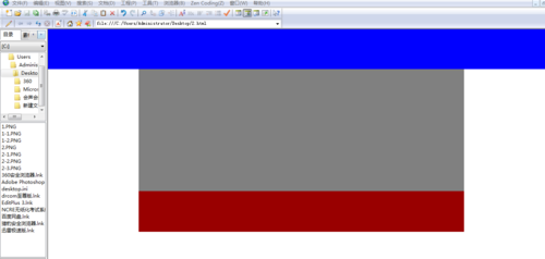
<!doctype html>
<html xmlns="http;//www.w3.org/1999/xhtml">
<head>
<meta http-equiv="Content=Type"conent="text/html;charset=utf-8">
<title>布局</title>
<style type="text/css">
body{margin:0;padding:0}
.top{height:100px;background:blue}
.main{width:800px;height:300px;background:gray;margin:0 auto}
.foot{width:800px;height:100px;background:#900;margin:0 auto}
</style>
</head>
<body>
<div class="top"></div>
<div class="main"></div>
<div class="foot"></div>
</body>
</html>
查看全部 -
以上是自我感觉第一节我所掌握的知识
查看全部 -
可以让元素脱离文档流的CSS设置是 float 和绝对定位:absolute
查看全部 -
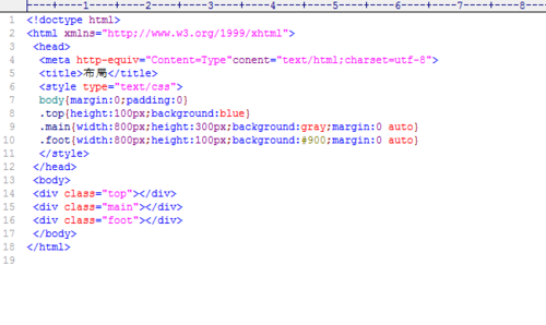
<!DOCTYPE html PUBLIC "-//W3C//DTD XHTML 1.0 Transitional//EN" "http://www.w3.org/TR/xhtml1/DTD/xhtml1-transitional.dtd">
<html xmlns="http://www.w3.org/1999/xhtml">
<head>
<meta http-equiv="Content-Type" content="text/html; charset=utf-8" />
<title>混合布局编程挑战</title>
<style type="text/css">
body{ margin:0; padding:0; font-size:30px; color:#fff}
.top{height: 80px;background: #ccc;}
.main{height: 400px;width:860px;margin:0 auto;background:red;}
.left{width:200px;height:300px;background:blue;position:absolute;left:0;top:80px;}
.right{height: 400px;float: right;background: #F90;width:70%;}
.foot{height: 50px;background: green;}
</style>
</head>
<body>
<div class="top">top</div>
<div class="main">
<div class="right">right</div>
<div class="left">left</div>
</div>
<div class="foot">foot</div>
</body>
</html>
查看全部 -
margin{0 auto}块元素垂直居中
查看全部 -
前端工程师就是将艺术与技术完美融合的工作。
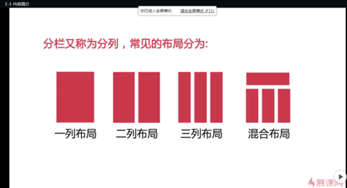
布局:一列布局、两列布局、三列布局、混合布局
查看全部 -
margin:0 auto;表示居中对齐
查看全部 -
.top{height:100px;background:blue}
.main{width:800px;height:300px;background:blue;margin:0 auto}
<div class="top"></div>
<div class="main"></div>
<div class="foot"></div>
查看全部 -
top,main(left,right),footer,当left,right都设置了浮动到左边、右边,在设置footer时,应该清除浮动,否则footer的内容会跑到top下面,占据了main的位置。也即是,clear: both;
查看全部 -
三列布局:左边、右边固定宽度,中间自适应宽度。(窗口拉伸变化,左、右的宽度都不变,中间的会随窗口变化。)
.left{ width:200px; height:600px; background:#ccc; position: absolute; left:0; top:0}
.main{ height:600px; margin: 0 310px 0 210px; background:#9CF}
.right{ height:600px; width:300px; position:absolute; right:0;top:0; background:#FCC;}
查看全部 -
什么是脱离文档流?什么是文档流?
浏览器默认的排版方式就是文档流(或者叫标准流)排版方式。脱离文档流就是不按照文档流的排版方式。
文档流的排版方式是:块级元素垂直排布,行内元素和行内块级水平排布。不脱离就是按照这种方式排版,
例如给元素设置浮动或者绝对定位,这就是脱离文档流布局
查看全部


举报