我正在尝试并排放置两个堆叠的条形图,但无法弄清楚。这是一个示例 df:Field IssuePolice Budget cutsResearch Budget cutsPolice Time consumingBanking Lack of oversightHealthcare Lack of supportResearch BureaucracyHealthcare BureaucracyBanking Mistrust我想要的是第一个字段的堆积条形图。它的高度为 8,由 2 个警察、2 个研究等细分。然后我想要第一个图表旁边的问题堆积条形图。第二个将有 8 的高度,并被 2 次预算削减、1 次耗时、1 次缺乏监督等堆叠在一起。我试过了:获取所有字段的堆积条形图:trace1 = go.Bar( x = df.Field.unique(), y = df.Field.value_counts(), name='Total Amount of roles')获得预算削减的堆积条形图(然后复制其他问题):trace2 = go.Bar( x = df.Field.unique(), y = df[df['Issue'] == 'Budget cuts'].Field.value_counts(), name='Budget cuts')data = [trace1, trace2]layout = go.Layout(barmode='stack')fig = go.Figure(data=data, layout=layout)py.plot(fig, filename='test.html')但是上面的代码将两个图叠加到一个上。我想要堆叠跟踪 1 和堆叠跟踪 2。我也希望将其集成到 Dash 中,而不是单独策划,但老实说,这将是次要的。将不胜感激任何帮助!
2 回答
有只小跳蛙
TA贡献1824条经验 获得超8个赞
编辑 - 在评论中进行简短对话后,这是我的最新建议:
这是一个可能的解决方案,其中包含每列堆叠的每个类别的每个出现次数(字段或问题):
阴谋:
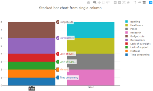
代码:
如您所见,它不是很灵活,因为您必须go.Bar为每个类别(银行、警察等)添加一个对象。但如果上面的情节是你要找的,我也会整理出那部分。
# import
import pandas as pd
import numpy as np
import plotly.graph_objs as go
from plotly.offline import download_plotlyjs, init_notebook_mode, plot, iplot
init_notebook_mode(connected=True)
#%qtconsole
# sample data
Field = ['Police', 'Research', 'Police', 'Banking', 'Healthcare', 'Research', 'Healthcare', 'Banking']
Issue = ['Budget cuts', 'Budget cuts', 'Time consuming', 'Lack of oversight', 'Lack of support', 'Bureaucracy', 'Bureaucracy', 'Mistrust']
# Put the lists in a pandas dataframe for
# easy grouping and indexing
df = pd.DataFrame([Field, Issue]).T
df.columns = ['Field', 'Issue']
grField = df.groupby('Field').count()
grIssue = df.groupby('Issue').count()
dfgr = pd.concat([grField, grIssue], axis = 1, sort = False)
dfgr = dfgr.T
# Make one go.Bar() object for each category
# for corresponing Field / Issue
trace1 = go.Bar(
x = ['Issue'],
#y = [dfgr['Field']],
y = [dfgr['Banking'].loc['Issue']],
name='Banking')
trace2 = go.Bar(
x = ['Issue'],
#y = [dfgr['Field']],
y = [dfgr['Healthcare'].loc['Issue']],
name='Healthcare')
trace3 = go.Bar(
x = ['Issue'],
#y = [dfgr['Field']],
y = [dfgr['Police'].loc['Issue']],
name='Police')
trace4 = go.Bar(
x = ['Issue'],
#y = [dfgr['Field']],
y = [dfgr['Research'].loc['Issue']],
name='Research')
trace5 = go.Bar(
x = ['Field'],
#y = [dfgr['Field']],
y = [dfgr['Budget cuts'].loc['Field']],
name='Budget cuts')
trace6 = go.Bar(
x = ['Field'],
#y = [dfgr['Field']],
y = [dfgr['Bureaucracy'].loc['Field']],
name='Bureaucracy')
trace7 = go.Bar(
x = ['Field'],
#y = [dfgr['Field']],
y = [dfgr['Lack of oversight'].loc['Field']],
name='Lack of oversight')
trace7 = go.Bar(
x = ['Field'],
#y = [dfgr['Field']],
y = [dfgr['Lack of oversight'].loc['Field']],
name='Lack of oversight')
trace8 = go.Bar(
x = ['Field'],
#y = [dfgr['Field']],
y = [dfgr['Lack of support'].loc['Field']],
name='Lack of support')
trace9 = go.Bar(
x = ['Field'],
#y = [dfgr['Field']],
y = [dfgr['Mistrust'].loc['Field']],
name='Mistrust')
trace10 = go.Bar(
x = ['Field'],
#y = [dfgr['Field']],
y = [dfgr['Time consuming'].loc['Field']],
name='Time consuming')
# gather data and set up layout
#data = [trace1, trace2, trace3, trace4, trace5, trace6, trace7, trace8, trace9, trace10]
data = [trace10, trace9, trace8, trace7, trace6, trace5, trace4, trace3, trace2, trace1]
layout = go.Layout(barmode='stack', title = 'Stacked bar chart from single column')
# Build figure
fig = go.Figure(data=data, layout=layout)
# PLot figure
iplot(fig, filename='test.html')
收到一只叮咚
TA贡献1821条经验 获得超5个赞
工作代码片段,以防万一这是您需要的:
import plotly.graph_objects as go
x=['a','b','c','d']
fig = go.Figure(go.Bar(x =x, y=[2,5,1,9], name='Montreal',
base = 0, width = 0.2, offset = 0.0,
marker = dict(color = 'rgb(0,120,255)')))
fig.add_trace(go.Bar(x=x, y=[1, 4, 9, 16], name='Ottawa',
width = 0.2, offset = -0.2,
marker = dict(color = 'rgb(250,60,0)')))
fig.add_trace(go.Bar(x=x, y=[6, 8, 4.5, 8], name='Toronto',
width = 0.2, offset = -0.2,
marker = dict(color = 'rgb(250,130,0)')))
fig.update_layout(barmode='stack', xaxis={'categoryorder':'array', 'categoryarray':['d','a','c','b']})
fig.show()
替代布局: change: base,offset of second figure
import plotly.graph_objects as go
x=['a','b','c','d']
fig = go.Figure(go.Bar(x =x, y=[2,5,1,9], name='Montreal',
base = 0, width = 0.2, offset = 0.0,
marker = dict(color = 'rgb(0,120,255)')))
fig.add_trace(go.Bar(x=x, y=[1, 4, 9, 16], name='Ottawa',
width = 0.2, offset = -0.4, base=0,
marker = dict(color = 'rgb(250,60,0)')))
fig.add_trace(go.Bar(x=x, y=[6, 8, 4.5, 8], name='Toronto',
width = 0.2, offset = -0.2,
marker = dict(color = 'rgb(250,130,0)')))
fig.update_layout(barmode='stack', xaxis={'categoryorder':'array', 'categoryarray':['d','a','c','b']})
fig.show()
添加回答
举报
0/150
提交
取消