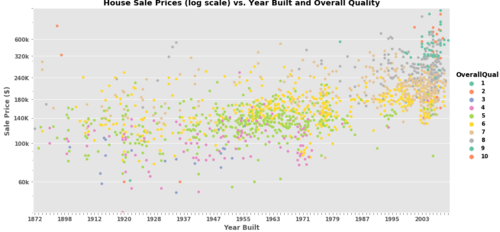
我有这个数据集:kaggle:房价:高级回归技术。我按如下方式加载了它:import numpy as npimport pandas as pdimport matplotlib.pyplot as plt%matplotlib inlineimport seaborn as snsimport scipy.stats as sttrain = pd.read_csv("train.csv")然后,我尝试使用整体质量作为色调,按年份构建绘制销售价格:plt.figure(figsize = [8, 6])sns.factorplot( x = 'YearBuilt', y = 'SalePrice', data = train, kind='swarm', hue='OverallQual', palette = 'Set2')plt.title('House Sale Prices (log scale) vs. Year Built and Overall Quality')plt.xticks([1880, 1900, 1920, 1940, 1960, 1980, 2000], ['1880', '1900', '1920', '1940', '1960', '1980', '2000'])#plt.xlim([1872,2009])plt.xlabel('Year Built')plt.yscale('log')#plt.ylim([4e4, 6e5])plt.yticks([6e4, 1e5, 1.4e5, 1.8e5, 2.4e5, 3.2e5, 4e5, 6e5], ['60k', '100k', '140K', '180k', '240K', '320k', '600k'])plt.ylabel('Sale Price ($)')plt.show()结果如下图所示:如果我包含 xlim 或 ylim,则图形根本不会显示出来。我是新手,所以任何帮助都非常感谢。
1 回答
芜湖不芜
TA贡献1796条经验 获得超7个赞
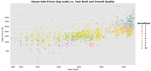
plt.style.use('ggplot')
g = sns.catplot(
x = 'YearBuilt',
y = 'SalePrice',
data = train,
kind='swarm',
hue='OverallQual',
palette = 'Set2', height=6, aspect=2)
locs, labels = plt.xticks() # use if needed, as explained below.
for axes in g.axes.flat:
for ind, label in enumerate(axes.get_xticklabels()):
if ind % 8 == 0: # every nth label is kept
label.set_visible(True)
else:
label.set_visible(False)
plt.title('House Sale Prices (log scale) vs. Year Built and Overall Quality')
plt.xlabel('Year Built')
plt.yscale('log')
plt.ylim([4e4, 6e5])
plt.yticks([6e4, 1e5, 1.4e5, 1.8e5, 2.4e5, 3.2e5, 4e5, 6e5], ['60k', '100k', '140K', '180k', '240K', '320k', '600k'])
plt.ylabel('Sale Price ($)')
plt.show()
添加回答
举报
0/150
提交
取消