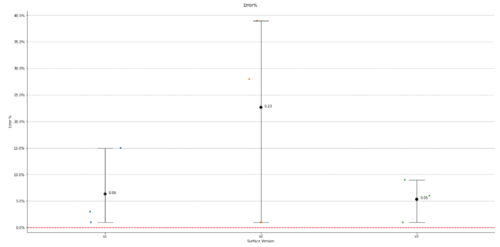
下面的代码创建一个分类图,其顶部有一个点图,其中点图显示每个类别的平均值和 95% 置信区间。我需要将平均数据标签添加到图中,但我不知道该怎么做。仅供参考,每个类别都有数千个点,因此我不想标记每个数据点,而只想标记estimator=np.mean点图中的值。这可能吗??我在此处创建了一个示例数据集,以便您可以复制并粘贴代码并自行运行。import pandas as pdimport seaborn as snsimport matplotlib.pyplot as pltimport matplotlib.ticker as mtickimport numpy as npd = {'SurfaceVersion': ['v1', 'v1', 'v1', 'v2', 'v2', 'v2', 'v3', 'v3', 'v3'], 'Error%': [.01, .03, .15, .28, .39, .01, .01, .06, .09]}df_comb = pd.DataFrame(data=d)plotHeight = 10plotAspect = 2 #create catplot with jitter per surface version:ax = sns.catplot(data=df_comb, x='SurfaceVersion', y='Error%', jitter=True, legend=False, zorder=1, height=plotHeight, aspect=plotAspect)ax = sns.pointplot(data=df_comb, x='SurfaceVersion', y='Error%', estimator=np.mean, ci=95, capsize=.1, errwidth=1, hue='SurfaceVersion', color='k',zorder=2, height=plotHeight, aspect=plotAspect, join=False)ax.yaxis.set_major_formatter(mtick.PercentFormatter(xmax=1.0))plt.gca().legend().set_title('')plt.grid(color='grey', which='major', axis='y', linestyle='--')plt.xlabel('Surface Version')plt.ylabel('Error %')plt.subplots_adjust(top=0.95, left=.05)plt.suptitle('Error%')plt.legend([],[], frameon=False) #This is to get rid of the legend that pops up with the seaborn plot b/c it's buggy.plt.axhline(y=0, color='r', linestyle='--')plt.show()
1 回答
MYYA
TA贡献1868条经验 获得超4个赞
您可以预先计算平均值并在循环中添加标签。请记住,就定位而言,x 值实际上只是 0、1、2。
mean_df = df_comb.groupby("SurfaceVersion")[["Error%"]].mean()
for i, row in enumerate(mean_df.itertuples()):
x_value, mean = row
plt.annotate(
round(mean, 2), # label text
(i, mean), # (x, y)
textcoords="offset points",
xytext=(10, 0), # (x, y) offset amount
ha='left')
添加回答
举报
0/150
提交
取消