我正在使用 Seabornviolinplot()并swarmplot()显示来自 Dataframe 的数据。Swarmplot 工作正常,但我在使用violinplot.我循环绘制了所有绘图,其中大多数都按预期显示,但少数人物没有相应的小提琴。在没有循环相同数据部分的情况下也会发生这种情况。有错误的图的 DataFrame。非常感谢您抽出时间! CDS source0 3158 nature1 2879 DTU2 2881 DTU3 3103 dairy4 2992 nature5 3127 dairy6 3127 nature7 2879 dairy8 3116 nature9 3091 nature10 3014 dairy11 3003 nature12 2951 dairy13 3161 nature14 2960 nature15 2971 nature16 3138 nature17 3153 nature18 2878 DTU19 2882 DTU20 2880 DTU21 2880 DTU22 2942 nature23 3027 dairy24 3021 dairy25 3395 nature26 3160 nature27 2997 nature28 3094 nature29 2798 nature30 3082 dairy31 3061 nature32 2912 nature33 2952 nature34 3154 nature35 3158 nature36 2980 dairy37 3069 dairy38 3080 nature39 2880 DTU40 3301 nature41 3042 nature42 3154 nature43 3034 nature44 2983 dairy45 2981 nature46 3049 nature47 3090 dairy48 2987 nature49 2828 nature50 2924 nature51 3108 dairy52 3128 nature53 3030 nature54 3120 nature55 3176 nature56 3185 nature57 3205 nature58 2987 nature59 2900 nature60 3247 nature61 3144 nature62 3092 nature63 2944 dairy64 3284 nature65 2947 nature66 3185 dairy67 2715 dairy68 2924 nature代码:for species in listofspecies: dfplot = df[df['species'].isin([species])] ax = sns.violinplot(data = dfplot, x='source', y="CDS", order=["dairy","DTU","nature"], inner=None) ax = sns.swarmplot(data = dfplot, x='source', y='CDS', order=["dairy","DTU","nature"], color=("white"), edgecolor="black", linewidth=0.7) plt.show() plt.clf()错误小提琴情节正确的:
1 回答
莫回无
TA贡献1865条经验 获得超7个赞
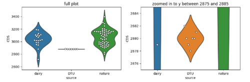
很少有数据点source == 'DTU';而且,他们的'CDS'价值观也非常接近。中央小提琴图的高度几乎为零。
有violinplot一个参数scale,默认为area。为了使所有面积相等,另外两把小提琴需要非常窄。设置scale='width'使所有小提琴具有相同的宽度:
ax = sns.violinplot(data=dfplot, x='source', y="CDS", order=["dairy", "DTU", "nature"],
                    inner=None, scale='width')
ax = sns.swarmplot(data=dfplot, x='source', y='CDS', order=["dairy", "DTU", "nature"],
                   color=("white"), edgecolor="black", linewidth=0.7, ax=ax)
左边的图像是生成的图,右边的图像放大到一个非常有限的 y 区域,集中在“CTU”小提琴图上。
添加回答
举报
0/150
提交
取消