我希望使用 k 均值聚类来绘制并返回每个聚类质心的位置。下面将两组 xy 散点分为 6 个簇。使用下面的 df,将A和B中C的坐标D绘制为散点图。我希望绘制并返回每个簇的质心。import pandas as pdimport matplotlib.pyplot as pltimport numpy as npfrom sklearn.cluster import KMeansdf = pd.DataFrame(np.random.randint(-50,50,size=(100, 4)), columns=list('ABCD'))fig, ax = plt.subplots()Y_sklearn = df[['A','B','C','D']].values model = KMeans(n_clusters = 4)model.fit(Y_sklearn)plt.scatter(Y_sklearn[:,0],Y_sklearn[:,1], c = model.labels_); plt.scatter(Y_sklearn[:,2],Y_sklearn[:,3], c = model.labels_); plt.show()
2 回答
开心每一天1111
TA贡献1836条经验 获得超13个赞
部分列表
A. 使用KMeans方法识别数据中的簇
B. 导入库
C. 虚拟数据
D. 自定义函数
E. 计算
True聚类中心KMeansF. 使用模型 定义、拟合和预测F.1。预测
y_train使用X_trainF.2。预测
y_test使用X_test
G. 用
train,test和prediction数据制作图形参考
A. 使用KMeans方法识别数据中的簇
我们将用它sklearn.cluster.KMeans来识别集群。该属性model.cluster_centers_将为我们提供预测的聚类中心。比如说,我们想找出5训练数据中X_train形状为:的簇(n_samples, n_features)和y_train形状为标签的簇:(n_samples,)。以下代码块将模型拟合到数据 ( X_train),然后进行预测y并将预测结果保存在y_pred_train变量中。
# Define model
model = KMeans(n_clusters = 5)
# Fit model to training data
model.fit(X_train)
# Make prediction on training data
y_pred_train = model.predict(X_train)
# Get predicted cluster centers
model.cluster_centers_ # shape: (n_cluster, n_features)
## Displaying cluster centers on a plot
# if you just want to add cluster centers
# to your existing scatter-plot,
# just do this --->>
cluster_centers = model.cluster_centers_
plt.scatter(cluster_centers[:, 0], cluster_centers[:, 1],
marker='s', color='orange', s = 100,
alpha=0.5, label='pred')
这就是结果⭐⭐⭐ 跳转到部分G查看用于制作绘图的代码。

B. 导入库
import numpy as np
import pandas as pd
import matplotlib.pyplot as plt
from sklearn.model_selection import train_test_split
from sklearn.datasets import make_blobs
from sklearn.cluster import KMeans
import pprint
%matplotlib inline
%config InlineBackend.figure_format = 'svg' # 'svg', 'retina'
plt.style.use('seaborn-white')
C. 虚拟数据
我们将使用以下代码块中生成的数据。根据设计,我们创建一个包含5集群和以下规范的数据集。然后使用将数据分为train和块。testsklearn.model_selection.train_test_split
## Creating data with
# n_samples = 2500
# n_features = 4
# Expected clusters = 5
# centers = 5
# cluster_std = [1.0, 2.5, 0.5, 1.5, 2.0]
NUM_SAMPLES = 2500
RANDOM_STATE = 42
NUM_FEATURES = 4
NUM_CLUSTERS = 5
CLUSTER_STD = [1.0, 2.5, 0.5, 1.5, 2.0]
TEST_SIZE = 0.20
def dummy_data():
## Creating data with
# n_samples = 2500
# n_features = 4
# Expected clusters = 5
# centers = 5
# cluster_std = [1.0, 2.5, 0.5, 1.5, 2.0]
X, y = make_blobs(
n_samples = NUM_SAMPLES,
random_state = RANDOM_STATE,
n_features = NUM_FEATURES,
centers = NUM_CLUSTERS,
cluster_std = CLUSTER_STD
)
return X, y
def test_dummy_data(X, y):
assert X.shape == (NUM_SAMPLES, NUM_FEATURES), "Shape mismatch for X"
assert set(y) == set(np.arange(NUM_CLUSTERS)), "NUM_CLUSTER mismatch for y"
## D. Create Dummy Data
X, y = dummy_data()
test_dummy_data(X, y)
## Create train-test-split
X_train, X_test, y_train, y_test = train_test_split(
X, y, test_size=TEST_SIZE, random_state=RANDOM_STATE)
D. 自定义函数
我们将使用以下3自定义函数:
get_cluster_centers()scatterplot()add_cluster_centers()
def get_cluster_centers(X, y, num_clusters=None):
"""Returns the cluster-centers as numpy.array of
shape: (num_cluster, num_features).
"""
num_clusters = NUM_CLUSTERS if (num_clusters is None) else num_clusters
return np.stack([X[y==i].mean(axis=0) for i in range(NUM_CLUSTERS)])
def scatterplot(X, y,
cluster_centers=None,
alpha=0.5,
cmap='viridis',
legend_title="Classes",
legend_loc="upper left",
ax=None):
if ax is not None:
plt.sca(ax)
scatter = plt.scatter(X[:, 0], X[:, 1],
s=None, c=y, alpha=alpha, cmap=cmap)
legend = ax.legend(*scatter.legend_elements(),
loc=legend_loc, title=legend_title)
ax.add_artist(legend)
if cluster_centers is not None:
plt.scatter(cluster_centers[:, 0], cluster_centers[:, 1],
marker='o', color='red', alpha=1.0)
ax = plt.gca()
return ax
def add_cluster_centers(true_cluster_centers=None,
pred_cluster_centers=None,
markers=('o', 's'),
colors=('red, ''orange'),
s = (None, 200),
alphas = (1.0, 0.5),
center_labels = ('true', 'pred'),
legend_title = "Cluster Centers",
legend_loc = "upper right",
ax = None):
if ax is not None:
plt.sca(ax)
for idx, cluster_centers in enumerate([true_cluster_centers,
pred_cluster_centers]):
if cluster_centers is not None:
scatter = plt.scatter(
cluster_centers[:, 0], cluster_centers[:, 1],
marker = markers[idx],
color = colors[idx],
s = s[idx],
alpha = alphas[idx],
label = center_labels[idx]
)
legend = ax.legend(loc=legend_loc, title=legend_title)
ax.add_artist(legend)
return ax
E. 计算True聚类中心
我们将计算和数据集true的聚类中心并将结果保存到: 。traintestdicttrue_cluster_centers
true_cluster_centers = {
'train': get_cluster_centers(X = X_train, y = y_train, num_clusters = NUM_CLUSTERS),
'test': get_cluster_centers(X = X_test, y = y_test, num_clusters = NUM_CLUSTERS)
}
# Show result
pprint.pprint(true_cluster_centers, indent=2)
输出:
{ 'test': array([[-2.44425795, 9.06004013, 4.7765817 , 2.02559904],
[-6.68967507, -7.09292101, -8.90860337, 7.16545582],
[ 1.99527271, 4.11374524, -9.62610383, 9.32625443],
[ 6.46362854, -5.90122349, -6.2972843 , -6.04963714],
[-4.07799392, 0.61599582, -1.82653858, -4.34758032]]),
'train': array([[-2.49685525, 9.08826 , 4.64928719, 2.01326914],
[-6.82913109, -6.86790673, -8.99780554, 7.39449295],
[ 2.04443863, 4.12623661, -9.64146529, 9.39444917],
[ 6.74707792, -5.83405806, -6.3480674 , -6.37184345],
[-3.98420601, 0.45335025, -1.23919526, -3.98642807]])}
KMeansF. 使用模型定义、拟合和预测
model = KMeans(n_clusters = NUM_CLUSTERS, random_state = RANDOM_STATE)
model.fit(X_train)
## Output
# KMeans(algorithm='auto', copy_x=True, init='k-means++', max_iter=300,
# n_clusters=5, n_init=10, n_jobs=None, precompute_distances='auto',
# random_state=42, tol=0.0001, verbose=0)
F.1。预测y_train使用X_train
## Process Prediction: train data
y_pred_train = model.predict(X_train)
# get model predicted cluster-centers
pred_train_cluster_centers = model.cluster_centers_ # shape: (n_cluster, n_features)
# sanity check
assert all([
y_pred_train.shape == (NUM_SAMPLES * (1 - TEST_SIZE),),
set(y_pred_train) == set(y_train)
])
F.2。预测y_test使用X_test
## Process Prediction: test data
y_pred_test = model.predict(X_test)
# get model predicted cluster-centers
pred_test_cluster_centers = model.cluster_centers_ # shape: (n_cluster, n_features)
# sanity check
assert all([
y_pred_test.shape == (NUM_SAMPLES * TEST_SIZE,),
set(y_pred_test) == set(y_test)
])
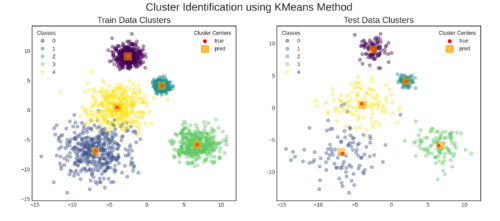
G. 用train,test和prediction数据制作图形
fig, axs = plt.subplots(nrows=1, ncols=2, figsize=(15, 6))
FONTSIZE = {'title': 16, 'suptitle': 20}
TITLE = {
'train': 'Train Data Clusters',
'test': 'Test Data Clusters',
'suptitle': 'Cluster Identification using KMeans Method',
}
CENTER_LEGEND_LABELS = ('true', 'pred')
LAGEND_PARAMS = {
'data': {'title': "Classes", 'loc': "upper left"},
'cluster_centers': {'title': "Cluster Centers", 'loc': "upper right"}
}
SCATTER_ALPHA = 0.4
CMAP = 'viridis'
CLUSTER_CENTER_PLOT_PARAMS = dict(
markers = ('o', 's'),
colors = ('red', 'orange'),
s = (None, 200),
alphas = (1.0, 0.5),
center_labels = CENTER_LEGEND_LABELS,
legend_title = LAGEND_PARAMS['cluster_centers']['title'],
legend_loc = LAGEND_PARAMS['cluster_centers']['loc']
)
SCATTER_PLOT_PARAMS = dict(
alpha = SCATTER_ALPHA,
cmap = CMAP,
legend_title = LAGEND_PARAMS['data']['title'],
legend_loc = LAGEND_PARAMS['data']['loc'],
)
## plot train data
data_label = 'train'
ax = axs[0]
plt.sca(ax)
ax = scatterplot(X = X_train, y = y_train,
cluster_centers = None,
ax = ax, **SCATTER_PLOT_PARAMS)
ax = add_cluster_centers(
true_cluster_centers = true_cluster_centers[data_label],
pred_cluster_centers = pred_train_cluster_centers,
ax = ax, **CLUSTER_CENTER_PLOT_PARAMS)
plt.title(TITLE[data_label], fontsize = FONTSIZE['title'])
## plot test data
data_label = 'test'
ax = axs[1]
plt.sca(ax)
ax = scatterplot(X = X_test, y = y_test,
cluster_centers = None,
ax = ax, **SCATTER_PLOT_PARAMS)
ax = add_cluster_centers(
true_cluster_centers = true_cluster_centers[data_label],
pred_cluster_centers = pred_test_cluster_centers,
ax = ax, **CLUSTER_CENTER_PLOT_PARAMS)
plt.title(TITLE[data_label], fontsize = FONTSIZE['title'])
plt.suptitle(TITLE['suptitle'],
fontsize = FONTSIZE['suptitle'])
plt.show()
# save figure
fig.savefig("kmeans_fit_result.png", dpi=300)
结果:
繁星点点滴滴
TA贡献1803条经验 获得超3个赞
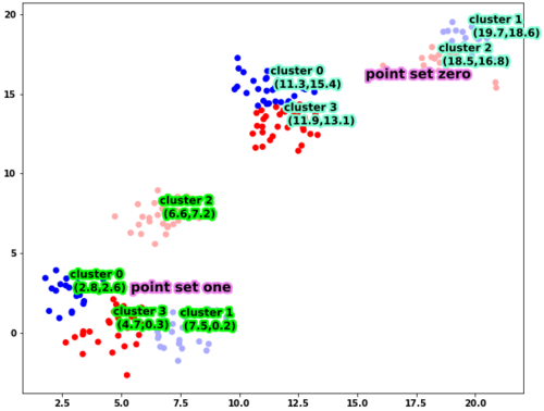
根据你制作散点图的方式,我猜测A和B对应于第一组点的xy坐标,而C和D对应于第二组点的xy坐标。如果是这样,则无法Kmeans直接应用于数据框,因为只有两个特征,即 x 和 y 坐标。找到质心实际上很简单,你所需要的就是model_zero.cluster_centers_。
我们首先构建一个更适合可视化的数据框
import numpy as np
# set the seed for reproducible datasets
np.random.seed(365)
# cov matrix of a 2d gaussian
stds = np.eye(2)
# four cluster means
means_zero = np.random.randint(10,20,(4,2))
sizes_zero = np.array([20,30,15,35])
# four cluster means
means_one = np.random.randint(0,10,(4,2))
sizes_one = np.array([20,20,25,35])
points_zero = np.vstack([np.random.multivariate_normal(mean,stds,size=(size)) for mean,size in zip(means_zero,sizes_zero)])
points_one = np.vstack([np.random.multivariate_normal(mean,stds,size=(size)) for mean,size in zip(means_one,sizes_one)])
all_points = np.hstack((points_zero,points_one))
正如您所看到的,这四个簇是由具有不同均值的四个高斯分布的采样点构建的。使用此数据框,您可以按照以下方式绘制它
import matplotlib.patheffects as PathEffects
from sklearn.cluster import KMeans
df = pd.DataFrame(all_points, columns=list('ABCD'))
fig, ax = plt.subplots(figsize=(10,8))
scatter_zero = df[['A','B']].values
scatter_one = df[['C','D']].values
model_zero = KMeans(n_clusters=4)
model_zero.fit(scatter_zero)
model_one = KMeans(n_clusters=4)
model_one.fit(scatter_one)
plt.scatter(scatter_zero[:,0],scatter_zero[:,1],c=model_zero.labels_,cmap='bwr');
plt.scatter(scatter_one[:,0],scatter_one[:,1],c=model_one.labels_,cmap='bwr');
# plot the cluster centers
txts = []
for ind,pos in enumerate(model_zero.cluster_centers_):
txt = ax.text(pos[0],pos[1],
'cluster %i \n (%.1f,%.1f)' % (ind,pos[0],pos[1]),
fontsize=12,zorder=100)
txt.set_path_effects([PathEffects.Stroke(linewidth=5, foreground="aquamarine"),PathEffects.Normal()])
txts.append(txt)
for ind,pos in enumerate(model_one.cluster_centers_):
txt = ax.text(pos[0],pos[1],
'cluster %i \n (%.1f,%.1f)' % (ind,pos[0],pos[1]),
fontsize=12,zorder=100)
txt.set_path_effects([PathEffects.Stroke(linewidth=5, foreground="lime"),PathEffects.Normal()])
txts.append(txt)
zero_mean = np.mean(model_zero.cluster_centers_,axis=0)
one_mean = np.mean(model_one.cluster_centers_,axis=0)
txt = ax.text(zero_mean[0],zero_mean[1],
'point set zero',
fontsize=15)
txt.set_path_effects([PathEffects.Stroke(linewidth=5, foreground="violet"),PathEffects.Normal()])
txts.append(txt)
txt = ax.text(one_mean[0],one_mean[1],
'point set one',
fontsize=15)
txt.set_path_effects([PathEffects.Stroke(linewidth=5, foreground="violet"),PathEffects.Normal()])
txts.append(txt)
plt.show()
运行这段代码,你会得到
添加回答
举报
0/150
提交
取消