

-
border-color默认是color的设置 <!DOCTYPE html> <html> <head></head> <style> .add{ display: block; width: 100px; height: 100px; position: relative; color: #ccc; transition: color .25s; border: 1px solid; } .add:before { content: ""; width: 80px; position: absolute; left: 10px; top: 45px; border-top:10px solid; } .add:after { content: ""; height: 80px; position: absolute;; left: 45px; top: 10px; border-left: 10px solid; } .add:hover { color: #067; } </style> <body> <div > </div> <p></p> <a class="add" href="javascript:"></a> </body> </html>查看全部
-
border-width不支持百分比值:语义和使用场景决定,边框不会因设备大小而变化 类似:outline,box-shadow,text-shadow,... border-width支持关键字thin,medium,thick,默认medium:3px,用的最多是thin:1px,因为border-style:double至少3px才有效果查看全部
-
border-style
1、border-style:solid; 实线
2、border-style:dashed; 虚线
3、border-style:dotted; 点线
<!DOCTYPE html>
<html>
    <head>
    <meta charset="UTF-8">
    <title>Document</title>
    <style>
        .radius_container {
        position: relative;
        }
        .box {
        position: absolute;
        width: 150px;
        height: 150px;
        overflow: hidden;
        }
        .dotted {
        width: 100%;
        height: 100%;
        border: 150px dotted #EF2424;
        }
        .radius-right_top {
        top: 0;
        left: 400px;
        }
        .radius_right_bottom {
        left: 400px;
        top: 200px;
        }
        .radius_left_bottom {
        left: 0;
        top: 200px;
        }
        .row {
        position: absolute;
        top: 75px;
        width: 550px;
        height: 200px;
        background: rgba(30,50,190,0.5);
        color: #ffffff;
        z-index: 3;
        font-size: 100px;
        line-height: 200px;
        text-align: center;
        }
        .col {
        position: absolute;
        left: 75px;
        width: 400px;
        height: 350px;
        background: rgba(30,50,190,0.5);
        z-index: 2;
        }
    </style>
    </head>
    <body>
        <div class="radius_container">
            <div class="row">按钮</div>
            <div class="col"></div>
            <div class="box">
                <div class="dotted"></div>
            </div>
            <div class="box radius-right_top">
                <div class="dotted"></div>
            </div>
            <div class="box radius_right_bottom">
                <div class="dotted"></div>
            </div>
            <div class="box radius_left_bottom">
                <div class="dotted"></div>
            </div>
        </div>
    </body>
</html>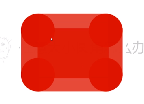
4、border-style:double; 双线(兼容性非常好)
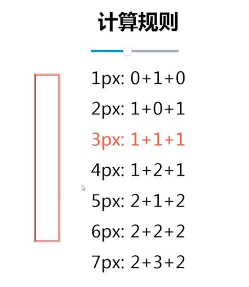
规律:双线宽度永远相等,中间间隔±1
<!DOCTYPE html>
<html>
<head>
<meta charset="UTF-8">
<title>Document</title>
<style>
/*border-style设为double,实现三道杠*/
.double {
width: 120px;
height: 20px;
background: rgba(0,0,0,0.1);
border-top: 60px double #CE2424;
border-bottom: 20px solid #CE2424;
}
</style>
</head>
<body>
<!-- border-style设为double,实现三道杠 -->
<div class="double"></div>
</body>
</html>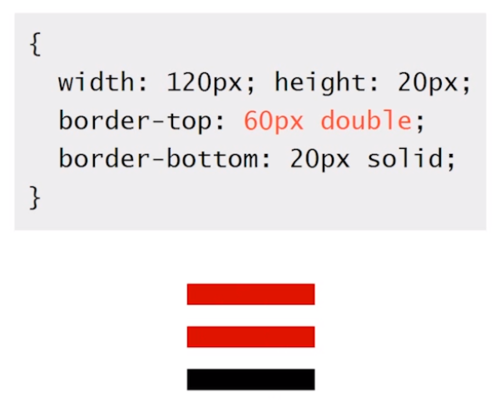
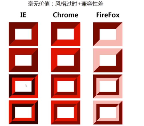
5、border-style:inset; 内凹(风格过时,兼容性差)
6、border-style:outset; 外凸(风格过时,兼容性差)
7、border-style:groove; 沟槽(风格过时,兼容性差)
8、border-style:ridge; 山脊(风格过时,兼容性差)
 查看全部
查看全部 -
border-color默认颜色就是color,类似的还有box-shadow,text-shadow
查看全部 -
border-width不支持百分比:没有因为设备变化而变化的特性,类似的还有outline,box-shadow,text-shadow
查看全部 -
实现梯形:
.triangle{
    width:100px;height:100px;
    border:100px solid:
    border-color:red green blue orange;
}
实现三角形
.triangle{
    width:0;height:0;
    border:100px solid:
    border-color:red transparent transparent transparent ;
}
梯形:
.triangle{
    width:400px;
    border:100px solid:
    border-color:transparent  transparent red ;
}
border:制作圆角,原理:用上下两个梯形拼接而成,可以兼容ie6,7,8
查看全部 -
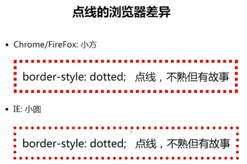
border-style: dotted在chrome和IE下是有区别的。
查看全部 -
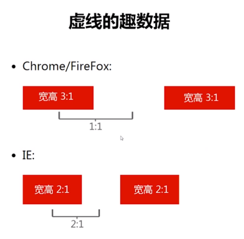
实线 border-style:solid; 虚线 border-style:dashed; chrome/firefox: 宽3:高1 视觉上较稀疏 IE: 宽2:高1 视觉上较密集 点线 border-style:dotted; chrome/firefox: 小方 IE: 小圆
查看全部 -
border-style : solid(实线) | dashed(虚线) | dotted(点线) | double(双实线) | inset(内凹) | outset(外凸) | groove(沟槽) | ridge(山脊)
查看全部 -
<!DOCTYPE html>
<html>
<head></head>
<style>
.add{
	display: block;
	width: 100px;
	height: 100px;
	position: relative;
	color: #ccc;
	transition: color .25s;
	border: 1px solid;
}
.add:before {
	content: "";
	width: 80px;
	position: absolute;
	left: 10px;
	top: 45px;
	border-top:10px solid;
}
.add:after {
	content: "";
	height: 80px;
	position: absolute;;
	left: 45px;
	top: 10px;
	border-left: 10px solid;
}
.add:hover {
	color: #067;
}
</style>
<body>
<div >
</div>
<p></p>
<a class="add" href="javascript:"></a>
</body>
</html>
查看全部 -
了解各种border-style类型。 实线 border-style:solid; 虚线 border-style:dashed; chrome/firefox: 宽3:高1 视觉上较稀疏 IE: 宽2:高1 视觉上较密集 点线 border-style:dotted; chrome/firefox: 小方 IE: 小圆查看全部
-
border-style类型:solid(实线)、dashed(虚线)^虚线边框在谷歌火狐中宽高比例为3/1、IE中为2/1、dotted(点线)^点线在火狐谷歌中为方形 IE中为圆形(通过文本溢出隐藏可以做圆角效果)、double(双线)^计算规则为双线宽度永远相等中间区域+1或-1、查看全部
-
border宽度不可使用百分比,受此限制,无法用于百分比布局需要; boder-color属性可继承color,因此可用于一次性优化多个布局; border可以透明,transparent属性,可利用此属性生成三角或者梯形; border-style中的double及dotted可用于创建三条短线样式、圆。 border以及background配合使用,可以定位背景图片至右侧。(backgroud-positon默认相对左上角)查看全部
-
/*完整代码:使用梯形叠加实现伪圆角效果*/ <!DOCTYPE html> <html lang="en"> <head> <meta charset="UTF-8"> <title>Document</title> <style> .box{ width:600px; height:200px; background:red; } .border{ width:580px;height:50px; border:10px solid; } .top{ border-color:transparent transparent red; } .bottom{ border-color:red transparent transparent; } </style> </head> <body> <div class="top border"></div> <div class="box"></div> <div class="bottom border"></div> </body> </html>查看全部
-
上下梯形做圆角查看全部


举报