


 如风般魅影 ·
grid-template|auto/rows(行)|columns (列)
开始学习 Grid 要做的第一件事情就是划格子,本章主要给大家讲解如何画格子。掌握好这个掌握好这个技能是学习 Grid 布局的基础。
1. 官方定义
grid-template-columns 该属性是基于 网格列. 的维度,去定义网格线的名称和网格轨道的尺寸大小。
grid-template-rows 该属性是基于 网格行 的维度,去定义网格线的名称和网格轨道的尺寸大小。
repeat() 函数表示轨道列表的重复片段,允许以更紧凑的形式写入大量显示重复模式的列或行。
auto-fill和 auto-fit 属性规定如何填充列(是否进行协调)。
fr fr 单位被用于在一系列长度值中分配剩余空间,如果多个已指定了多个部分,则剩下的空间根据各自的数字按比例分配。
minmax() 定义了一个长宽范围的闭区间, 它与 CSS 网格布局一起使用。
grid-auto-columns 指定了隐式创建的网格纵向轨道(track)的宽度
grid-auto-rows 用于指定隐式创建的行轨道大小。
2. 慕课解释
grid-template-columns 网格的列的宽度,我们可以理解为项目的宽度,这样更容易学习。
grid-template-rows 网格行的高度,我们同样可以理解为项目的高度。
grid-auto-columns 超出定义的列后,多于没有定义的列宽。
grid-auto-rows 超出定义的行后,多于的行高。
repeat(number,length) 这是 Grid 布局中用到的函数它接受两个参数分别是 number 代表重复数量和 length代表宽度或高度的值。它也可以代表重复的模式,例如 repeat(2, 100px 200px 300px)实际就是 100px 200px 300px 100px 200px 300px。
auto-fill 如同它字面的意思,自动规划多余空间内项目填充,这里要注意的是它和 auto 自适应宽度是不同的。
auto-fit
fr 代表倍数关系,它数字部分都是整数例如 1fr 2fr 后面是前面的两倍。
minmax() 代表一个长度范围例如 minmax(10px, 100px) 就是这个长度是 10px ~ 100px 之间。
3. 语法
grid-template-columns:none | px | % | em| rem | fr | auto| minmax(min,max) | auto| repeat;
grid-template-rows:none | px | % | em| rem | fr | auto| minmax(min,max) | auto| repeat;
grid-auto-columns:none | px | % | em| rem | fr | auto| minmax(min,max) | auto| ;
grid-auto-rows:none | px | % | em| rem | fr | auto| minmax(min,max) | auto| ;
说明:grid-template-columns 和 grid-template-rows 接受多个值,并且它们可以混合使用。grid-auto-columns 和 grid-auto-rows 接受 1 个值。
函数语法:
grid-template-rows:repeat(2,10px 1rem 1em,1fr)
说明:repeat的意思是重复,上面的意思每 4 行的高度分别是 10px 1rem 1em,1fr 一共重复 2 次,共 8 行。
grid-template-rows: 100px minmax(40px,60px)
说明:minmax 的意思是取最大和最小,上面的意思是第 2 行的高度最小是 40px 最大是 60px.
4. 兼容性
| IE | Edge | Firefox | Chrome | Safari | Opera | ios | android |
|---|---|---|---|---|---|---|---|
| No | 16+ | 52+ | 57+ | 10.1+ | 44+ | 10.3+ | 81 |
5. 实例
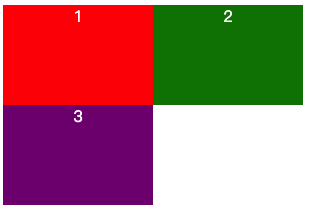
none不明确网格,列数和宽度行数和高度都由grid-auto-flow属性隐式指定。这样写他们将排成1列因为我们没有规定列宽。
<div class="demo">
    <div class="item">1</div>
    <div class="item">2</div>
    <div class="item">3</div>
    <div class="item">4</div>
</div>
.demo{
    display:grid;
    grid-template-columns: none;
    grid-template-rows:none;
    grid-auto-columns: 100px;
    grid-auto-rows: 50px;
    color:#fff;
    text-align: center;
}
效果图
<!DOCTYPE html>
<html lang="en">
<head>
    <meta charset="UTF-8">
    <meta name="viewport" content="width=device-width, initial-scale=1.0">
    <title>Document</title>
    <style>
        .demo{
            display:grid;
            grid-template-columns: 100px 100px;
            grid-template-rows:none;
            grid-auto-rows: 50px;
            color:#fff;
            text-align: center;
        }
        .item:nth-of-type(1){
            background: red;
        }
        .item:nth-of-type(2){
            background: green;
        }
        .item:nth-of-type(3){
            background: purple;
        }
        .item:nth-of-type(4){
            background: yellowgreen;
        }
    </style>
</head>
<body>
    <div class="demo">
        <div class="item">1</div>
        <div class="item">2</div>
        <div class="item">3</div>
        <div class="item">4</div>
    </div>
</body>
</html>
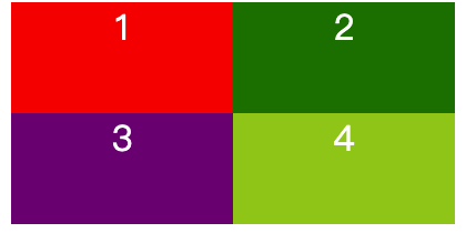
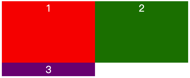
- 设置一个左 100px 右侧自适应的左右布局。
<div class="demo">
    <div class="item">1</div>
    <div class="item">2</div>
</div>
.demo{
    display:grid;
    grid-template-columns: 100px auto;
    color:#fff;
    text-align: center;
}
效果图

<!DOCTYPE html>
<html lang="en">
<head>
    <meta charset="UTF-8">
    <meta name="viewport" content="width=device-width, initial-scale=1.0">
    <title>Document</title>
    <style>
        .demo{
            display:grid;
            grid-template-columns: 100px auto;
            color:#fff;
            text-align: center;
        }
        .item:nth-of-type(1){
            background: red;
        }
        .item:nth-of-type(2){
            background: green;
        }
    </style>
</head>
<body>
    <div class="demo">
        <div class="item">1</div>
        <div class="item">2</div>
    </div>
</body>
</html>
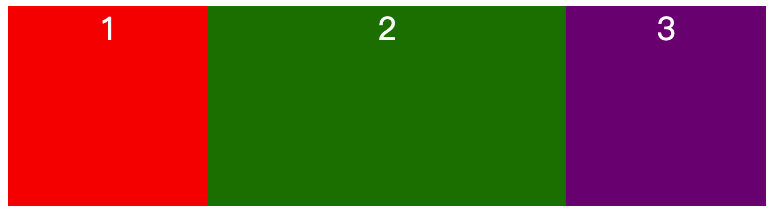
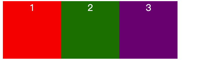
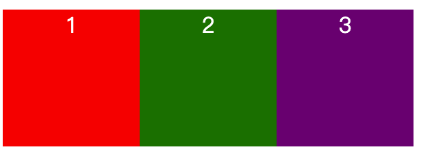
- 设置一个左 100px 中自适应右侧 100px 的左中右布局。
<div class="demo">
    <div class="item">1</div>
    <div class="item">2</div>
    <div class="item">3</div>
</div>
.demo{
    display:grid;
    grid-template-columns: 100px auto 100px;
    color:#fff;
    text-align: center;
}
效果图

<!DOCTYPE html>
<html lang="en">
<head>
    <meta charset="UTF-8">
    <meta name="viewport" content="width=device-width, initial-scale=1.0">
    <title>Document</title>
    <style>
        .demo{
            display:grid;
            grid-template-columns: 100px auto 100px;
            color:#fff;
            text-align: center;
        }
        .item:nth-of-type(1){
            background: red;
        }
        .item:nth-of-type(2){
            background: green;
        }
        .item:nth-of-type(3){
            background: purple;
        }
    </style>
</head>
<body>
    <div class="demo">
        <div class="item">1</div>
        <div class="item">2</div>
        <div class="item">3</div>
    </div>
</body>
</html>
- 为上面的布局设置一个固定的行高。
.demo{
    display:grid;
    grid-template-columns: 100px auto 100px;
    grid-template-rows: 100px;
    color:#fff;
    text-align: center;
}
效果图
<!DOCTYPE html>
<html lang="en">
<head>
    <meta charset="UTF-8">
    <meta name="viewport" content="width=device-width, initial-scale=1.0">
    <title>Document</title>
    <style>
        .demo{
            display:grid;
            grid-template-columns: 100px auto 100px;
            grid-template-rows:100px;
            color:#fff;
            text-align: center;
        }
        .item:nth-of-type(1){
            background: red;
        }
        .item:nth-of-type(2){
            background: green;
        }
        .item:nth-of-type(3){
            background: purple;
        }
    </style>
</head>
<body>
    <div class="demo">
        <div class="item">1</div>
        <div class="item">2</div>
        <div class="item">3</div>
    </div>
</body>
</html>
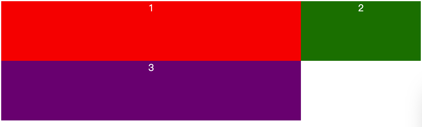
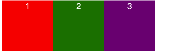
- 修改上面的布局为两列,其中只设定一行高度。
.demo{
    display:grid;
    grid-template-columns: 150px 150px;
    grid-template-rows: 100px;
    color:#fff;
    text-align: center;
}
效果图
<!DOCTYPE html>
<html lang="en">
<head>
    <meta charset="UTF-8">
    <meta name="viewport" content="width=device-width, initial-scale=1.0">
    <title>Document</title>
    <style>
        .demo{
            display:grid;
            grid-template-columns: 150px 150px;
            grid-template-rows: 100px;
            color:#fff;
            text-align: center;
        }
        .item:nth-of-type(1){
            background: red;
        }
        .item:nth-of-type(2){
            background: green;
        }
        .item:nth-of-type(3){
            background: purple;
        }
    </style>
</head>
<body>
    <div class="demo">
        <div class="item">1</div>
        <div class="item">2</div>
        <div class="item">3</div>
    </div>
</body>
</html>
说明:我们容器里面有 3 个项目 而只设定了第一行的高度因此,第 2 行的高度是文字撑开的高度。
- 让每行的高度为 100px 。
.demo{
    display:grid;
    grid-template-columns: 150px 150px;
    grid-auto-rows: 100px;
    color:#fff;
    text-align: center;
}
效果图
<!DOCTYPE html>
<html lang="en">
<head>
    <meta charset="UTF-8">
    <meta name="viewport" content="width=device-width, initial-scale=1.0">
    <title>Document</title>
    <style>
        .demo{
            display:grid;
            grid-template-columns: 150px 150px;
            grid-auto-rows:100px;
            color:#fff;
            text-align: center;
        }
        .item:nth-of-type(1){
            background: red;
        }
        .item:nth-of-type(2){
            background: green;
        }
        .item:nth-of-type(3){
            background: purple;
        }
    </style>
</head>
<body>
    <div class="demo">
        <div class="item">1</div>
        <div class="item">2</div>
        <div class="item">3</div>
    </div>
</body>
</html>
- 使用
minmax()让其第二列的宽度在 100px 到 200px 之间。
.demo{
    display:grid;
    grid-template-columns: 500px minmax(100px,200px);
    grid-auto-rows: 100px;
    color:#fff;
    text-align: center;
}
效果图
<!DOCTYPE html>
<html lang="en">
<head>
    <meta charset="UTF-8">
    <meta name="viewport" content="width=device-width, initial-scale=1.0">
    <title>Document</title>
    <style>
        .demo{
            display:grid;
            grid-template-columns: 500px minmax(100px,200px);
            grid-auto-rows:100px;
            color:#fff;
            text-align: center;
        }
        .item:nth-of-type(1){
            background: red;
        }
        .item:nth-of-type(2){
            background: green;
        }
        .item:nth-of-type(3){
            background: purple;
        }
    </style>
</head>
<body>
    <div class="demo">
        <div class="item">1</div>
        <div class="item">2</div>
        <div class="item">3</div>
    </div>
</body>
</html>
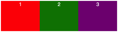
- 使用
fr把容器分为 3 等列。
.demo{
    display:grid;
    grid-template-columns: 1fr 1fr 1fr;
    grid-auto-rows: 100px;
    color:#fff;
    text-align: center;
}
效果图
也可以用小数。
.demo{
    display:grid;
    grid-template-columns: 1fr 1fr .5fr;
    grid-auto-rows: 100px;
    color:#fff;
    text-align: center;
}
效果图
<!DOCTYPE html>
<html lang="en">
<head>
    <meta charset="UTF-8">
    <meta name="viewport" content="width=device-width, initial-scale=1.0">
    <title>Document</title>
    <style>
        .demo{
            display:grid;
            grid-template-columns: 1fr 1fr .5fr;
            grid-auto-rows:100px;
            color:#fff;
            text-align: center;
        }
        .item:nth-of-type(1){
            background: red;
        }
        .item:nth-of-type(2){
            background: green;
        }
        .item:nth-of-type(3){
            background: purple;
        }
    </style>
</head>
<body>
    <div class="demo">
        <div class="item">1</div>
        <div class="item">2</div>
        <div class="item">3</div>
    </div>
</body>
</html>
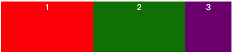
- 使用 repeat 函数。
.demo{
            display:grid;
    grid-template-columns: repeat(3,100px);
    grid-auto-rows:100px;
    color:#fff;
    text-align: center;

}
效果图
<!DOCTYPE html>
<html lang="en">
<head>
    <meta charset="UTF-8">
    <meta name="viewport" content="width=device-width, initial-scale=1.0">
    <title>Document</title>
    <style>
        .demo{
            display:grid;
            grid-template-columns: repeat(3,100px);
            grid-auto-rows:100px;
            color:#fff;
            text-align: center;

        }
        .item:nth-of-type(1){
            background: red;
        }
        .item:nth-of-type(2){
            background: green;
        }
        .item:nth-of-type(3){
            background: purple;
        }
    </style>
</head>
<body>
    <div class="demo">
        <div class="item">1</div>
        <div class="item">2</div>
        <div class="item">3</div>
    </div>
</body>
</html>
auto-fill自动填充规划剩余空间的项目
.demo{
    display:grid;
    grid-template-columns: repeat(auto-fill,100px);
    grid-auto-rows:100px;
    color:#fff;
    text-align: center;

}
效果图
<!DOCTYPE html>
<html lang="en">
<head>
    <meta charset="UTF-8">
    <meta name="viewport" content="width=device-width, initial-scale=1.0">
    <title>Document</title>
    <style>
        .demo{
            display:grid;
            grid-template-columns: repeat(auto-fill,100px);
            grid-auto-rows:100px;
            color:#fff;
            text-align: center;

        }
        .item:nth-of-type(1){
            background: red;
        }
        .item:nth-of-type(2){
            background: green;
        }
        .item:nth-of-type(3){
            background: purple;
        }
    </style>
</head>
<body>
    <div class="demo">
        <div class="item">1</div>
        <div class="item">2</div>
        <div class="item">3</div>
    </div>
</body>
</html>
auto-fit自动规划多余空间。
.demo{
    display:grid;
    grid-template-columns: repeat(auto-fit,100px);
    grid-auto-rows:100px;
    color:#fff;
    text-align: center;

}
效果图
<!DOCTYPE html>
<html lang="en">
<head>
    <meta charset="UTF-8">
    <meta name="viewport" content="width=device-width, initial-scale=1.0">
    <title>Document</title>
    <style>
        .demo{
            display:grid;
            grid-template-columns: repeat(auto-fit,100px);
            grid-auto-rows:100px;
            color:#fff;
            text-align: center;

        }
        .item:nth-of-type(1){
            background: red;
        }
        .item:nth-of-type(2){
            background: green;
        }
        .item:nth-of-type(3){
            background: purple;
        }
    </style>
</head>
<body>
    <div class="demo">
        <div class="item">1</div>
        <div class="item">2</div>
        <div class="item">3</div>
        <div class="item">3</div>
        <div class="item">3</div>
        <div class="item">3</div>
    </div>
</body>
</html>
小结
auto-fill和auto-fit虽然都是自动画出布局,但是还是有一定区别:
假如一个容器内有 3 个项目 这时候有多余的空间可以去填 4 个项目,auto-fill会在剩余空间画一个空的项目位置,而auto-fit则不会。fr可以和其它的数值混用,例如:
.demo{
    grid-template-columns: 1fr 1fr 20px 1rem;
}
3 minmax() 中的值也可以使用 fr,例如:
.demo{
    grid-template-columns: minmax(1fr,2fr);
}
它们的规则是一个范围,左边是最小值,右侧是最大值。
repeat()函数用来设定 Grid 重复的轨道,内部同样可以嵌套多个值,例如:
repeat() 和 minmax() 一起使用:
.demo{
    grid-template-columns:repeat(3,minmax(10px,20px) 10px 30px);
}

Copyright 2026 imooc.com All Rights Reserved |
京ICP备12003892号-11 京公网安备11010802030151号
2026 imooc.com All Rights Reserved |
京ICP备12003892号-11 京公网安备11010802030151号