


 手撕红黑树 ·
这节课我们把案例放在最前面,供大家直接观看效果。
这么做的原因一方面是考虑到有些同学可能前面都没看完,直接就翻到最后一节看看写的是什么。
另一方面是本节课案例较为复杂,防止大家看的晕了就不想继续往下看了,所以先把例子直接放在前面:
1. 定义条形雪碧图动画
/* 清除浏览器默认边距 */
* { padding: 0; margin: 0; }

body {
  /* 这段代码是为了居中显示,不是重点,看不懂的话可以无视 */
  height: 100vh;
  display: flex;
  align-items: center;
  justify-content: center;

  /* 添加背景图 */
  background: url(../img/bg.jpg) center / cover;
}

.animate {
  width: 130px;
  height: 130px;
  background: url(../img/rect.png);

  /* 动画: 动画名(loading) 时长(0.6秒) 运行方式(step-end) 动画次数(无限) */
  animation: loading .6s step-end infinite;
}

/* 定义动画:动画名(loading) */
@keyframes loading {
  from { background-position: 0 0 } /* 第一个数字代表x轴坐标,第二个数字代表y轴坐标 */
  10% { background-position: -130px 0 } /* x坐标:-130 y坐标:0 */
  20% { background-position: -260px 0 }	/* x坐标:-260 y坐标:0 */
  30% { background-position: -390px 0 }	/* x坐标:-390 y坐标:0 */
  40% { background-position: -520px 0 }	/* x坐标:-520 y坐标:0 */
  50% { background-position: 0 -130px }	/* x坐标:0 y坐标:-130 */
  60% { background-position: -130px -130px } /* x坐标:-130 y坐标:-130 */
  70% { background-position: -260px -130px } /* x坐标:-260 y坐标:-130 */
  80% { background-position: -390px -130px } /* x坐标:-390 y坐标:-130 */
  90% { background-position: -520px -130px } /* x坐标:-520 y坐标:-130 */
  to { background-position: 0 } /* 最后一帧不显示,可以随便写 */
}

/* 定义动画:动画名(animate) */
@keyframes animate {
  from { background-position: 0 }
  to { background-position: -2600px }
}
咦?条形图只需要定义两行?一个from一个to???
是的,这就是为什么推荐制作雪碧图的时候做成一行的原因。
你只需要定义一开始的时候图像在原点,然后最后的时候图像有多宽,你就写负多少:
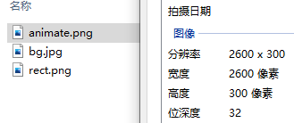
这个图是2600像素,所以to里面的background-position就是 -2600px。
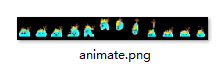
数了一下这张雪碧图里面一共有 12 个元素,所以 steps() 括号里面要写12。
div 盒子的宽高应该正好和雪碧图里面的一个元素的宽高相对应:用雪碧图的 宽 2600 除以 12 等于 216.666… 无限循环。
咱们取一个近似值,就 216px 吧。
所以宽高设置为 216 * 300,怎么设置呢?要让加载动画结束之后(也就是定义加载动画的最后一帧)div 就变成这个宽高。
/* 清除浏览器默认边距 */
* { padding: 0; margin: 0; }

body {
  /* 这段代码是为了居中显示,不是重点,看不懂的话可以无视 */
  height: 100vh;
  display: flex;
  align-items: center;
  justify-content: center;

  /* 添加背景图 */
  background: url(../img/bg.jpg) center / cover;
}

.animate {
  width: 130px;
  height: 130px;
  background: url(../img/rect.png);

  /* 动画: 动画名(loading) 时长(0.6秒) 运行方式(step-end) 动画次数(无限) */
  animation: loading .6s step-end infinite;
}

/* 定义动画:动画名(loading) */
@keyframes loading {
  from { background-position: 0 0 } /* 第一个数字代表x轴坐标,第二个数字代表y轴坐标 */
  10% { background-position: -130px 0 } /* x坐标:-130 y坐标:0 */
  20% { background-position: -260px 0 }	/* x坐标:-260 y坐标:0 */
  30% { background-position: -390px 0 }	/* x坐标:-390 y坐标:0 */
  40% { background-position: -520px 0 }	/* x坐标:-520 y坐标:0 */
  50% { background-position: 0 -130px }	/* x坐标:0 y坐标:-130 */
  60% { background-position: -130px -130px } /* x坐标:-130 y坐标:-130 */
  70% { background-position: -260px -130px } /* x坐标:-260 y坐标:-130 */
  80% { background-position: -390px -130px } /* x坐标:-390 y坐标:-130 */
  90% { background-position: -520px -130px } /* x坐标:-520 y坐标:-130 */

  /* 修改最后一帧,以便动画结束后盒子就应用最后一帧的样式 */
  to {
    /* 下一个动画的宽高 */
    width: 216px;
    height: 300px;

    /* 下一个动画的雪碧图 */
    background-image: url(../img/animate.png);
  }
}

/* 定义动画:动画名(animate) */
@keyframes animate {
  from { background-position: 0 }
  to { background-position: -2600px }
}
2. 调用两个动画
重点是如何进行调用,先来看一下语法:
/* 清除浏览器默认边距 */
* { padding: 0; margin: 0; }

body {
  /* 这段代码是为了居中显示,不是重点,看不懂的话可以无视 */
  height: 100vh;
  display: flex;
  align-items: center;
  justify-content: center;

  /* 添加背景图 */
  background: url(../img/bg.jpg) center / cover;
}

.animate {
  width: 130px;
  height: 130px;
  background: url(../img/rect.png);

  /* 动画: 动画名(loading) 时长(0.6秒) 运行方式(step-end) 动画次数(3次) 填充模式(双向) */
  animation: loading .6s step-end 3 both, /* 动画可以定义多个,每个动画用逗号分隔。*/
  /* 第二个动画的动画名(animate) 时长(0.8秒) 运行方式(step-end) 延时(1.8秒) 动画次数(无限) */
             animate .8s steps(12) 1.8s infinite;
}

/* 定义动画:动画名(loading) */
@keyframes loading {
  from { background-position: 0 0 } /* 第一个数字代表x轴坐标,第二个数字代表y轴坐标 */
  10% { background-position: -130px 0 } /* x坐标:-130 y坐标:0 */
  20% { background-position: -260px 0 }	/* x坐标:-260 y坐标:0 */
  30% { background-position: -390px 0 }	/* x坐标:-390 y坐标:0 */
  40% { background-position: -520px 0 }	/* x坐标:-520 y坐标:0 */
  50% { background-position: 0 -130px }	/* x坐标:0 y坐标:-130 */
  60% { background-position: -130px -130px } /* x坐标:-130 y坐标:-130 */
  70% { background-position: -260px -130px } /* x坐标:-260 y坐标:-130 */
  80% { background-position: -390px -130px } /* x坐标:-390 y坐标:-130 */
  90% { background-position: -520px -130px } /* x坐标:-520 y坐标:-130 */

  /* 修改最后一帧,以便动画结束后盒子就应用最后一帧的样式 */
  to {
    /* 下一个动画的宽高 */
    width: 216px;
    height: 300px;

    /* 下一个动画的雪碧图 */
    background-image: url(../img/animate.png);
  }
}

/* 定义动画:动画名(animate) */
@keyframes animate {
  from { background-position: 0 }
  to { background-position: -2600px }
}
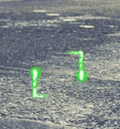
运行结果:
这是怎么个原理呢?原来调用动画的时候可以一次性调用多个动画,动画与动画直接用逗号进行分隔。
第一个加载动画我们让他重复运行 3 次,由于下一个动画的背景图和宽高都和加载动画不同,所以调用第一个动画时用填充模式将最后一帧定义的样式应用到下个动画上。
3. 调节雪碧图尺寸
不过感觉最后这个跳动的卡通小人还是有点大,像素颗粒感明显,所以我们绝定缩小一下加载动画最后一帧给定的宽高:
/* 清除浏览器默认边距 */
* { padding: 0; margin: 0; }

body {
  /* 这段代码是为了居中显示,不是重点,看不懂的话可以无视 */
  height: 100vh;
  display: flex;
  align-items: center;
  justify-content: center;

  /* 添加背景图 */
  background: url(../img/bg.jpg) center / cover;
}

.animate {
  width: 130px;
  height: 130px;
  background: url(../img/rect.png);

  /* 动画: 动画名(loading) 时长(0.6秒) 运行方式(step-end) 动画次数(3次) 填充模式(双向) */
  animation: loading .6s step-end 3 both, /* 动画可以定义多个,每个动画用逗号分隔。*/
  /* 第二个动画的动画名(animate) 时长(0.8秒) 运行方式(step-end) 延时(1.8秒) 动画次数(无限) */
             animate .8s steps(12) 1.8s infinite;
}

/* 定义动画:动画名(loading) */
@keyframes loading {
  from { background-position: 0 0 } /* 第一个数字代表x轴坐标,第二个数字代表y轴坐标 */
  10% { background-position: -130px 0 } /* x坐标:-130 y坐标:0 */
  20% { background-position: -260px 0 }	/* x坐标:-260 y坐标:0 */
  30% { background-position: -390px 0 }	/* x坐标:-390 y坐标:0 */
  40% { background-position: -520px 0 }	/* x坐标:-520 y坐标:0 */
  50% { background-position: 0 -130px }	/* x坐标:0 y坐标:-130 */
  60% { background-position: -130px -130px } /* x坐标:-130 y坐标:-130 */
  70% { background-position: -260px -130px } /* x坐标:-260 y坐标:-130 */
  80% { background-position: -390px -130px } /* x坐标:-390 y坐标:-130 */
  90% { background-position: -520px -130px } /* x坐标:-520 y坐标:-130 */

  /* 修改最后一帧,以便动画结束后盒子就应用最后一帧的样式 */
  to {
    /* 下一个动画的宽高 */
    width: 108px;
    height: 150px;

    /* 下一个动画的雪碧图 */
    background-image: url(../img/animate.png);
  }
}

/* 定义动画:动画名(animate) */
@keyframes animate {
  from { background-position: 0 }
  to { background-position: -2600px }
}
注意:宽高一定要按比例缩小,不能宽缩小三分之一,高缩小一半。要宽和高都同时缩小一半才能保持住比例。
运行结果:
看起来怎么和咱们预想中的效果不太一样呢?
因为盒子缩小了一半,但是雪碧图却并没有缩小,那么大家还记得之前的章节中我们讲过的如果雪碧图尺寸不吻合时怎么办吗?
对没错!(大概率是不记得了)就是background-size: cover;
/* 清除浏览器默认边距 */
* { padding: 0; margin: 0; }

body {
  /* 这段代码是为了居中显示,不是重点,看不懂的话可以无视 */
  height: 100vh;
  display: flex;
  align-items: center;
  justify-content: center;

  /* 添加背景图 */
  background: url(../img/bg.jpg) center / cover;
}

.animate {
  width: 130px;
  height: 130px;
  background: url(../img/rect.png);

  /* 动画: 动画名(loading) 时长(0.6秒) 运行方式(step-end) 动画次数(3次) 填充模式(双向) */
  animation: loading .6s step-end 3 both, /* 动画可以定义多个,每个动画用逗号分隔。*/
  /* 第二个动画的动画名(animate) 时长(0.8秒) 运行方式(step-end) 延时(1.8秒) 动画次数(无限) */
             animate .8s steps(12) 1.8s infinite;
}

/* 定义动画:动画名(loading) */
@keyframes loading {
  from { background-position: 0 0 } /* 第一个数字代表x轴坐标,第二个数字代表y轴坐标 */
  10% { background-position: -130px 0 } /* x坐标:-130 y坐标:0 */
  20% { background-position: -260px 0 }	/* x坐标:-260 y坐标:0 */
  30% { background-position: -390px 0 }	/* x坐标:-390 y坐标:0 */
  40% { background-position: -520px 0 }	/* x坐标:-520 y坐标:0 */
  50% { background-position: 0 -130px }	/* x坐标:0 y坐标:-130 */
  60% { background-position: -130px -130px } /* x坐标:-130 y坐标:-130 */
  70% { background-position: -260px -130px } /* x坐标:-260 y坐标:-130 */
  80% { background-position: -390px -130px } /* x坐标:-390 y坐标:-130 */
  90% { background-position: -520px -130px } /* x坐标:-520 y坐标:-130 */

  /* 修改最后一帧,以便动画结束后盒子就应用最后一帧的样式 */
  to {
    /* 下一个动画的宽高 */
    width: 108px;
    height: 150px;

    /* 下一个动画的雪碧图 */
    background-image: url(../img/animate.png);

    /* 雪碧图的最短边(这里是高)刚好能够覆盖住盒子 */
    background-size: cover;
  }
}

/* 定义动画:动画名(animate) */
@keyframes animate {
  from { background-position: 0 }
  to { background-position: -2600px }
}
运行结果:

4. 重新调整速度
尺寸的问题是解决了,怎么速度又不对了?
原来是因为雪碧图缩小了一半,所以现在的宽只有 1300 px了。
可是我们定义的动画是 -2600 px,于是乎动画在相同的时间移动了 2 倍的距离,看起来就会导致速度加快。
解决办法也很简单,把定义的动画距离也同比例缩小:
/* 清除浏览器默认边距 */
* { padding: 0; margin: 0; }

body {
  /* 这段代码是为了居中显示,不是重点,看不懂的话可以无视 */
  height: 100vh;
  display: flex;
  align-items: center;
  justify-content: center;

  /* 添加背景图 */
  background: url(../img/bg.jpg) center / cover;
}

.animate {
  width: 130px;
  height: 130px;
  background: url(../img/rect.png);

  /* 动画: 动画名(loading) 时长(0.6秒) 运行方式(step-end) 动画次数(3次) 填充模式(双向) */
  animation: loading .6s step-end 3 both, /* 动画可以定义多个,每个动画用逗号分隔。*/
  /* 第二个动画的动画名(animate) 时长(0.8秒) 运行方式(step-end) 延时(1.8秒) 动画次数(无限) */
             animate .8s steps(12) 1.8s infinite;
}

/* 定义动画:动画名(loading) */
@keyframes loading {
  from { background-position: 0 0 } /* 第一个数字代表x轴坐标,第二个数字代表y轴坐标 */
  10% { background-position: -130px 0 } /* x坐标:-130 y坐标:0 */
  20% { background-position: -260px 0 }	/* x坐标:-260 y坐标:0 */
  30% { background-position: -390px 0 }	/* x坐标:-390 y坐标:0 */
  40% { background-position: -520px 0 }	/* x坐标:-520 y坐标:0 */
  50% { background-position: 0 -130px }	/* x坐标:0 y坐标:-130 */
  60% { background-position: -130px -130px } /* x坐标:-130 y坐标:-130 */
  70% { background-position: -260px -130px } /* x坐标:-260 y坐标:-130 */
  80% { background-position: -390px -130px } /* x坐标:-390 y坐标:-130 */
  90% { background-position: -520px -130px } /* x坐标:-520 y坐标:-130 */

  /* 修改最后一帧,以便动画结束后盒子就应用最后一帧的样式 */
  to {
    /* 下一个动画的宽高 */
    width: 108px;
    height: 150px;

    /* 下一个动画的雪碧图 */
    background-image: url(../img/animate.png);

    /* 雪碧图的最短边(这里是高)刚好能够覆盖住盒子 */
    background-size: cover;
  }
}

/* 定义动画:动画名(animate) */
@keyframes animate {
  from { background-position: 0 }
  to { background-position: -1300px }
}
运行结果:
<!DOCTYPE html>
<html>
<head>
  <meta charset="UTF-8">
  <meta name="viewport" content="width=device-width, initial-scale=1.0">
  <title>动画实战</title>
  <style>
	/* 清除浏览器默认边距 */
	* { padding: 0; margin: 0; }

	body {
	  /* 这段代码是为了居中显示,不是重点,看不懂的话可以无视 */
	  height: 100vh;
	  display: flex;
	  align-items: center;
	  justify-content: center;

	  /* 添加背景图 */
	  background: url(http://img.mukewang.com/wiki/5eda029f08f198f513660768.jpg) center / cover;
	}

	.animate {
	  width: 130px;
	  height: 130px;
	  background: url(http://img.mukewang.com/wiki/5eda0279091a541906500260.jpg);

	  /* 动画: 动画名(loading) 时长(0.6秒) 运行方式(step-end) 动画次数(3次) 填充模式(双向) */
	  animation: loading .6s step-end 3 both, /* 动画可以定义多个,每个动画用逗号分隔。*/
	  /* 第二个动画的动画名(animate) 时长(0.8秒) 运行方式(step-end) 延时(1.8秒) 动画次数(无限) */
	             animate .8s steps(12) 1.8s infinite;
	}

	/* 定义动画:动画名(loading) */
	@keyframes loading {
	  from { background-position: 0 0 } /* 第一个数字代表x轴坐标,第二个数字代表y轴坐标 */
	  10% { background-position: -130px 0 } /* x坐标:-130 y坐标:0 */
	  20% { background-position: -260px 0 }	/* x坐标:-260 y坐标:0 */
	  30% { background-position: -390px 0 }	/* x坐标:-390 y坐标:0 */
	  40% { background-position: -520px 0 }	/* x坐标:-520 y坐标:0 */
	  50% { background-position: 0 -130px }	/* x坐标:0 y坐标:-130 */
	  60% { background-position: -130px -130px } /* x坐标:-130 y坐标:-130 */
	  70% { background-position: -260px -130px } /* x坐标:-260 y坐标:-130 */
	  80% { background-position: -390px -130px } /* x坐标:-390 y坐标:-130 */
	  90% { background-position: -520px -130px } /* x坐标:-520 y坐标:-130 */

	  /* 修改最后一帧,以便动画结束后盒子就应用最后一帧的样式 */
	  to {
	    /* 下一个动画的宽高 */
	    width: 108px;
	    height: 150px;

	    /* 下一个动画的雪碧图 */
	    background-image: url(http://img.mukewang.com/wiki/5ed9b321092b587026000300.jpg);

		/* 雪碧图的最短边(这里是高)刚好能够覆盖住盒子 */
	    background-size: cover;
	  }
	}

	/* 定义动画:动画名(animate) */
	@keyframes animate {
	  from { background-position: 0 }
	  to { background-position: -1300px }
	}
  </style>
</head>
<body>
  <div class="animate"></div>
</body>
</html>
5. 小结
大家可以打开编辑器运行一下项目代码,毕竟在 gif 动图上的效果不如直接在浏览器里面来的痛快。
只要有一张好的雪碧图,就可以做出来各种各样炫酷的效果。那么屏幕前的你是不是蠢蠢欲动了呢?
快去网上搜索一下序列帧,然后下载一张自己满意的雪碧图去练练手吧!

 2026 imooc.com All Rights Reserved |